Elevate Your Content: Exploring the 4 E’s of Excellent Animations

Elevate Your Content: Exploring the 4 E’s of Excellent Animations
Entice – Creating Excitement
To capture your audience’s attention, it is crucial to entice them right from the start. By understanding the purpose of your animation and creating a sense of anticipation, you can ignite curiosity and generate excitement. Learn how to leverage the fear of missing out and pique the curiosity of the viewers, ensuring they are eager to explore what you have to offer.
Enchant – Building Emotional Connections
Animations have the power to enchant your audience, evoking feelings of awe and wonder. By creating visually stunning and emotionally resonant experiences, you can forge a deep connection between your brand and the target audience. Discover how to tap into their desire for beauty and use animations to help them envision their dreams of success, placing your property at the center of their aspirations.
Entertain – Adding a Relational Dialogue
Entertainment plays a vital role in keeping your audience engaged and building a more relatable connection. Discover how humor or light-heartedness can make your brand more inviting and the dream you offer more attainable. Infuse animations with scenes that are simply fun to watch to spark ideas, conversations and make your content shareable.
Educate – Simplify and Appeal
Animations can be a powerful educational tool, simplifying complex information and presenting it in an appealing way. Present your offering in the most pedagogical manner, taking an outside perspective on your messaging to cater to your address audience’s concerns and interests. Creating your narrative and messaging around your audience interests ensures the messages of the animation stick.
Meet Petr Titera – Animation Expert at Walk the Room
We sat down with Petr to discuss all the art of animation and how he became an expert!
Petr, how are you doing today?
It’s Friday so great. thanks 🙂
Can you tell us a little bit about how you found your way to the visualization industry?
My earliest memories of using this software go back to high school when I came across a book about 3ds Max 5 which was around the year 2002. At that time, we didn’t have internet access at home. I remember my first attempt at following a tutorial, trying to make a ball bounce down a set of stairs.After that I was also playing a lot with game level editors.
Back then, finding any animation courses in the Czech Republic was really hard. But later, when I moved to England, I found some great courses in college and university. These courses boosted my confidence and gave me the inspiration I needed to pursue my dream of working in the visualization industry.
At Walk the Room you quickly became the go-to person for animations, what is it about animations that you like so much?
To me, animation is just a natural progression from static images, allowing for the presentation and communication of richer content with addition of audio. When seamlessly edited alongside an appropriate soundtrack, it has the power to create more emotions in people than a still image. And that’s what I like the most, matching the audio with visuals.
How can you tell a great animation from an OK one? What is the first thing you should look for?
First thing is the camera movement. People who are just starting with animation want to show everything very quickly and the camera is too fast and chaotic. Subtlety and simplicity is the key. Then it comes to composition, framing and focus points.
What kind of software are you most excited about at the moment?
I am always excited about what the latest updates to our software brings. It improved greatly in the last 10 years in terms of speed and ease of use.
But I am also excited about rapidly developing AI features. Photoshop Beta and its own generative fill. Midjourn and Runaway looks very exciting where you can basically generate images from text input and animate those images again with your text input.
Do you have a favorite animation?
There are many great animations we have recently worked on. I always appreciate well matched and composited drone shots. These are very hard to do. NCC Exterior shots are great in this one. And the New York promo looks amazing as well.
Do you have any advice for people looking to improve their skills within animations?
There are lots of great tutorials on youtube. That’s where I learnt from mostly. Take inspiration from cinema, music videos and other arch viz studios. Be patient 🙂
Excellent animations are not just visually appealing, but purposeful and strategic in their execution. By leveraging the 4 E’s, you can create amazing animations that effectively communicate your message and leave a lasting impression on your audience!
ARC Uxbridge: A best-in-class office and lab campus
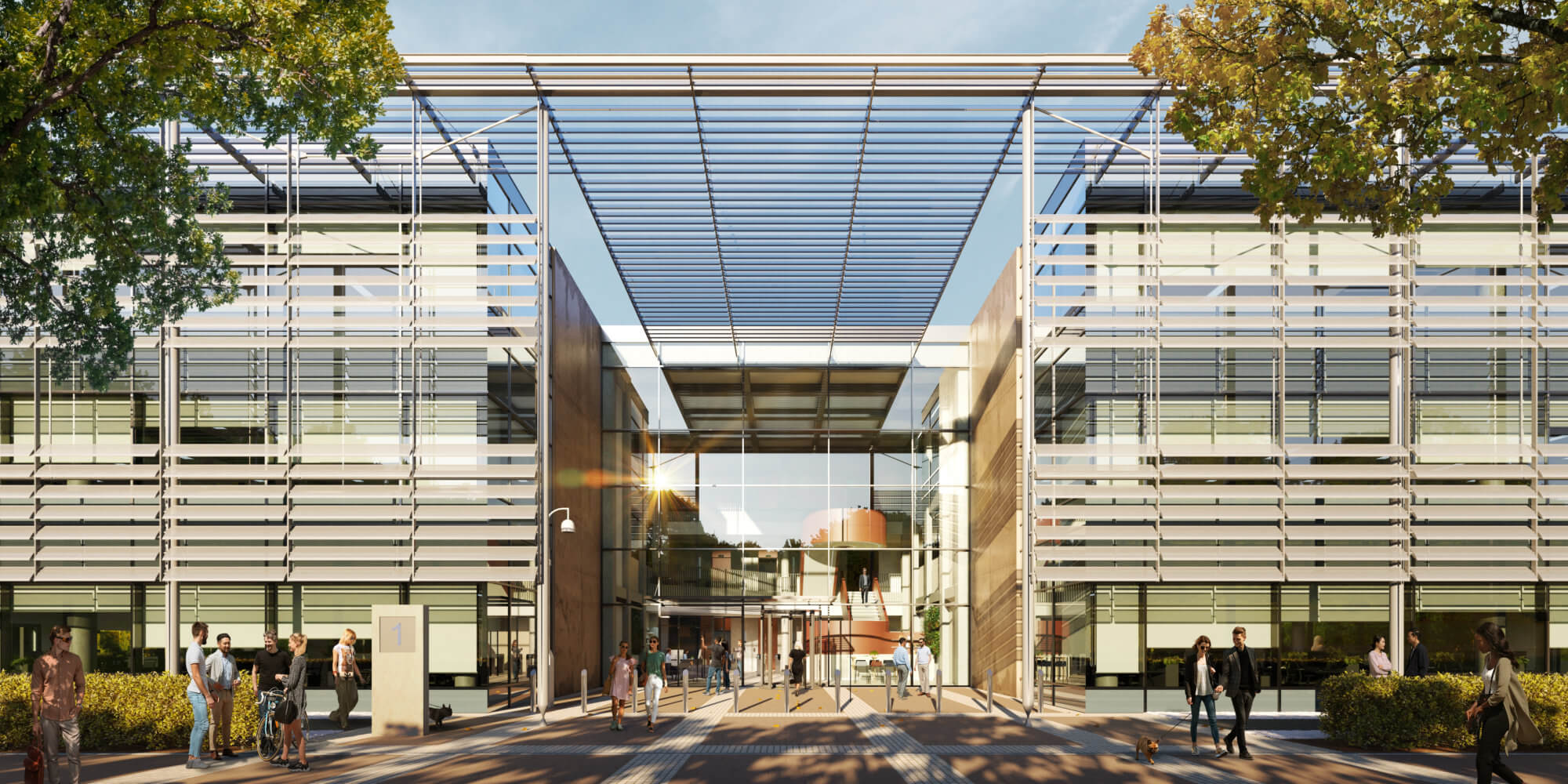
ARC Uxbridge: A best-in-class office and lab campus
The vision
ARC’s passion is supporting science and innovation businesses to thrive. By creating an environment that encourages collaboration and fosters creativity, clusters across the ARC network create the best possible environments for innovation that makes a difference in challenges faced around the world. Home to over 300 leading science and innovation organizations as well as over 10,000 employees, ARC offers access to a growing network with a range of exclusive benefits, including events, summits, training, profile, and access to space for away days and science sprints. ARC Uxbridge is for people who want to be part of an exciting innovation platform, and the refurbishment and all marketing materials needed to reflect that.
Originally constructed in 2001 as a solely occupied building, Building 1 has been well maintained and looked after, but it reflected its time and age. The market has ultimately moved on in terms of aesthetics and sustainability, among other things. The main goal of the brief given to the architects was that the building needed to be the best in the Thames Valley – modern but maintaining the inevitable professional feel that is needed at ARC Uxbridge. Spratley and Partners were brought on to design a market-leading finish that benefits from 50 acres of greenbelt, brilliant parking ratios, and pioneering on-site amenities.
The target audience
Historically, the campus has attracted Blue Chip multi-national organizations that solely occupied their own buildings. The pandemic has led to a change in the way people work and make use of office space, however, and flexible working practices have led to potential occupiers looking for less space but still of extremely high quality. ARC recognized this quickly and has been able to make improvements and adjustments to the campus to offer more flexible space, with options to let buildings to more than one occupier, leading to a broader target market. The main focus has been to allow members desk space in Adapt (their Serviced Office Provision) to benefit from all the amenities and benefits the park has to offer. ARC Uxbridge also has a rich history of pharma company occupation, which they have grown creating a pharmaceutical cluster.
The challenge
One of the main challenges in showing the unique selling points of ARC Uxbridge is that everyone sees a campus and a car park with expansive buildings, when ARC Uxbridge is much the opposite. The marketing materials needed to show the modern, thriving campus with best-of-breed facilities that it is.
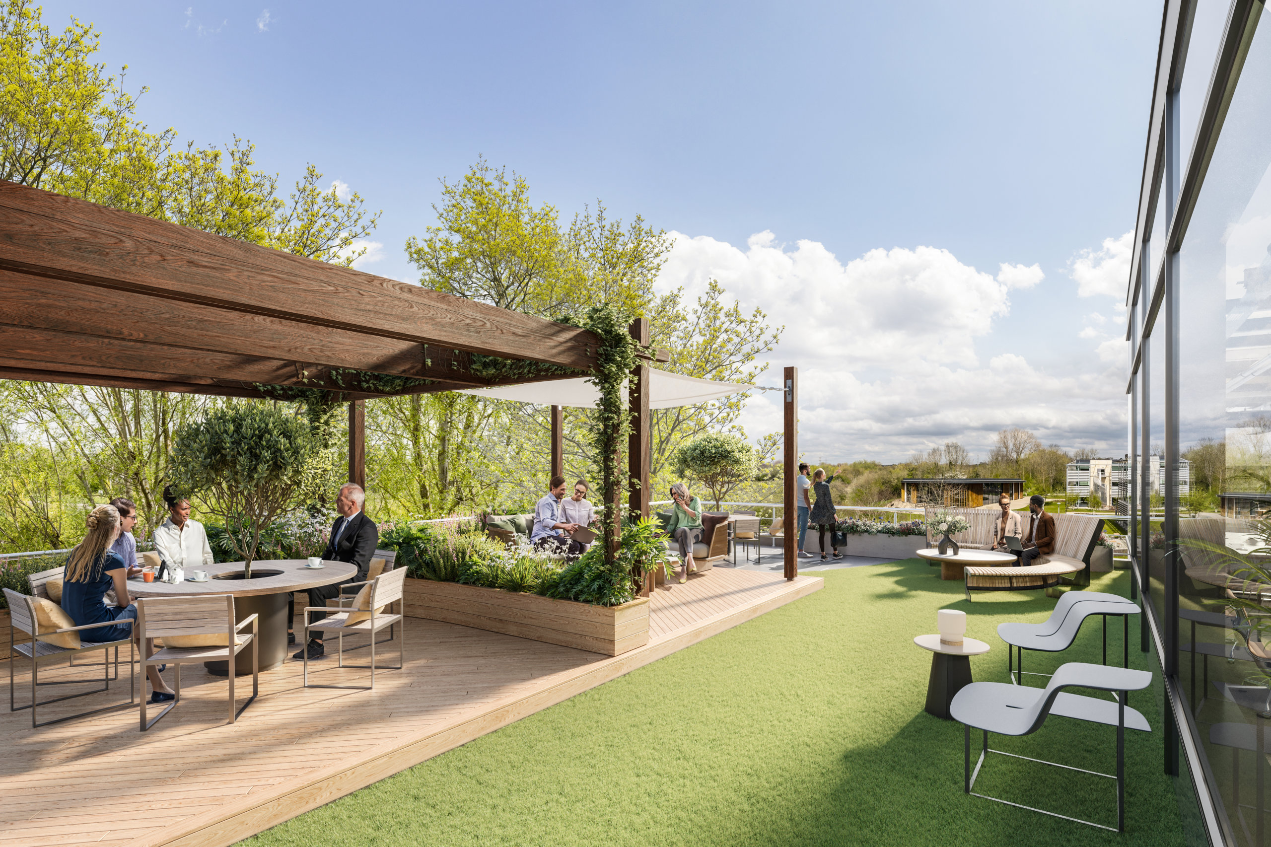
Uxbridge has fantastic parking ratios, which is of extreme importance to members, but they also own 50 acres of greenbelt at the site with trim trails, preserved habitats, and lakes (which can be fished), so 71% of the park is natural green areas that are well maintained and well used. It was important show ample space for parking without taking away from the beauty of the surrounding green areas.
The goals for the assets were very much in line with the goals of the company to support innovation and create market-leading environments and clusters to allow the people working in them to make a difference in the world. To make this happen, the goals of the design were to allow for ultimate flexibility which allows ARC to entice smaller and larger members to create a buzzing, vibrant cluster.
The partnership with WtR
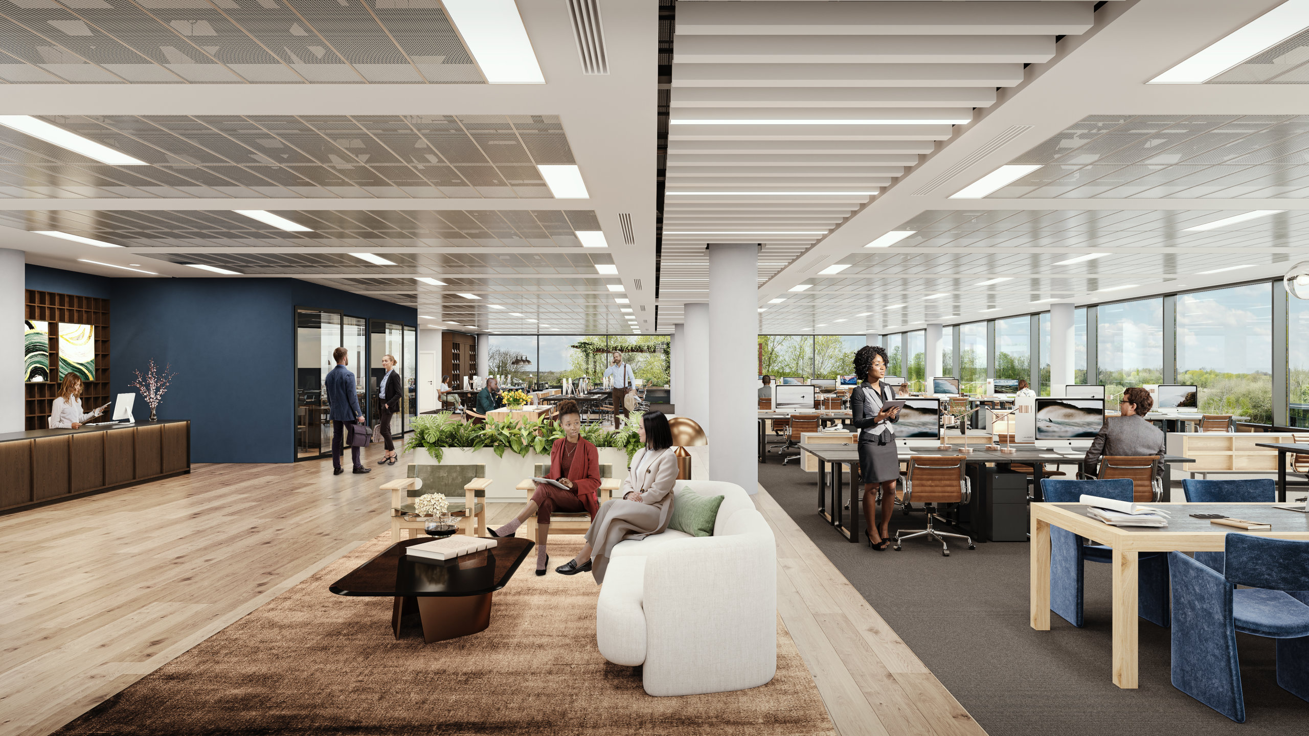
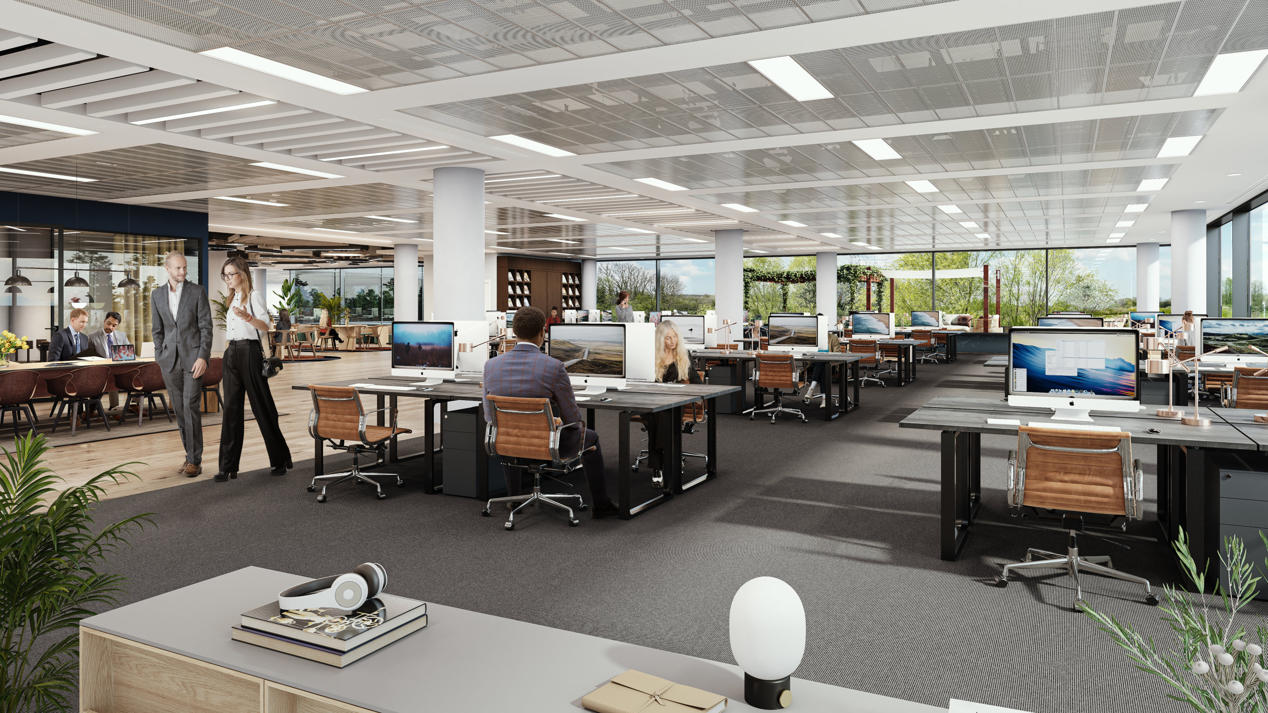
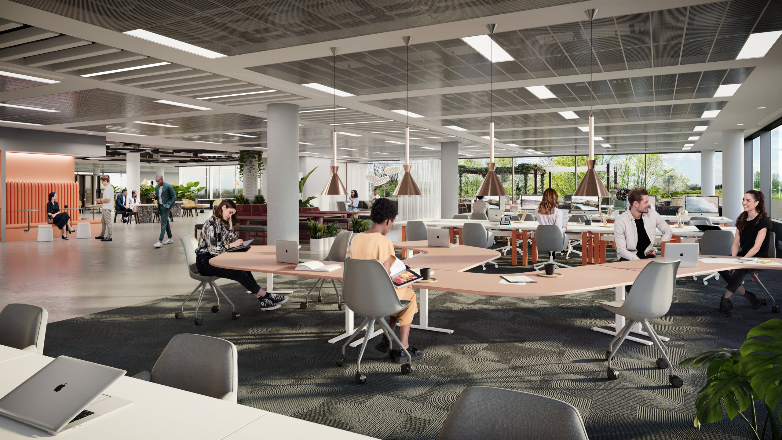
To illustrate the potential of Building 01, we created 6 CGIs to showcase how the office space could be brought to life to fit the needs of different prospective tenants. We also produced an animation to show Building 01 in the context of the broader surroundings of ARC Uxbridge and the vast amenities on offer.
There was a real feel of a partnership of ‘we want this to be perfect’ not ‘that will do’. We very much look forward to working with WtR again.
ARC reported positive feedback internally and from the agent community. They found the process of working with WtR to be “fluid, easy, and very enjoyable” and appreciated our adaptability when it came to last-minute changes. “The quality of the video is one of the best I have seen, and the CGIs look amazing in our marketing channel”, stated George Wilson, Asset Manager at ARC. “There was a real feel of a partnership of ‘we want this to be perfect’ not ‘that will do’. We very much look forward to working with WtR again.”
Working with WtR
Would you like to discuss how we could help you showcase your unique project? Get in touch! We’d love to discuss your needs and how we could deliver the optimal suite of assets needed to market your commercial property.


