


WtR Conversations: Morten Wettergren

WtR Conversations: Morten Wettergren
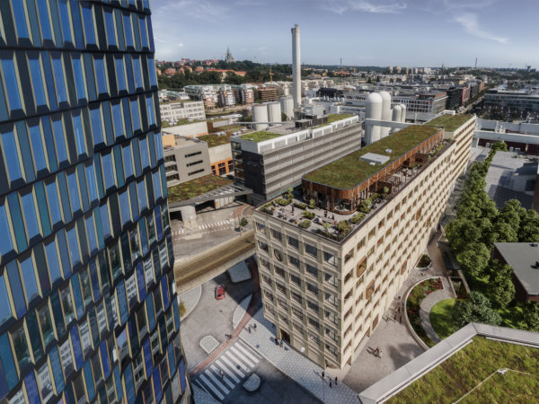
This story begins in the 1980’s with a plan to build the world's most modern postal facility. It could have ended 30 years later, but through great wit and determination, it entered a new era. We’re of course talking about Tomteboda, named not after the mythical creature Tomten (Santa Claus) but Bolstomta, the original name of the site. We had the great pleasure to sit down with Morten Wettergren, Obligo’s Head of Real Estate Sweden, and in charge of the Tomteboda undertaking.
Morten, tell us a little bit about Tomteboda
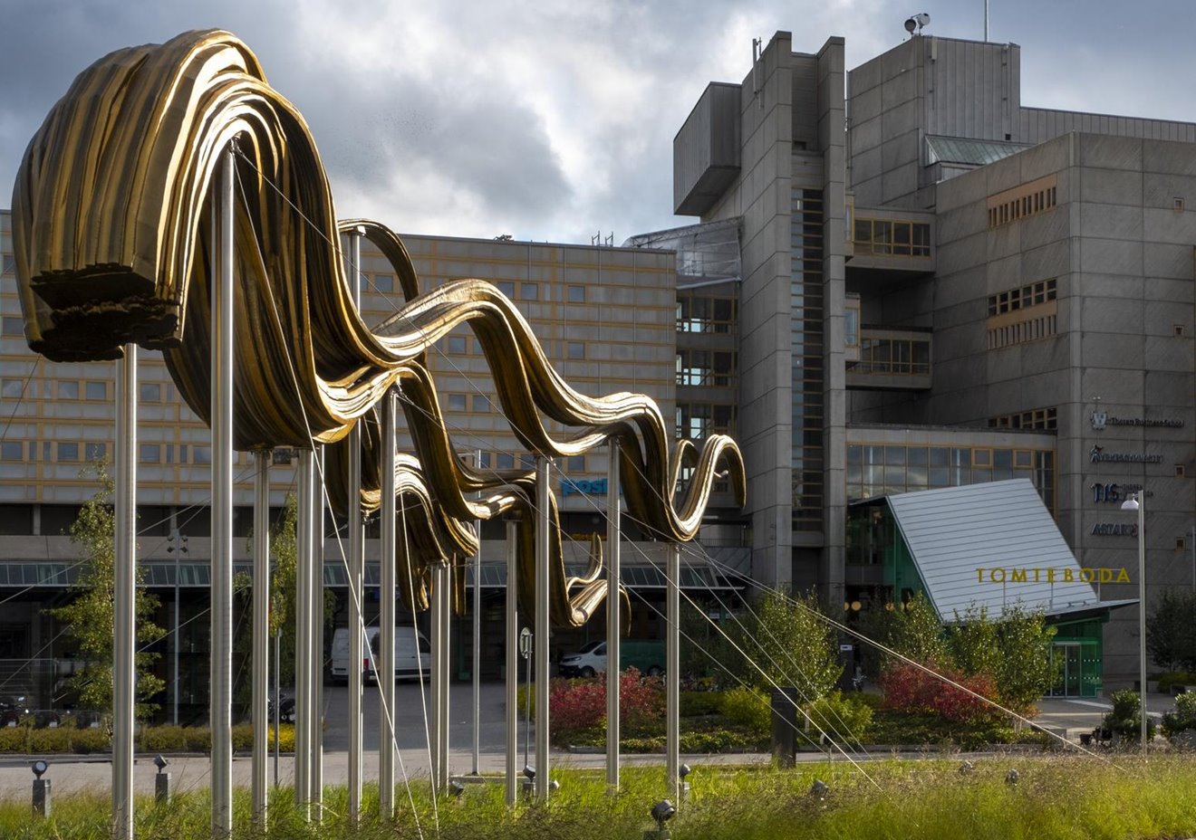
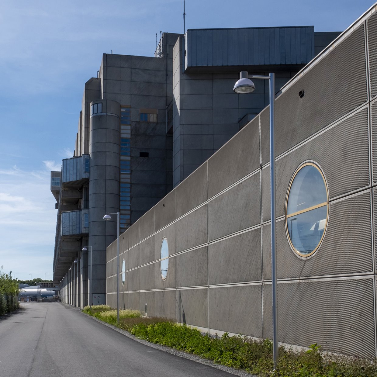
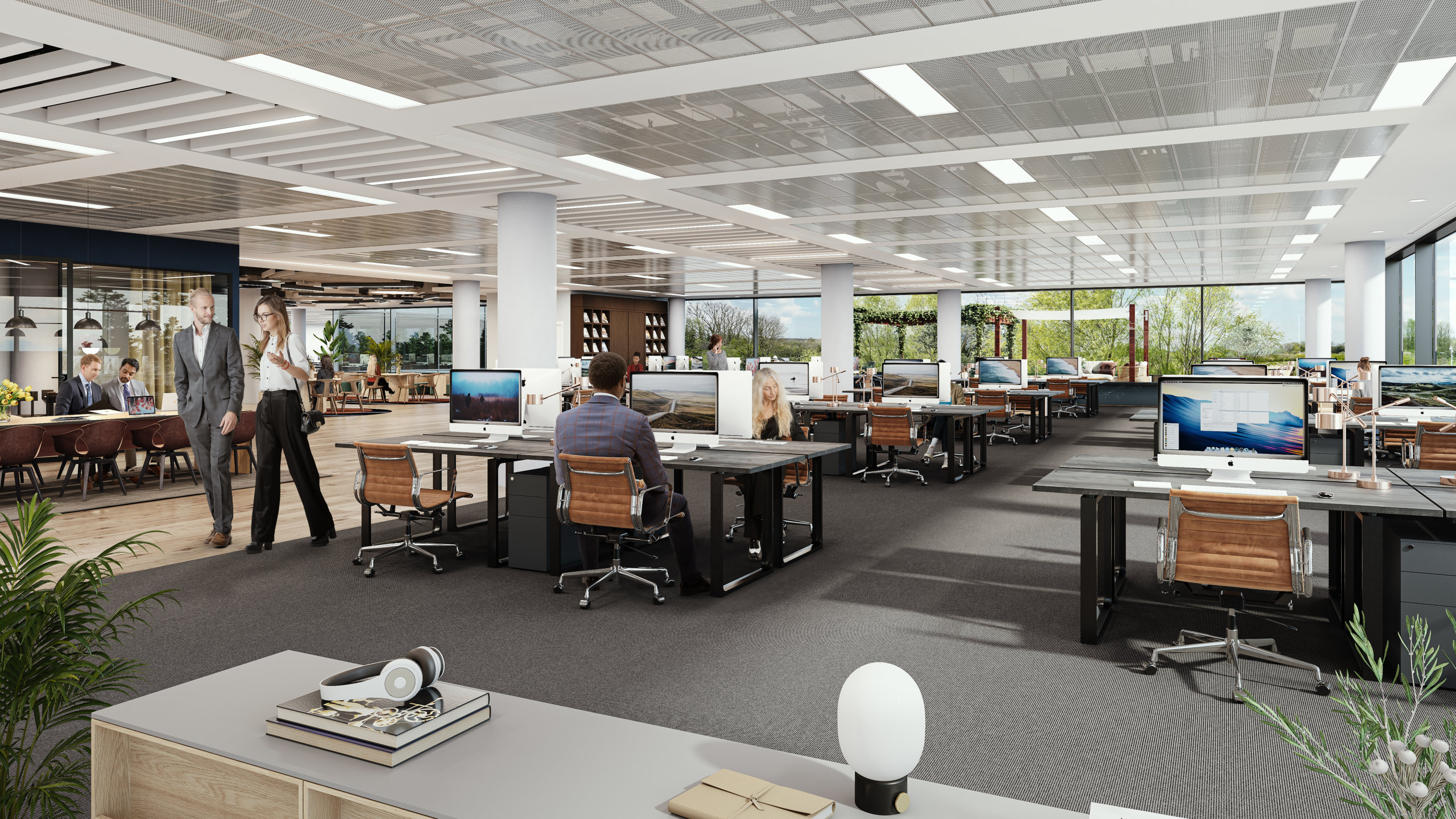
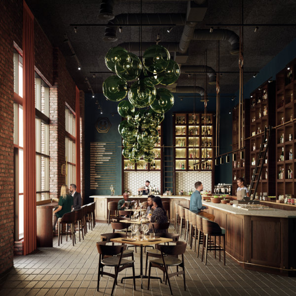
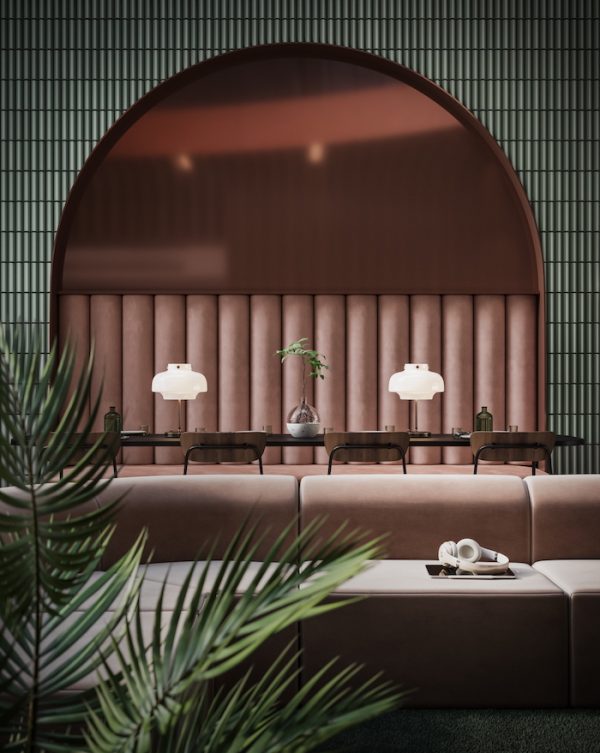
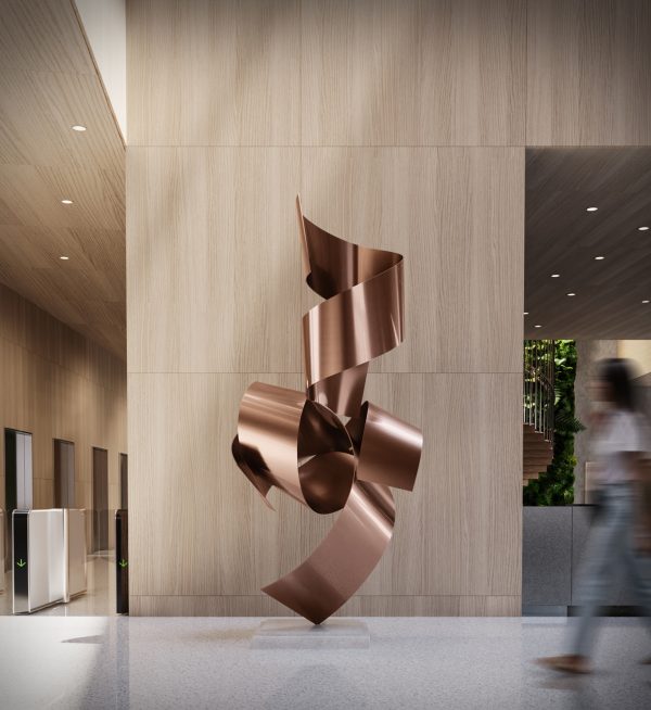
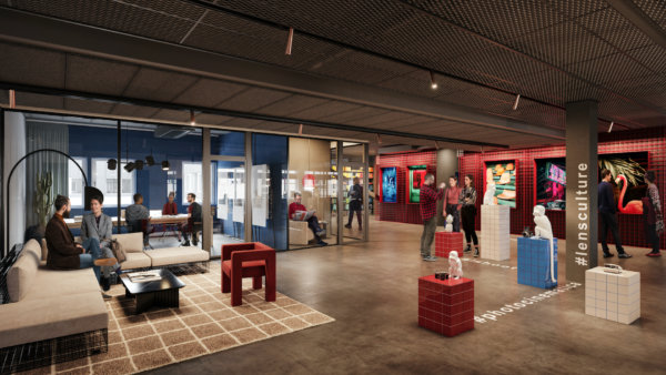
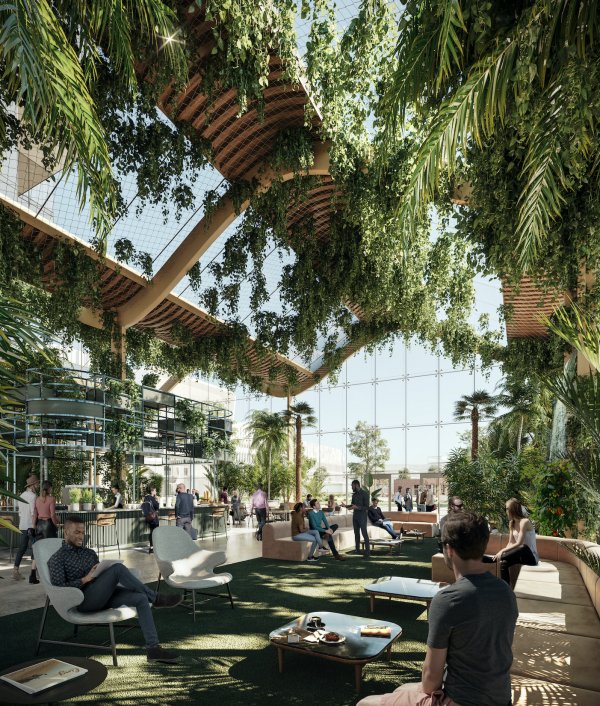
It’s really a gigantic building, 100 000 SQM (1 070 000 SQF). The facade is 400 meters long, and I think we have Europe’s longest corridors running alongside it. It’s unique in many ways, but one of the things that stands out is the massive structure, you simply don’t build like this any more. Then there’s the arts program. Introducing art in an industrial setting was unheard of at the time, and is still very uncommon. In June 2022 we added Ebba Bohlin’s spectacular artwork “Dispersal routes” to the collection, situated in the roundabout enteringing the main building. It’s eight meters high and 15 meters long. Everything is big when it comes to Tomteboda!

Photos by Anders Roth.
How did Obligo come to acquire the building?
It’s an icon! We acquired it in 2007, through a fund structure. Back then PostNord was the sole tenant, and a very stable one at that. Just 4 years later they announced that they were moving out and in 2015 we found ourselves with 100 000 SQM to fill. The news came as quite a shock to us, and the bank that financed the acquisition, as it changed the valuation of the building considerably. Unfortunately PostNord hadn’t been given the clearance to open a new exit from the highway and felt forced to move elsewhere. We’re very happy to have parts of their operation back now though!
Going back to the roots, what was the original intention behind Tomteboda?
Tomteboda was inaugurated in 1983. At the time it was the world’s most advanced postal facility. It was designed in the spirit of Corbusier’s philosophy of buildings as machines for living and working in. The architect behind it was Rosenberg & Stål Arkitektkontor, led by architect Gustaf Rosenberg. They successfully blended functionality with attention to every last detail, resulting in an iconic piece of modern architecture.
As much as I don’t want to think about it, that was 40 years ago. What’s happened since then?
Nothing lasts forever, and as amazing as Tomteboda may have been in the 80s, if you don’t evolve with your time, you will eventually become outdated and that’s what happened. In the 90s, Tomteboda suddenly wasn’t so modern anymore. The privatization of the postal service exposed it to competition, and the digital revolution was just beginning to take hold. People were sending fewer and fewer letters, and Tomteboda struggled to meet the changing demands. There were even thoughts of leveling the building. But a drastic measure like that wasn’t reasonable from any perspective, especially not from an environmental stand-point.
How did you start the reinvention of Tomteboda?
The solution was not immediately clear when we realized that Tomteboda needed a new purpose. But after sitting down with a diverse project team to review our options, we quickly understood that the building offered a level of flexibility and functionality that other structures in the area simply couldn’t match. Tomteboda’s unique construction allowed us to essentially rip everything out and recreate it to suit new tenants.
Fairly quickly we signed a lease with SL (Stockholms Public Transportation company) for 25 years. The bottom floor was the perfect location for Stockholm’s public buses, and with such a strong foundation, our confidence grew. We knew the type of tenants we should be targeting. At the time, rents in the city center were on the rise and many governmental departments and companies were looking for alternatives. Being located just 5 minutes away from central Stockholm, we were in a golden position and were happy to welcome MSB (The Swedish Civil Contingencies Agency) to Tomteboda in 2019.
Bringing a vision of this scale to life required the involvement of countless individuals, each playing a critical role in achieving the results we have today. Walk the Room joined us in early workshops and collaborated with us and the architects to discuss which details to preserve and how to uphold the original intention while reinventing it for a new era.
Can you give us an example of details that make Tomteboda so iconic?
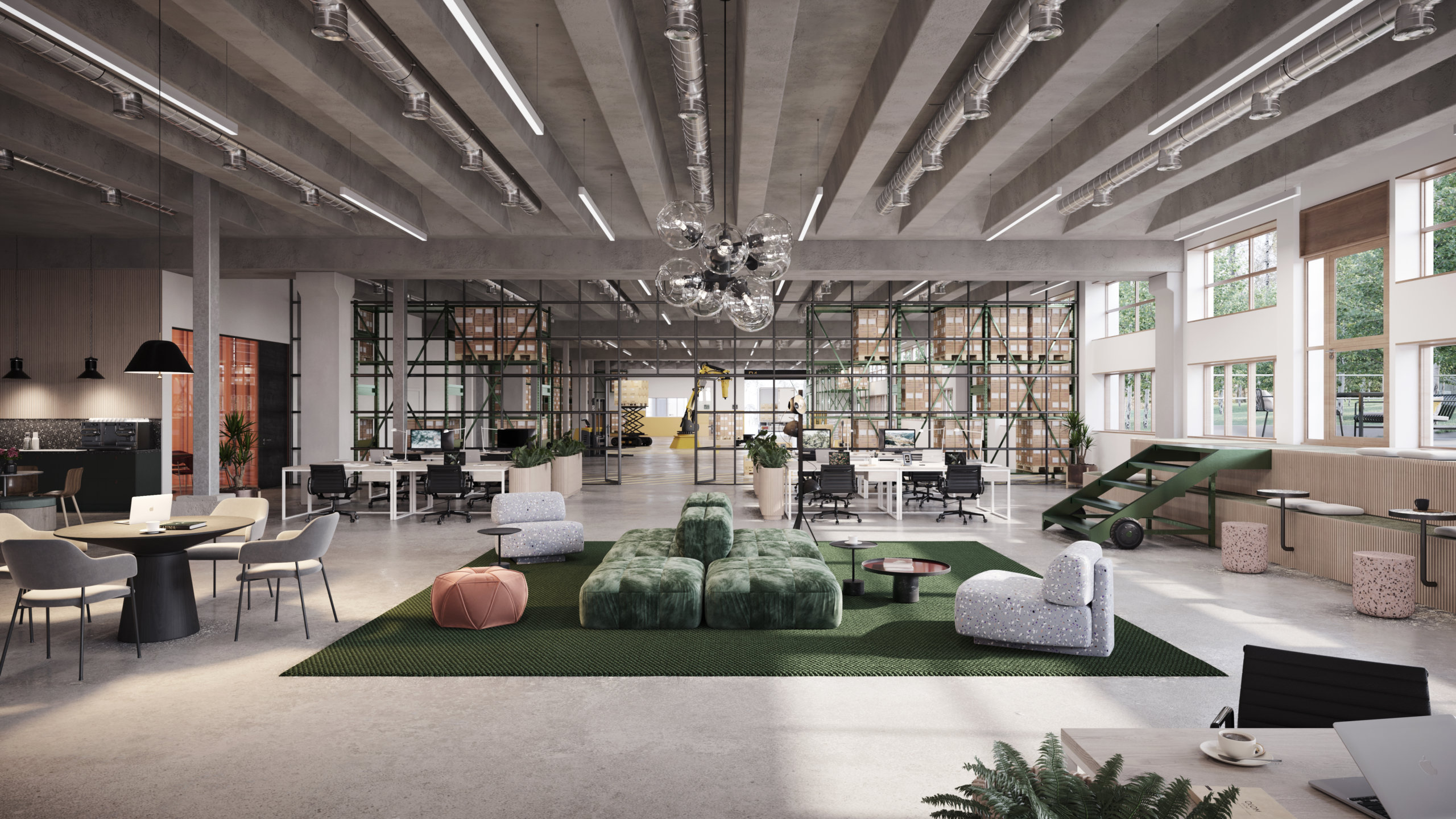
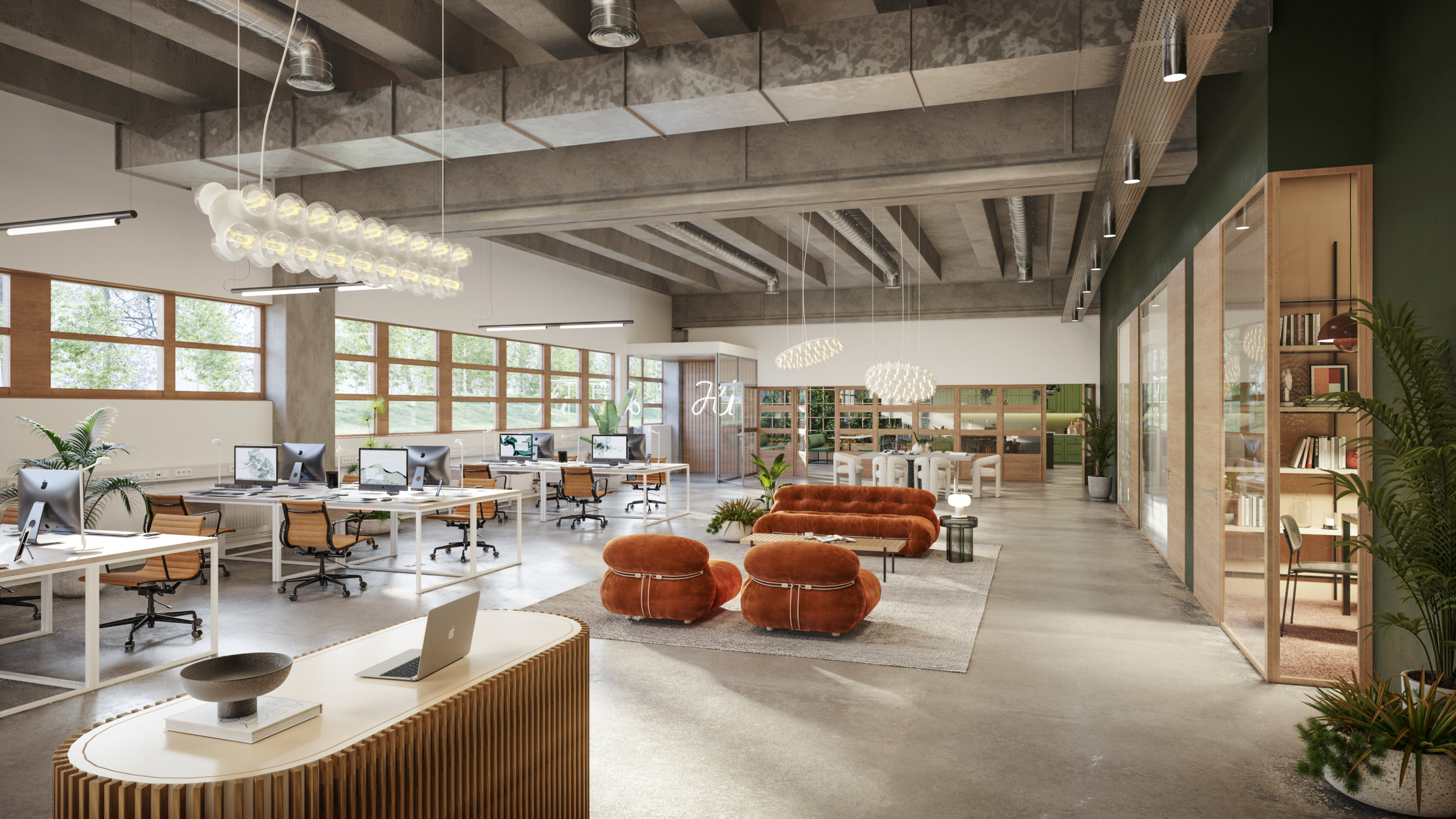
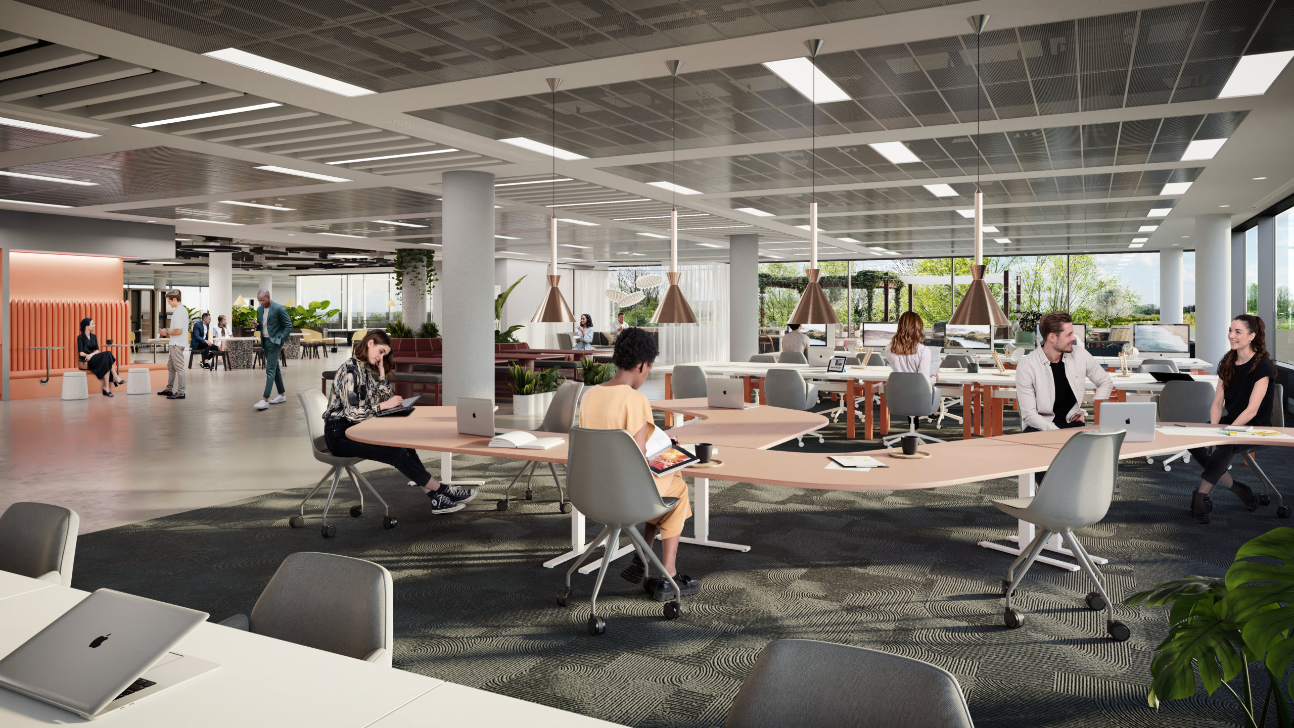
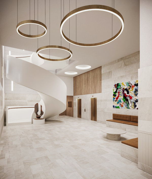
We actually wrote a whole book together with one of the original architects, historians, people working here in the 80s and many more, to honor the legacy of the building. Apart from the structure itself, a custom color palette with a signature orange-yellow, a green, and two blues was developed for Tomteboda. As you can see, the original color scheme is still here, and it was a vital part of the interior design and the visualizations. We also focused on highlighting the industrial elements of the building, concrete can be really beautiful when treated properly.
A challenging catch
Finding the right tenant for the old Train Hall proved to be a tricky task. For a long time, we had hoped that the building would once again serve as a train depot, but eventually we had to accept that this was not meant to be. Eventually Northvault, a battery manufacturer and Valneva, a vaccine company, expressed interest in the space and today they share the building. Valnevas operations are subject to extremely strict regulations, and the facility they have built is truly impressive!

What are you working on at the moment?
Honestly, we’re in a bit of a luxury position right now – we’re not actively seeking new tenants. Instead, we’re more focused on keeping some space available for our current tenants in case they need to expand. There is one piece of the puzzle that’s still missing, though – we’d love to find an arts association. It’s been such an important part of the Tomteboda’s history, and we think it’s important to keep that spirit alive.
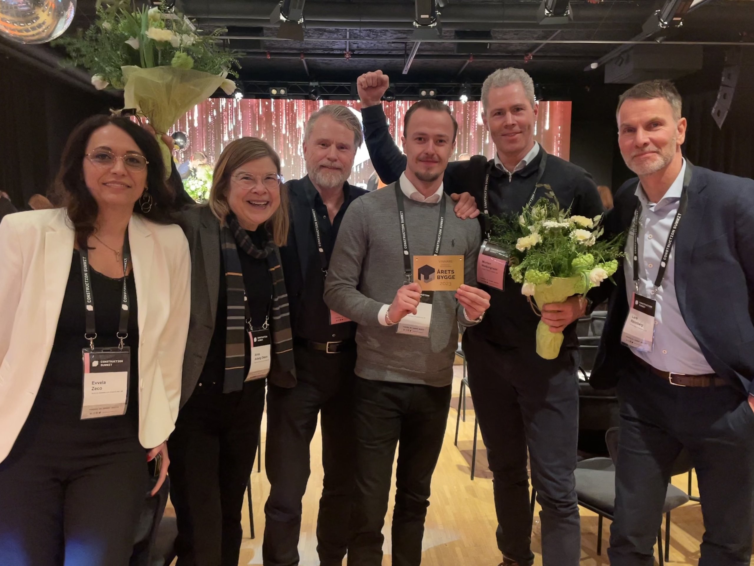
Finally, congratulations on winning Building of the year! We’re guessing that the feat of reducing the energy consumption from 12,000MWh to 3,000MWh had something to do with it?
Thank you! We put as many solar cells on the ceiling as we were able to, a major factor in achieving these results. I think this project demonstrates that it is possible to take what we have and elevate it to house new functions. A large number of actors and specialists have collaborated closely, with great consideration, to transform this robust construction into a modern reference project. Everyone has been eager to explore new solutions which has resulted in a building that will last far into the future. We’re extremely proud of the recognition and award.
To read more about Tomteboda, visit: https://tomteboda.se/
WtR Conversations: Jens Rasmussen

WtR Conversations: Jens Rasmussen
With a climate crisis on our hands, it is no secret that we need to shift how plan, draw, build, operate and manage our real estate. In this blog post we met up with Jens Rasmussen from Helst Arkitekter, the Finnish architects behind Laske, a tool for doing CO2 calculations from BIM models.
Tell me about your office/practice!
My colleague Rabbe and I were working in an office together, mainly on hospitals and other big projects. We were a bit tired of it and wanted to work on smaller and residential projects. Get to a more human scale if you will. We were prepared to do whatever. From the start we also did everything (our smallest project was a 2 m2 bathroom) but now we have scaled up into doing bigger projects like residential blocks / office buildings but still with one leg in Villa design.We’re now 6 coworkers and an office dog, with around a hundred projects under our belt.

Is there a specific project that captures the essence of Helst?
Well, perhaps more than a specific project we really found our way when we recruited our first coworker. Rather than a top down approach we wanted to include everyone already in the design phase. It stuck with us, and every project we undertake starts with a workshop where everyone pours all their ideas out on the table. After that it’s up to the lead architect to cherry pick the best ideas and incorporate them as they see fit. It’s fun, it’s collaborative, but most importantly it’s a rich place to start a project from.
Like many architects you are focused on creating sustainable architecture, but you took it one step further, why was that?
The footprint of this industry is something that needs to be taken very seriously. Being a small firm, we found that it’s very hard to understand the effect of different material choices or other decisions. In larger projects or firms you have whole teams calculating CO2, but even when you have access to experts for calculations, it’s time consuming. So you either “waste” time and money doing it early or you potentially need to waste time and money going back on ideas after they’ve proven not sufficiently sustainable very late in the process. We wanted to automate and simplify the process to make it accessible and usable throughout the process.
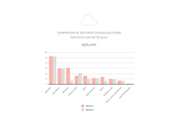
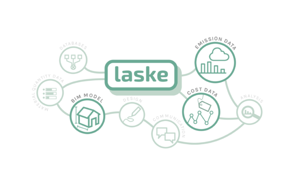
What is Laske?
Laske is a plugin to Archicad that allows you to do calculations of the CO2 effect directly from the BIM model, with no more than three clicks. It generates diagrams and models on what building components create emissions, and simplifies investigating how much CO2 could be saved by for example changing the frame of a building, or the windows. Simply put, it enables architects, builders and clients to make more insightful decisions.
What’s next for Laske?
Building Laske was a team effort. Valter, who’s a wizard in calculations built the model, and Ninni, who is a researcher on circular buildings at Tampere University,, is a never ending source of information. At HELST architects we are already using LASKE in all our designs, but we want to spread the knowledge to more designers. Therefore we are now developing LASKE into a program that can be used by other companies.
We have been partly founded by the Ministry of Environment in Finland to develop LASKE into a program that we can sell and distribute in the Nordics. At the moment we are looking into different solutions to secure the rest of the funding for this phase of LASKE, hopefully with someone from our industry that understands the needs and possibilities of such a tool.
Read more about Laske and Helst Arkitekter here: click.
ARC Uxbridge: A best-in-class office and lab campus

ARC Uxbridge: A best-in-class office and lab campus
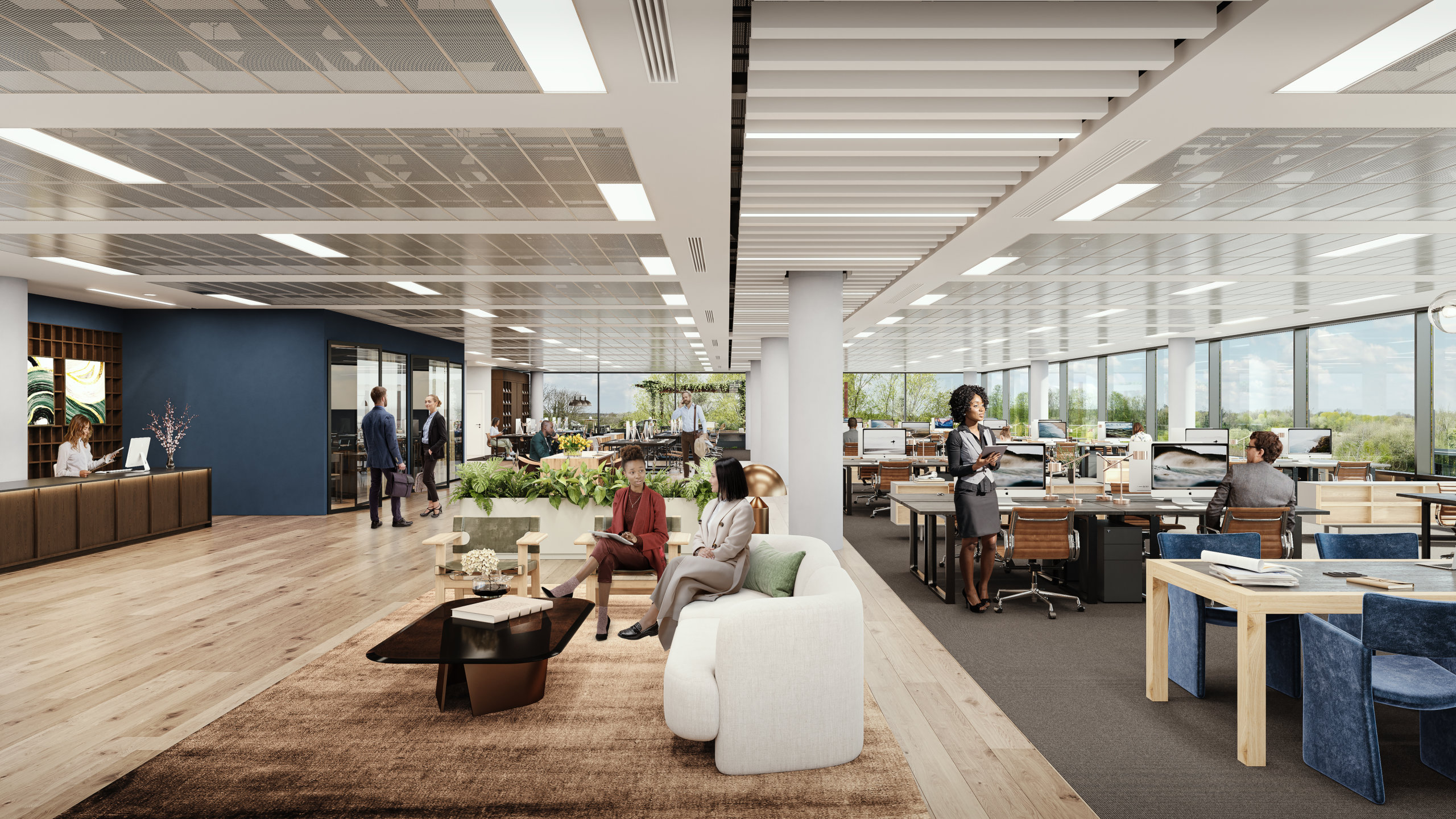
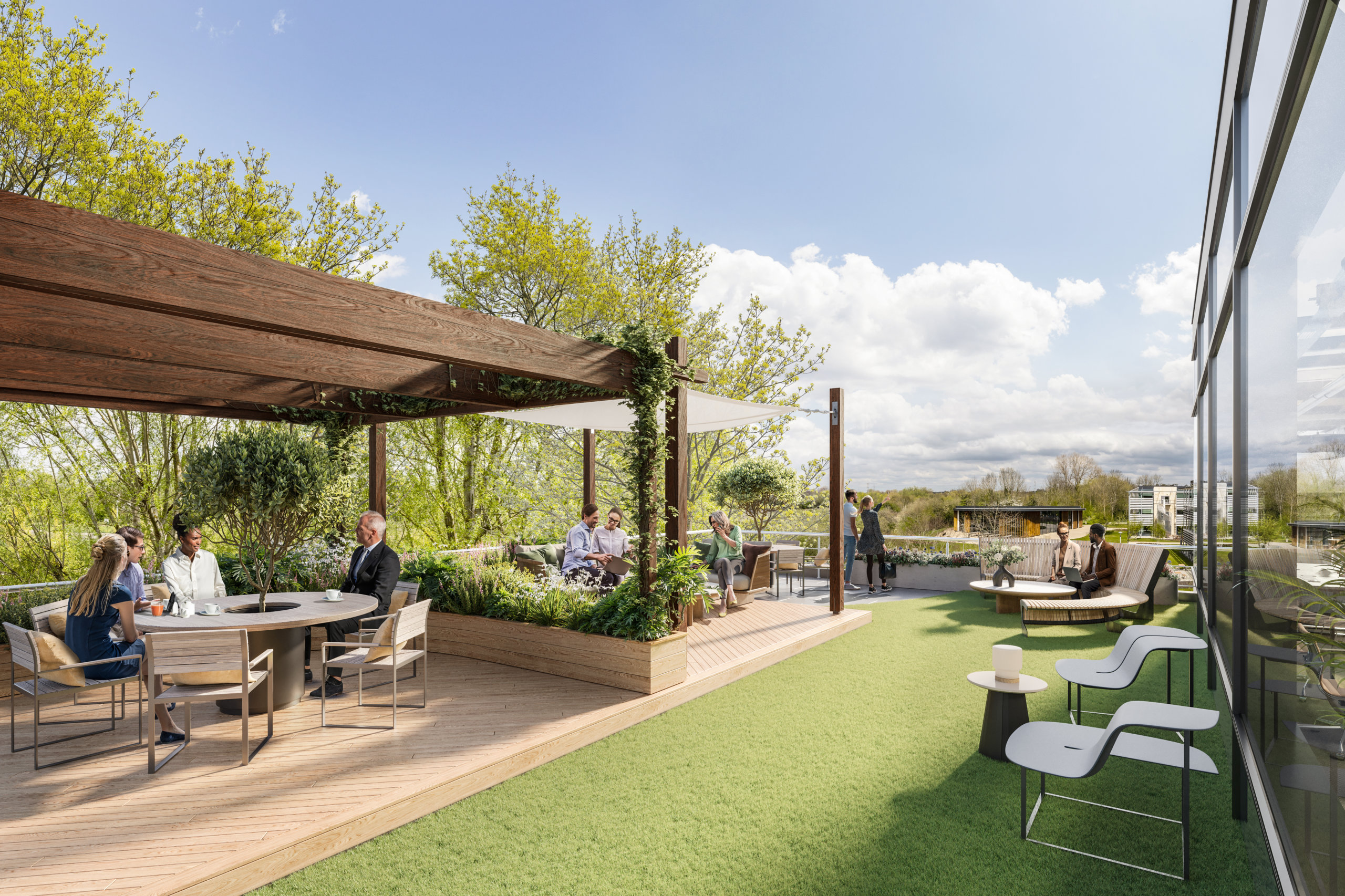
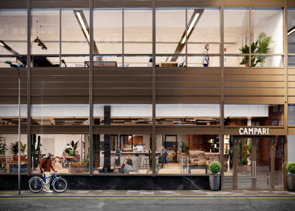
ARC Uxbridge is a leading business and innovation campus offering best-in-class office and lab space with easy access to London and Uxbridge town center. Set in 70 acres of parkland amidst a thriving community of innovative businesses, Building 01 has been completely refurbished to create over 85,000 sq ft of premium office space. The light-filled premises offer views of the surrounding greenery, the thriving Clubhouse, and the Sands River. Add to that a private roof terrace with flexible spaces for having a coffee between meetings or holding an impromptu brainstorming session, and you have one of the best workspaces in the area. Read on to learn more about our client's vision and how we worked together to bring it to life.
The vision
ARC’s passion is supporting science and innovation businesses to thrive. By creating an environment that encourages collaboration and fosters creativity, clusters across the ARC network create the best possible environments for innovation that makes a difference in challenges faced around the world. Home to over 300 leading science and innovation organizations as well as over 10,000 employees, ARC offers access to a growing network with a range of exclusive benefits, including events, summits, training, profile, and access to space for away days and science sprints. ARC Uxbridge is for people who want to be part of an exciting innovation platform, and the refurbishment and all marketing materials needed to reflect that.
Originally constructed in 2001 as a solely occupied building, Building 1 has been well maintained and looked after, but it reflected its time and age. The market has ultimately moved on in terms of aesthetics and sustainability, among other things. The main goal of the brief given to the architects was that the building needed to be the best in the Thames Valley – modern but maintaining the inevitable professional feel that is needed at ARC Uxbridge. Spratley and Partners were brought on to design a market-leading finish that benefits from 50 acres of greenbelt, brilliant parking ratios, and pioneering on-site amenities.
The target audience
Historically, the campus has attracted Blue Chip multi-national organizations that solely occupied their own buildings. The pandemic has led to a change in the way people work and make use of office space, however, and flexible working practices have led to potential occupiers looking for less space but still of extremely high quality. ARC recognized this quickly and has been able to make improvements and adjustments to the campus to offer more flexible space, with options to let buildings to more than one occupier, leading to a broader target market. The main focus has been to allow members desk space in Adapt (their Serviced Office Provision) to benefit from all the amenities and benefits the park has to offer. ARC Uxbridge also has a rich history of pharma company occupation, which they have grown creating a pharmaceutical cluster.
The challenge
One of the main challenges in showing the unique selling points of ARC Uxbridge is that everyone sees a campus and a car park with expansive buildings, when ARC Uxbridge is much the opposite. The marketing materials needed to show the modern, thriving campus with best-of-breed facilities that it is.
Uxbridge has fantastic parking ratios, which is of extreme importance to members, but they also own 50 acres of greenbelt at the site with trim trails, preserved habitats, and lakes (which can be fished), so 71% of the park is natural green areas that are well maintained and well used. It was important show ample space for parking without taking away from the beauty of the surrounding green areas.
The goals for the assets were very much in line with the goals of the company to support innovation and create market-leading environments and clusters to allow the people working in them to make a difference in the world. To make this happen, the goals of the design were to allow for ultimate flexibility which allows ARC to entice smaller and larger members to create a buzzing, vibrant cluster.

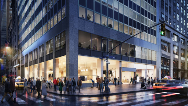
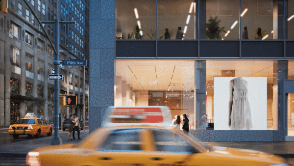
The partnership with WtR
To illustrate the potential of Building 01, we created 6 CGIs to showcase how the office space could be brought to life to fit the needs of different prospective tenants. We also produced an animation to show Building 01 in the context of the broader surroundings of ARC Uxbridge and the vast amenities on offer.
There was a real feel of a partnership of ‘we want this to be perfect’ not ‘that will do’. We very much look forward to working with WtR again.
ARC reported positive feedback internally and from the agent community. They found the process of working with WtR to be “fluid, easy, and very enjoyable” and appreciated our adaptability when it came to last-minute changes. “The quality of the video is one of the best I have seen, and the CGIs look amazing in our marketing channel”, stated George Wilson, Asset Manager at ARC. “There was a real feel of a partnership of ‘we want this to be perfect’ not ‘that will do’. We very much look forward to working with WtR again.”
Working with WtR
Would you like to discuss how we could help you showcase your unique project? Get in touch! We’d love to discuss your needs and how we could deliver the optimal suite of assets needed to market your commercial property.
Digital Property Marketing: 13 Details That Ensure You Stand Out

Digital Property Marketing: 13 Details That Ensure You Stand Out
Most industries have been revolutionized by digitalization, and marketing is no exception. An ever-growing amount of marketing takes place online, and brands all over the world have spent years fine-tuning how to optimize their content for digital, and small mobile screens in particular. It begs the question - are we marketing properties in outdated ways? And are there ways to improve content for digital?
Optimizing property marketing for today’s audience
Google “best performing ads” on social media and a few common denominators will quickly appear. Striking colors, movement, short and catchy copy, the absence of complex information to process and digest. Google high-end commercial real estate visualizations, renders, or CGIs, and the majority of the images that come up follow a different logic, mostly displaying gorgeous, sophisticated, detailed images. This is not to say that these kinds of images and animations don’t have a place, but do they effectively capture people’s attention online?
B2B Marketing can still be emotion-driven
Some may argue that B2B marketing is different, less emotional, more about numbers. While there may be some truth to that, the dynamics of grabbing and holding the target audience’s attention are the same – we are, after all, still human. What can be done to complement commercial property imagery created for traditional media like billboards, printed folders and large screens? Details. Zeroing in on a detail – a dining table, a view, an exercise room, or even a chair – can help you grab the viewer’s attention to initiate a conversation and proceed to talking about the project as a whole.
Money well spent
Is it worth the extra money? Well, when the traditional images have already been created, the most expensive parts, meaning the model, the design, and the lighting have already been paid for. If the resolution is set to only work for a small format, spending that extra bit of cash can actually help increase the ROI on the visualization part of the marketing budget.
It’s all about the details
So why do details work? They’re human scale, and they help people imagine what it would actually be like to spend time in a space. Details make the dream tangible. But all details aren’t created equal, they need to stand out from the noise, and they need to speak to the viewer on an emotional level. We’ve compiled a list of stand-out images from projects we’ve worked on to showcase these 13 details for you, and to inspire you when planning your next project.
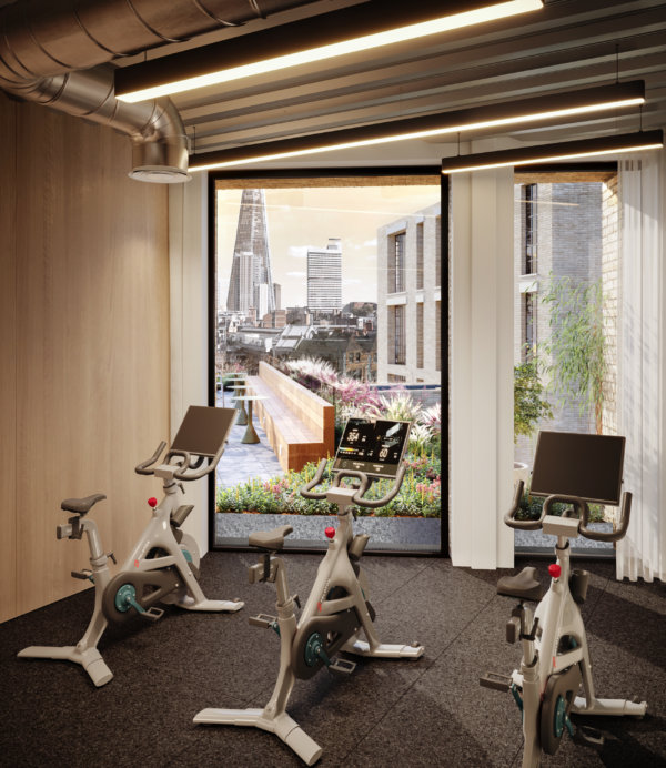
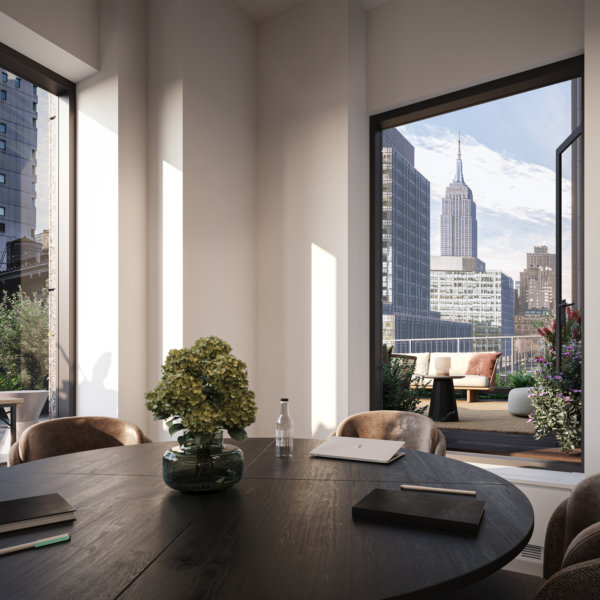
1. Showcase those spectacular views
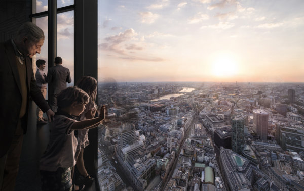
Is there any better way to “sell” a commercial property than with stunning views? It may be clear from an exterior image of a building that it’s sure to have amazing views, but that’s not the same as putting your audience in the room and actually showing them that view. Add people to the mix – because what interests people most are people – and you’ve just sold the benefits of those top floor spaces in milliseconds.
2. Location, location, location
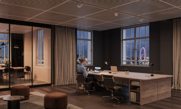
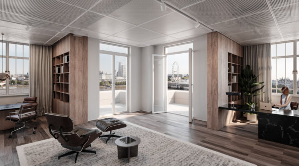
We all know that location is one of, if not the most important selling point of any project. Demonstrating the location on a map is both informative and functional, but showing it from the inside, using landmarks and recognizable areas connects to people’s emotions. Borrow the wow-factor from those nearby places, and just like that, your property goes from good to great. Who wouldn’t want a workspace with a view of the London Eye?
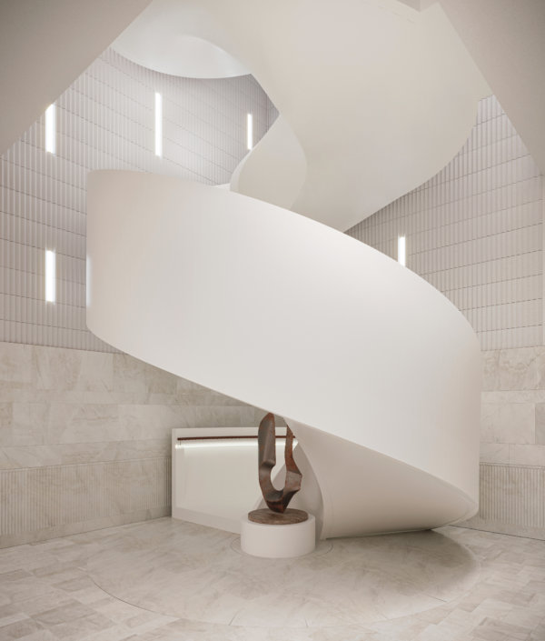
3. Make the most of unique features in your architectural visualizations
You’re just about to spend an unholy amount of money on restoring a facade to its original glory, or to build a staircase worthy of a Hollywood scene. Make sure those jaw-dropping features don’t get lost in the grand scheme of things by showcasing them in the way they were meant to be experienced. And ensure it pays off at the bottom line.
4. Tailor property marketing to audience interests
It’s notoriously hard to get people to read anything online, let alone interact with it. Part of the trick, of course, is to target your marketing to your audience’s interests. Larger images need to appeal to a broad audience with a diverse set of interests, but zeroing in on the details can help you speak directly to a sub-target audience like retailers, restaurateurs, or co-working spaces. They’ll appreciate you going the extra mile by taking their specific needs and wants into consideration.
5. Position the project using the right brands
By including brands and products that have the right associations, renders can signal the project’s future potential. It roots the project in the area, supporting local brands, or appealing to the audience of the featured brands. Whether it’s Apple, Four Seasons, or our local coffee shop, we all have brands we love. That makes us feel all the right things. Take advantage of that when marketing your property.
6. Feature iconic designs
We’re not saying everyone is a sucker for design, but we’re kind of saying everyone is a sucker for design. Whether people are knowledgeable enough to name specific chairs or lamps, most people know high quality interior design when they see it. Using iconic pieces of furniture draws the viewer in by being equally familiar and desirable, and it paints the space in the right light.
7. Use strong shapes or colors
The human eye and mind navigates the (overwhelming) amount of impressions we encounter daily in a number of ways, but generally, we humans favor things that don’t require a large amount of brain power, such as reading. That means that strong shapes and colors have a powerful effect on us in the same way “stop signs” do. By including strong shapes and colors in details, you ensure your image grabs your audience from the get-go.
8. Look for unique angles
A trick of the trade to optimize strong shapes and colors, as mentioned in the previous point, is to look for interesting angles and showcase them in your 3D visualizations. Those angles create a “What am I looking at? I need to figure this out.” moment in the viewer and establish interest in the image. That’s half of your job finished already.
9. Fine tune the atmosphere and ambience
Before we can even get to square meter price and desk capacity, the oh so important desire for the space must be established. Create an atmosphere or ambience so vivid that the viewer can almost touch it, and you’ve just sold a lifestyle (and a property). Be bold and be specific. It’s better to be clearly cool, refreshing, cozy, or lively than to try to be a little bit of everything.
10. Make it move
Animations can be costly, but there’s also a nifty way of adding movement to still images that grabs attention on small screens. Make the color of a typewriter change from blue to red to green and back, and you immediately capture attention without it costing an arm and a leg. Complement it with smart copy and you’ve got yourself a great asset for your property marketing efforts! Better yet, include movement in a way that ensures your potential customer imagines just how your space benefits their business.
11. Incorporate the latest trends
You know how the items worn on the catwalks of the most prestigious fashion brands are bought by few, but seen by many? And how that goes on to help them sell the white t-shirts or mascaras that often make up the bulk of their business? Well, we think of restaurants and bars as the catwalks of commercial real estate projects. The bulk of the building may be office spaces, but it’s the restaurateurs and retail spaces that help build the perception and vibe of the building as a whole. Use those details to convey that the space will be the talk of the town, and your customer will understand that this prestige rubs off on the rest of the spaces and tenants as well.
12. Art for the sake of art – and business
Art doesn’t require a reason for being, but in this context, it has one nonetheless. It’s a good place to inject color in an image and create a focal point – without using strong color in furniture which may be polarizing or come across as too much. While it may not appeal to everyone on a personal level, it will most certainly capture their attention.
13. Employ inviting textures
Speaking to as many senses as possible is a way of ensuring that no stone is left unturned in the quest to attract the engagement of the viewer. Using highly tactile materials in the space, both in surface layers and in furniture, is a way to create ambient atmospheres without dimming the lights – especially useful in daytime places such as office spaces.
Ready to take your property marketing efforts to the next level by utilizing these tips? Get in touch to discuss your next project! We’d love to discuss how we can help you showcase your commercial property to your target audience on the right channels.
Celebrating 4 Outstanding Architects and Designers from the LGBTQ Community

Celebrating 4 Outstanding Architects and Designers from the LGBTQ Community
As part of Pride Month, we’ve been celebrating the life and works of some outstanding designers and architects from the LGBTQ+ community on our social media channels. From the “father of skyscrapers” to a pioneer in the tropical modernism movement to the woman who’s credited with creating the profession of interior design, we’ve learned a lot of fascinating things, and we hope you’ve enjoyed it as much as we have. In case you missed our posts or you just want to learn a bit more about the 4 people we featured, read on!
Louis Sullivan
Louis Sullivan is known as the father of skyscrapers and his numerous works include the Auditorium Building in Chicago, the Guaranty Building (now the Prudential Building) in Buffalo, NY, and the Wainwright Building, St. Louis. Sullivan was a pioneer in designing steel-framed skyscrapers, but he’s also known for defining an architectural style unique to America. He believed a building should respond to its specific environment in the same way a plant would grow “naturally, logically, and poetically out of all its conditions.” You may have also heard his most famous quote – “form follows function”. As with many LGBTQ individuals of his era, his personal correspondence was destroyed toward the end of his lifetime. His legacy remains, not only in the form of revered architecture, but through his student, Frank Lloyd Wright, who apprenticed with him for six years.
Read more about him in Robert Twombly’s “Louis Sullivan: His Life & Work”.
Eileen Gray
Eileen Gray was an Anglo-Irish designer of decorative furniture and Modernist architecture. Gray came to architecture later in life after first studying drawing and painting at the Slade School of Fine Art. She was one of the first women to be accepted at The Slade, and that wasn’t the first time she’d carve out a space for herself in a male-dominated world. Ultimately, her passions lay elsewhere though, and she began experimenting with Japanese lacquerwork fused with geometry. She became interested in architecture in her late forties after a successful career in furniture design. She is best known for E-1027, a modernist villa in Cape Martin in Southern France. It’s an iconic seaside villa that she completed at the age of 51 with no formal architectural training. Gray was largely unrecognized in her own lifetime, but today she is regarded as a pioneer of the Modernist movement, and E-1027 is now a French National Cultural Monument.
Read more about her in “Eileen Gray: Her Life and Work: The Biography”.

Geoffrey Bawa
This is Geoffrey Bawa, Sri Lanka’s most renowned architect. He was born to a mother of German, Scottish, and Sinhalese descent and a father of Sri Lankan, Muslim, and French descent. It was these early influences that were instrumental in shaping his choices in both life and his future profession. He first studied and practiced law, but after the early deaths of his parents, he quit to spend time traveling. It was upon his return that he got his start in architecture after purchasing a rubber plantation called Lunuganga that he would go on to develop throughout his lifetime. Often called the father of the tropical modernist movement, Bawa’s style of architecture suited the hot, humid climate of Sri Lanka and focused on traditional materials. His influence can be seen across Sri Lanka, Bali, and Singapore. He’s perhaps best known for his hotel designs such as Kandalama Hotel. The structure of the luxury hotel was designed so that it hangs onto a cliff while facing Sigiriya rock.
Read more about him in “In Search of Bawa” by David Robson.

Elsie de Wolfe
This is Elsie de Wolfe, an American designer credited with creating interior design as a profession. Born in New York in 1865, de Wolfe was a socialite who spent her early years in Scotland and was presented to Queen Victoria at court – a rare honor for an American at that time. She originally trained as an actress, but became more famous for her on stage attire than her acting ability. She became a fashion icon and was even named “best-dressed woman in the world” in 1935. In 1887, de Wolfe settled into what was then called a “Boston marriage” with Elisabeth Marbury, a formidable figure in New York society who was wildly successful in her own right as a literary agent for the likes of Oscar Wilde, George Bernard Shaw, and many others. The two women shared a house on Irving Square, and it was there that de Wolfe discovered her talent and love for interior design. She was known for her hatred of the Victorian style of the time, which she considered hideous and dark. She opened up the space and redid the house in soft, warm colors to make it light, airy, and feminine. She became a professional decorator in 1905. That same year a group of powerful women, including Marbury, Anne Tracy Morgan, and Florence Harriman opened the first private club exclusively for women in NYC – The Colony Club. De Wolfe was commissioned to design the interiors. She was also active in the women’s suffrage movement and was awarded the Legion d’Honneur for giving the Red Cross the use of her villa in France during World War I.
Read more about her in her own book “The House in Good Taste”.

Did you enjoy our Pride Month campaign? Want to keep up with our latest news? Follow us on social media to stay up to date, meet interesting architects and designers, and to see beautiful 3D visualizations.
Architectural Walkthroughs: Sell Your Commercial Property in Under 2 Minutes
Architectural Walkthroughs: Sell Your Commercial Property in Under 2 Minutes
What can architectural walkthroughs do for your business? Quite a lot. And it doesn’t matter whether you’re a property developer trying to get investors on board, a leasing agent trying to showcase your property’s potential to a prospective tenant, or an architect trying to win a competition to design a whole city block. Architectural walkthroughs can do a lot of the heavy lifting for you. Why tell your prospective client about your vision when you can put them right in the middle of it? Ready to see how you can take your client on a visual journey and sell your property in under two minutes? We’ve put together a few of the flythrough animations that we’ve provided for clients to let you see the value they can add to your property.
Fully immerse your audience in the lifestyle you’re offering
We all know what it’s like to get lost in a great movie. To completely lose track of time and place, and to feel like you’re right in the middle of the French Riviera or Middle-earth. You can give your clients exactly the same experience with architectural walkthroughs. After all, it’s not actually sq ft we’re thinking about when we buy a property. It’s the lifestyle it can give us. Show your client how the natural light shines through the floor to ceiling windows. Put some books on the coffee table and pick the perfect chair to cozy up an office space. Add the perfect music, special effects, and camera movements to convey the right atmosphere, and it’s easy to imagine living, eating, or working in a particular space. With this kind of visual storytelling, your clients are sure to fall in love with your property.
Showcase unique features with exceptional detail
What’s that jaw-dropping feature that you know would sell your project all by itself if only your client could visualize it? Are you planning to restore all the original detail on a ceiling? Is your lobby going to be an oasis of green? As fantastic as we think 3D renders are, there are some things that will always be better captured on film. Walk your audience through your space and zero in the one feature that will stop them in their tracks.
Take your audience on a visual journey
Renders go a long way in showcasing your property vision, but 3D animations breathe life into your property. You can map out a whole visual journey and take your prospective client along for the ride. Show them each room as if they were walking through it. Give them a bird’s eye view of the property before taking them along their daily route. What shops will they pass? Where will they stop for their daily coffee? Will they take a break in the courtyard and chat with their colleagues? How about yoga on the roof terrace at lunch time? Just as important as a journey through the spaces is transitioning from day to night, so your audience gets the full picture. This is when you can create that extra special moment. A view of the Empire State building as the sun sets. A morning coffee in the sun-drenched office kitchen. By creating a captivating experience for your audience, you’ll capture their attention and speak to their emotions.
Walk your viewer through the surrounding area
With animations you can showcase interiors, close ups of design details, and much much more. You can take your viewer on a trip around their future office space or around the whole neighborhood. What could be more immersive than that? Take them from the tube to the lobby of their office. Show them the restaurant options for lunch. Or walk them through a nearby park. The possibilities are endless.
Demonstrate the size of the space and equip it in a matter of seconds
Renders are great, but when it comes to really conveying the dimensions and proportions of a space, architectural walkthroughs are the way to go. Instead of showing only certain angles of a space, you can walk your audience through each room, giving them a real sense of the size of the space and what they can do with it. Go even further by showing them the empty space and then quickly filling it. Not only will they understand the scale and dimensions, but they’ll also get to see the potential of the space realized in a matter of seconds.
5 Unique CRE Ideas to Up-level Your Next Property

5 Unique CRE Ideas to Up-level Your Next Property
The world of commercial real estate is full of creativity and originality, and we’ve had the great pleasure to work on CGIs and animations for several unique properties over the years. We hope this list inspires you to go the extra mile with your next commercial property. And when it comes to finding that something special and ensuring it’s communicated properly to your shareholders, we’d love to help you bring your property to life through 3D visualization. Get in touch if you’d like to discuss your project.
Car Park Transformation
A car park is just a car park. Until it isn’t. Kungsleden got creative with this car park in Stockholm and transformed into a multi-purpose space. Need a place to work? You’ll find it here. Need space for an art exhibition? Check. Want to open a pop-up shop? No problem. Oh and you can park your car here too.
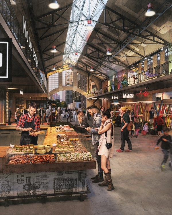
Meatpacking District
When the municipality of Stockholm decided it was time to develop the meatpacking district, it presented a unique opportunity for whichever property developer won the deal. The ideas and plans had to be presented to the council and the competition was fierce. The winning idea by Atrium Ljunberg and Gatun revitalizes the area while staying true to its roots by creating spaces for art and commerce and keeping food at the heart. This massive, ongoing project will be fully realized by 2030.
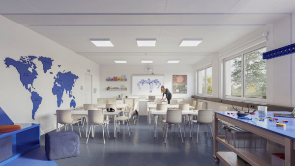
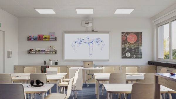
Adaptable Schools
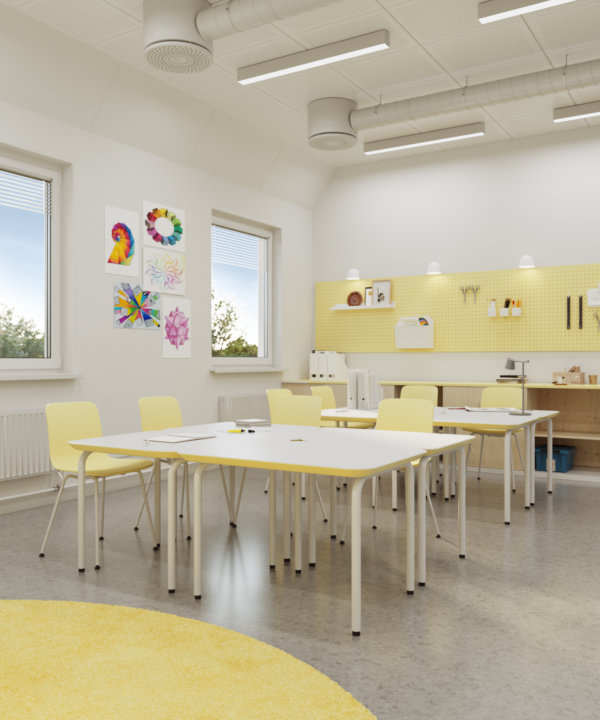
The world has changed and so have the schools. That’s the basis that Adapteo Group has created their adaptable, modular schools on. With modular technology, each school can be built according to specific needs and easily adapted when those needs inevitably change. Offering a cost-effective, low-maintenance, and quick solution, these school facilities can be provided for a few days or long-term. New ideas and mindsets call for flexibility – Adapteo ensures we’re ready for what the future brings.

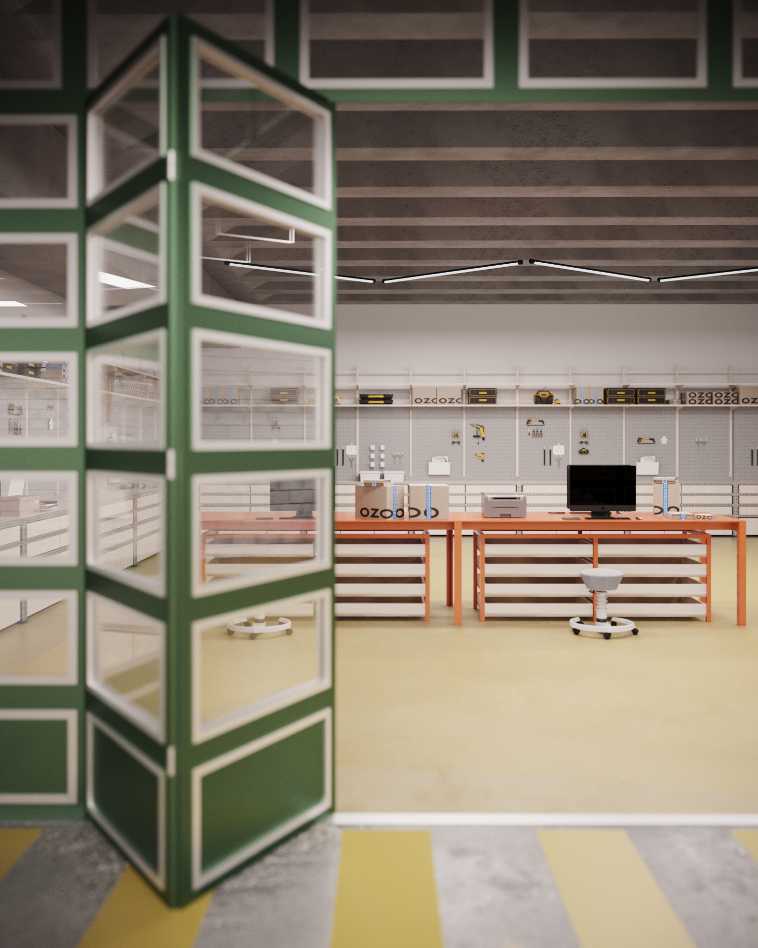
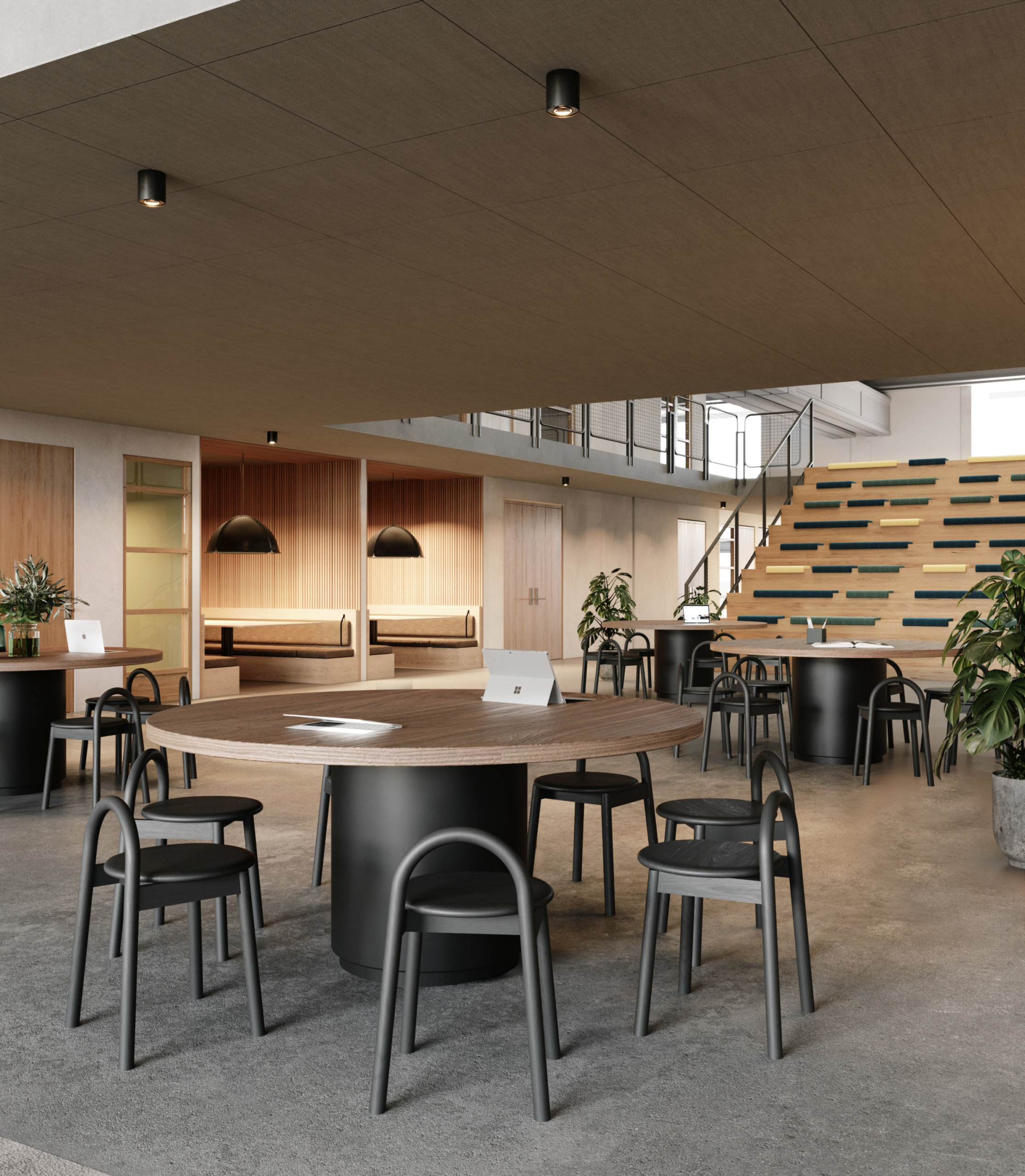
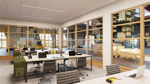
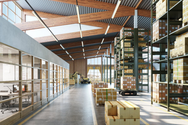
The Terminal
Industrial spaces don’t have to be boring. And this refurbishment of the largest postal sorting office in Sweden by JLL is the perfect embodiment of that. The goal was to refurbish the space with creative offices that offered fantastic access to industrial space and warehouse logistics. The project resulted in a light-filled, clean, and minimalist warehouse with fun, green, and spacious offices.
Oasis in Finnslätten
You could be forgiven for thinking you’re outside when sitting in the lobby of this building in the urban campus of Finnslätten. Developed by Kungsleden and designed by Tovatt Architects & Planners, Finnslätten is already unique as an urban campus where research, development, and production join forces to meet societal challenges. But this oasis is a destination in itself. Whether you need 10 minutes to yourself or a meeting place to discuss creative ideas, you’ll find what you need there.
8 Ways That 3D Visualizations Bolster Your Property Marketing Efforts

8 Ways That 3D Visualizations Bolster Your Property Marketing Efforts
The commercial property space is in a very unique place, with lets dropping and major companies pulling out of contracts that would never have been expected - it’s time for owners to have a look at their development and client strategies. While the discussion as to where budgets could be cut to make up the difference, or what properties and projects alike can do to make sure that they are or will be filled with quality people. Below we have mapped out 8 strong arguments to support why developers, owners, and marketers should invest in quality and reach associated with 3D visualizations and partners.
Communicate your property
Communicate any property efficiently with digital presentation assets such as CGIs, 360s, walkthroughs, and animations that will engage your audience, increasing online excitement that matters. By adding 3D property elements to your offering you bring the essence of the real world into the digital world.
Show the characteristics and spaces that you and your clients care about, by allowing them to be experienced online from anywhere in the world.

Visually package your property’s USPs
Every one of your properties/projects have unique value, whether it be location, surroundings, layouts, size, materials, or flexibility, you can use 3D to visually explain your vision before development, refurbishment, or fit-out takes place. Ultimately, you will be able to quickly create interest and put on display the true value of your property.
Drive future value
We all know that the value of a property is not only immediate, in fact, its intrinsic value appreciates with time. But further value can be planned and even put on display through additional plans that may not be in phase 1. Does your property have the potential for future development? Make your plans visionary and at the same time concrete by showcasing the potential to drive future value.
Define unique characteristics
As the old adage goes, the devil is in the details. Every property/project is built around a few major values, which in the end, drive the interest in purchasing a property. However, increasing property value, and ultimately closing a quality buyer, lies in the details. By using 3D to push an average presentation into a game-changer, you can also put on display those unique individual characteristics that you have envisioned, which ultimately can skyrocket property value. Red granite lobby tabletops instead of wood? 3D allows you to capture every unique characteristic, which ultimately separates quality buyers from others.
Target great buyers/tenants
Like any great presentation or pitch, the tailoring of all information is key to its success. Imagine you’re a buyer/tenant, and you are viewing a property image that is in all white and beige, with floor plans laid out and neutral furniture peppered about. Sure, it’s in a great part of town and the commutes are easy for your employees. But aren’t you a little worried about the level of service and relationship you would receive from an owner that only values their property with some basic 2d layouts and image overlays? Now picture an owner that took the time to create an image that could actually show your company and teams in the office, with desks and furniture to subtly match your company feel and vibrance, virtually moving you into the space before you’ve even signed the contract.
Have meaningful conversations with clients
Have you ever joined a meeting where someone wasn’t prepared and decisions needed to be made? During this meeting, you end up using the time to draft what should have been ready for the meeting to discuss.
3D visualizations are quite literally the version of being the most prepared for a client or investor meeting possible. By delivering 3D visualizations of a concept you show your audience that not only have you thought the entire property concept through and sketched it out, but you have fully committed to what it will be. Confidence in an idea is a major cornerstone to buyer confidence and commitment.
Stand above your competition
Keeping up with the competition” is a relic of the past. “Staying relevant” is a graveyard for slow decision-making. You either continue defining the future and pushing your competition to keep up, or you enjoy what’s left when they are done cherry-picking the best buyers and tenants out there.
We all know that for larger deals, each potential tenant or buyer of a property has multiple options to move to or invest in. Choosing a 3D partner that will not only deliver images for you on time but truly drive the creative process, create value, and deliver things that you didn’t know possible is what will keep you ahead of the competition and in the good graces of potential clients.
Increase your potential buyer reach
It’s simple, in today’s ease of global movement and competitive property markets, people buy and rent property sight-unseen. With every development, refurb, or office let your potential reach is global. How do you reach a global audience with a very fixed-in-place product, property? You take the mountain to Mohamed.
Save the client effort, time, and travel by creating an overwhelming digital showcase of your property, which will increase your buyer circle (overseas), cut transaction costs, and impress your prospects.