Digital Property Marketing: 13 Details That Ensure You Stand Out
Digital Property Marketing: 13 Details That Ensure You Stand Out
Optimizing property marketing for today’s audience
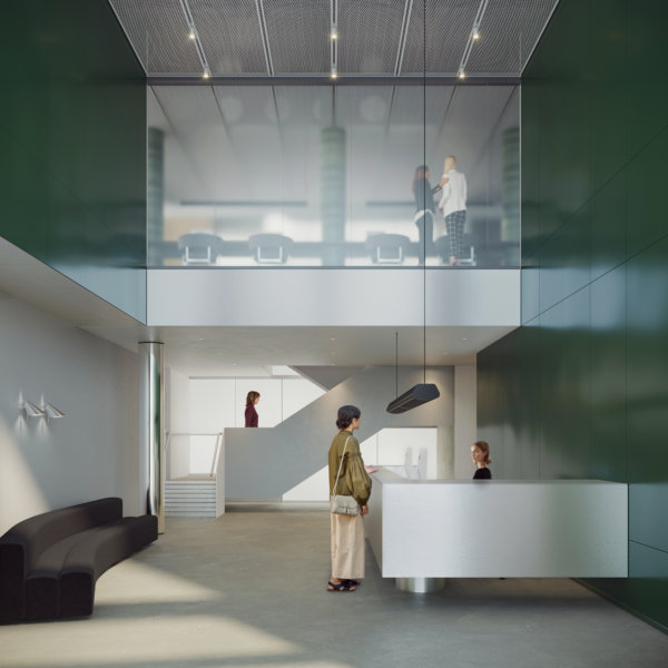
Google “best performing ads” on social media and a few common denominators will quickly appear. Striking colors, movement, short and catchy copy, the absence of complex information to process and digest. Google high-end commercial real estate visualizations, renders, or CGIs, and the majority of the images that come up follow a different logic, mostly displaying gorgeous, sophisticated, detailed images. This is not to say that these kinds of images and animations don’t have a place, but do they effectively capture people’s attention online?
B2B Marketing can still be emotion-driven
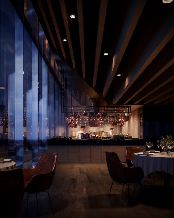
Some may argue that B2B marketing is different, less emotional, more about numbers. While there may be some truth to that, the dynamics of grabbing and holding the target audience’s attention are the same – we are, after all, still human. What can be done to complement commercial property imagery created for traditional media like billboards, printed folders and large screens? Details. Zeroing in on a detail – a dining table, a view, an exercise room, or even a chair – can help you grab the viewer’s attention to initiate a conversation and proceed to talking about the project as a whole.
Money well spent
Is it worth the extra money? Well, when the traditional images have already been created, the most expensive parts, meaning the model, the design, and the lighting have already been paid for. If the resolution is set to only work for a small format, spending that extra bit of cash can actually help increase the ROI on the visualization part of the marketing budget.
It’s all about the details
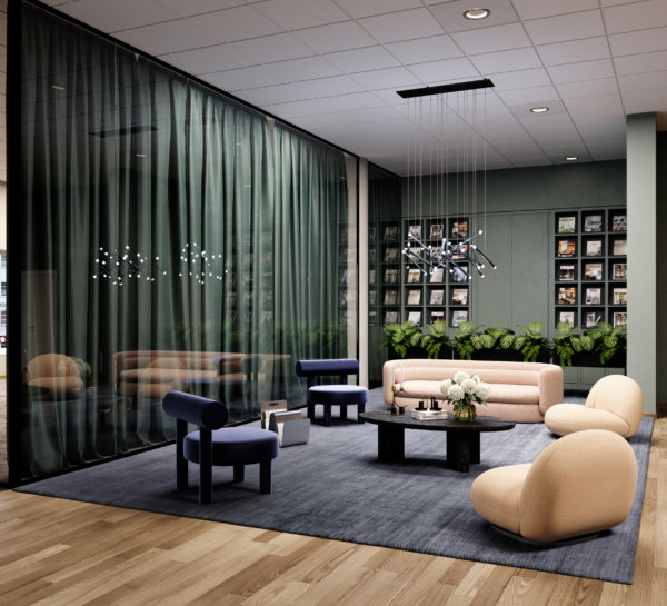
So why do details work? They’re human scale, and they help people imagine what it would actually be like to spend time in a space. Details make the dream tangible. But all details aren’t created equal, they need to stand out from the noise, and they need to speak to the viewer on an emotional level. We’ve compiled a list of stand-out images from projects we’ve worked on to showcase these 13 details for you, and to inspire you when planning your next project.
1. Showcase those spectacular views
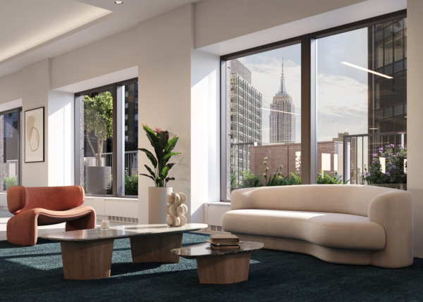
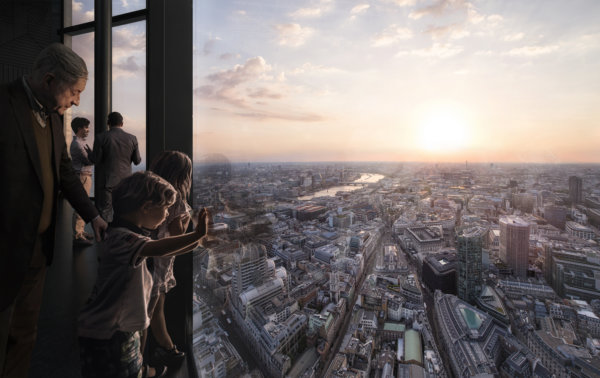
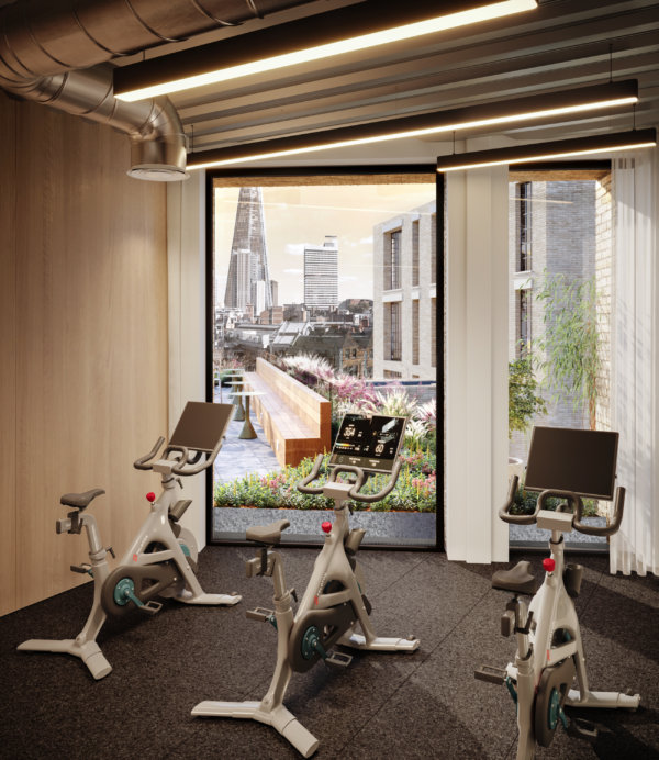
Is there any better way to “sell” a commercial property than with stunning views? It may be clear from an exterior image of a building that it’s sure to have amazing views, but that’s not the same as putting your audience in the room and actually showing them that view. Add people to the mix – because what interests people most are people – and you’ve just sold the benefits of those top floor spaces in milliseconds.
2. Location, location, location
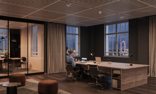
We all know that location is one of, if not the most important selling point of any project. Demonstrating the location on a map is both informative and functional, but showing it from the inside, using landmarks and recognizable areas connects to people’s emotions. Borrow the wow-factor from those nearby places, and just like that, your property goes from good to great. Who wouldn’t want a workspace with a view of the London Eye?
3. Make the most of unique features in your architectural visualizations
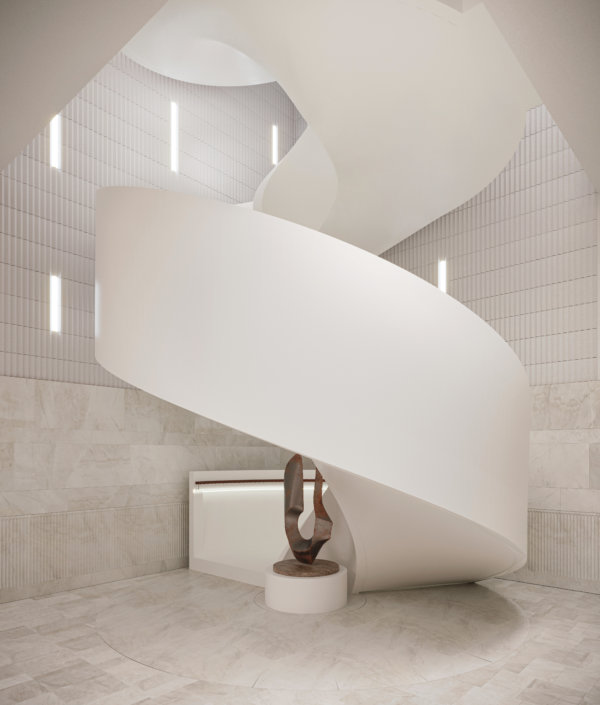
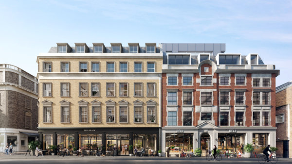
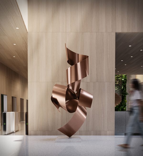
You’re just about to spend an unholy amount of money on restoring a facade to its original glory, or to build a staircase worthy of a Hollywood scene. Make sure those jaw-dropping features don’t get lost in the grand scheme of things by showcasing them in the way they were meant to be experienced. And ensure it pays off at the bottom line.
4. Tailor property marketing to audience interests
It’s notoriously hard to get people to read anything online, let alone interact with it. Part of the trick, of course, is to target your marketing to your audience’s interests. Larger images need to appeal to a broad audience with a diverse set of interests, but zeroing in on the details can help you speak directly to a sub-target audience like retailers, restaurateurs, or co-working spaces. They’ll appreciate you going the extra mile by taking their specific needs and wants into consideration.
5. Position the project using the right brands
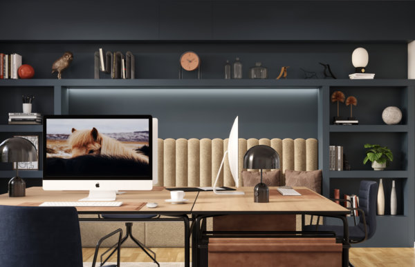
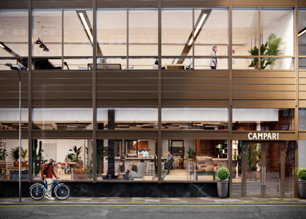
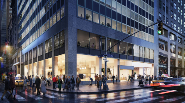
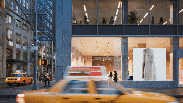
By including brands and products that have the right associations, renders can signal the project’s future potential. It roots the project in the area, supporting local brands, or appealing to the audience of the featured brands. Whether it’s Apple, Four Seasons, or our local coffee shop, we all have brands we love. That makes us feel all the right things. Take advantage of that when marketing your property.
6. Feature iconic designs
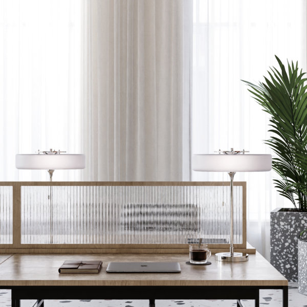
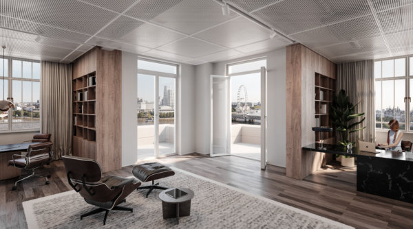
We’re not saying everyone is a sucker for design, but we’re kind of saying everyone is a sucker for design. Whether people are knowledgeable enough to name specific chairs or lamps, most people know high quality interior design when they see it. Using iconic pieces of furniture draws the viewer in by being equally familiar and desirable, and it paints the space in the right light.
7. Use strong shapes or colors
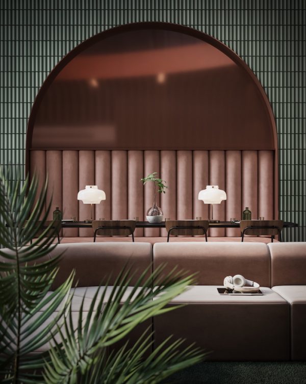
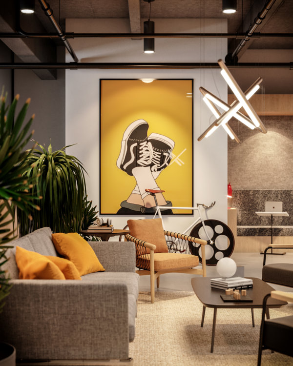
The human eye and mind navigates the (overwhelming) amount of impressions we encounter daily in a number of ways, but generally, we humans favor things that don’t require a large amount of brain power, such as reading. That means that strong shapes and colors have a powerful effect on us in the same way “stop signs” do. By including strong shapes and colors in details, you ensure your image grabs your audience from the get-go.
8. Look for unique angles
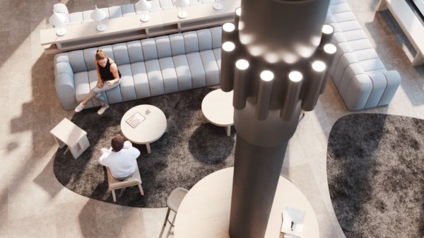
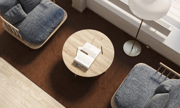
A trick of the trade to optimize strong shapes and colors, as mentioned in the previous point, is to look for interesting angles and showcase them in your 3D visualizations. Those angles create a “What am I looking at? I need to figure this out.” moment in the viewer and establish interest in the image. That’s half of your job finished already.
9. Fine tune the atmosphere and ambience
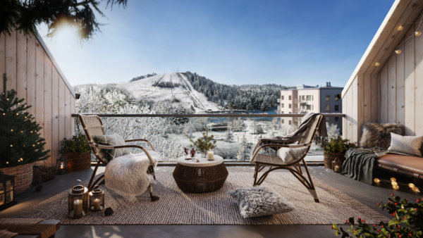
Before we can even get to square meter price and desk capacity, the oh so important desire for the space must be established. Create an atmosphere or ambience so vivid that the viewer can almost touch it, and you’ve just sold a lifestyle (and a property). Be bold and be specific. It’s better to be clearly cool, refreshing, cozy, or lively than to try to be a little bit of everything.
10. Make it move
Animations can be costly, but there’s also a nifty way of adding movement to still images that grabs attention on small screens. Make the color of a typewriter change from blue to red to green and back, and you immediately capture attention without it costing an arm and a leg. Complement it with smart copy and you’ve got yourself a great asset for your property marketing efforts! Better yet, include movement in a way that ensures your potential customer imagines just how your space benefits their business.
11. Incorporate the latest trends
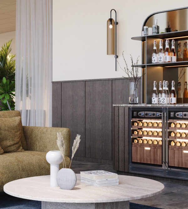
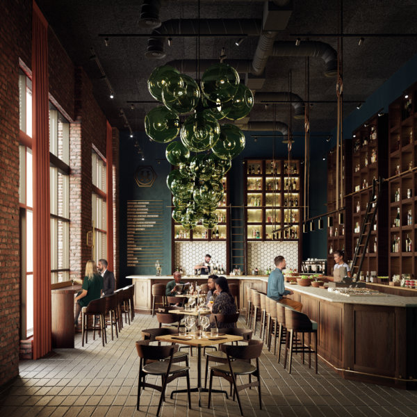
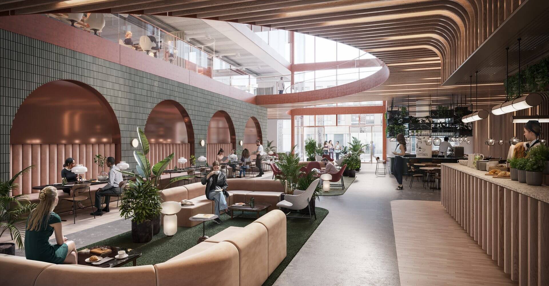
You know how the items worn on the catwalks of the most prestigious fashion brands are bought by few, but seen by many? And how that goes on to help them sell the white t-shirts or mascaras that often make up the bulk of their business? Well, we think of restaurants and bars as the catwalks of commercial real estate projects. The bulk of the building may be office spaces, but it’s the restaurateurs and retail spaces that help build the perception and vibe of the building as a whole. Use those details to convey that the space will be the talk of the town, and your customer will understand that this prestige rubs off on the rest of the spaces and tenants as well.
12. Art for the sake of art – and business
Art doesn’t require a reason for being, but in this context, it has one nonetheless. It’s a good place to inject color in an image and create a focal point – without using strong color in furniture which may be polarizing or come across as too much. While it may not appeal to everyone on a personal level, it will most certainly capture their attention.
13. Employ inviting textures
Speaking to as many senses as possible is a way of ensuring that no stone is left unturned in the quest to attract the engagement of the viewer. Using highly tactile materials in the space, both in surface layers and in furniture, is a way to create ambient atmospheres without dimming the lights – especially useful in daytime places such as office spaces.
Ready to take your property marketing efforts to the next level by utilizing these tips? Get in touch to discuss your next project! We’d love to discuss how we can help you showcase your commercial property to your target audience on the right channels.

