


Our approach to AI use in CGIs

Our approach to AI use in CGIs
Yes, it’s a topic of AI, yet again. It seems like you cannot open an internet browser and not read about it - from monitoring your daily routines and sleep cycles to helping you order the perfect balanced meals or picking the most fitting movie to watch after a long day - we can all agree at this point that AI is everywhere and is here to stay.
Its presence in the CGI industry is vast at this point, and not learning to take advantage of it would be deciding not to grow. So we grew. We learned. We tested. We adapted. And we believe that we ended up with a safe and sustainable workflow regarding AI tools. With insights from our Art Director, Marcelo Duarte, and our Chief Operating Officer, Charlotte Stuveback, we compiled our findings about the latest tools and discussed how we approach the AI beast.
Introducing the AI tools to the team
Our team of artists and developers is a truly exceptional group – we’re all very dedicated to our craft and continuous learning. AI Tools were no exception – as the industry shifts and changes, our artists’ curiosity follows. We organized a set of workshop days to make sure everyone had a chance to experiment with the available tools and compiled the information in our internal learning hub. By doing so, we’re making sure the information is evenly distributed, ensuring that any of our artists can jump on AI tool tasks if needed.
Our recent workshops focused on enhancing the materials in CGIs.


Ensuring efficiency – putting a workflow in place
At WTR, we continually seek new solutions to enhance our services and expand our portfolio, staying competitive in the industry. However, the real challenge lies in integrating these new products into our production process. With most of our team being composed of managers and artists working on client projects, we sometimes face difficulties in allocating time and resources for extensive testing, updates, and feedback amidst our regular project schedules.
The implementation process has to happen internally before it reaches our clients for us to run through many possible scenarios, set a base workflow for that new solution, spread the knowledge, and then think of the next milestones and future versions.
Safety and sustainability of AI tools – generating images vs enhancing your artwork
AI has likely impacted or fooled you, especially in creative industries. While many use AI for content generation, it’s crucial to also use it to optimize workflows. This approach can help maintain creativity while improving competitiveness in time and pricing.
AI can enhance various aspects of creative work, from rendering to client interactions. It can assist with:
- Improving visual outputs
- Note-taking and summarizing client briefs
- Creating mood boards
- Developing internal proposals
However, using cutting-edge technology often involves legal gray areas. It’s essential to ensure legal compliance for both company and client safety when implementing new AI solutions.
Quick AI Renders
One of the game changers from our AI research was the ability to propose different specs or moodboards to our clients, straight from our Digital Twins for commercial leasing. Developing CGIs can be a long process with many feedback rounds and is quite frankly too expensive for many clients. By implementing AI on top of our Digital Twins we can save 90% of time while still providing high-quality work.
The process is made faster by setting the angles in the twin directly and providing different style options turning decisions into a quick yes or no elimination process. This new technique has allowed us to reach and help a wider audience of clients who do not have big budgets to work with.

We use a similar approach for scene lighting, instead of spending hours rendering multiple lighting options, we can now easily send lighting proposals generated by AI, decided upon and developed manually to spec by our artists, ensuring the artists have a clear brief to follow and also that the clients are aware of what they are agreeing to and getting as a result.
Other practical ways of how we use AI – process optimization, material enhancement & noise reduction.
Process Optimisation with the help of AI
As mentioned above, most companies and people, in general, are used to seeing AI in a generative setting which is an amazing asset but in our line of work we need our images to follow precise specifications which means freely generating an image is not a viable option for us, but thanks to our team and some extensive research, we found ways to use AI in our day to day work in different ways, adding small imperfections to the images or bits of “realism” as we call them, improving low-quality photography, changing a character’s clothing or hairstyle, and other activities that might have taken us a few hours to find, fix or to get to a satisfying point, we can now achieve the same or better results in only a few minutes.
Materials enhancement
At this point, it’s hard to say we use a specific AI engine, we’ve had a few workshops for a couple of different ones like Stable Diffusion/ A1111 and Comfy U.I. but it can vary depending on the purpose we’re using it for, none have been the “all in 1” solution but for example, when it comes to enhancing renders and materials our usual workflow runs through Stable Diffusion/A1111 which we found to give us excellent results when it comes to fabrics, hard surfaces, and even people’s clothing, that being the last step, sort of like the “cherry on top”, the majority of our work is still bespoke and done manually in conventional 3D software.

Noise Reduction and Image Clean-up
Often in our day-to-day projects, we may receive input photography from the clients themselves which could be troublesome for a myriad of reasons like low image resolution, noise, civilians in the frame, construction sites, and building facade conditions to just name a few. Thankfully due to the latest artificial intelligence developments, we can much more comfortably deal with these issues, or at least in a fraction of the time. Comfy U.I. helps us upscale input photos to a much higher quality without losing detail fidelity or even the latest Adobe AI tools help us clean up images much faster than we would’ve let’s say a year ago clone stamping for hours.
Where do we see the future of AI use?
A.I. engines are bound to revolutionize the archviz and many other industries in the coming years, offering unprecedented efficiency and creativity and there is nothing we can do about it. Looking at it from a positive and productive standpoint, these tools will streamline workflows by automating repetitive tasks, freeing up time for creative teams to focus on more complex and artistic elements. AI-driven visualizations will potentially enable faster iterations, allowing for quicker feedback stages, and ultimately accelerating project timelines. As we mentioned in the sections above, AI can already enhance design possibilities by generating innovative ideas and options that we might not have even considered yet.
In short, AI is here to stay and it will keep improving, it won’t replace us but we do have to learn how to use it in our favor, this technology will empower us to deliver more dynamic and visually stunning projects, elevating the quality of our work while staying competitive in a fast-evolving industry and potentially exploring new ones.
All AI tools are learning from human processes and creativity. We are hoping for and believing in a future where AI can assist us with tedious, repetitive, and time-consuming tasks that are not bringing any direct value to our projects or clients. The time we gain with these tools we use for exploring, learning, and pushing our own creative and technical boundaries. AI should be your assistant, moving you faster and further than before, but we see ourselves in the driving seat of progress, as the ones pointing out the direction where we would like to go, rather than the other way around.
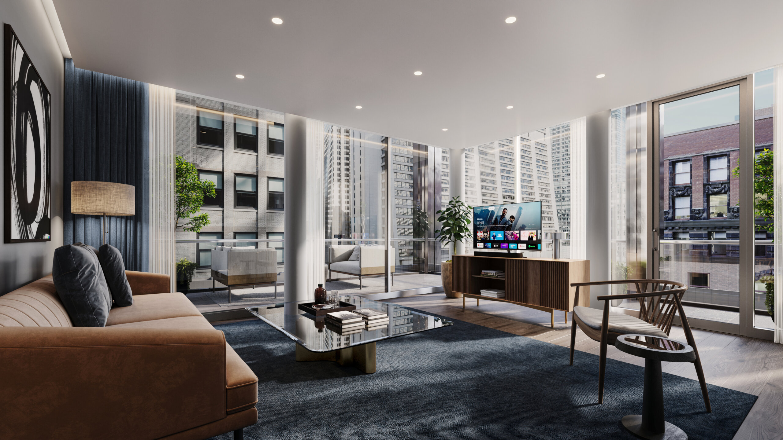
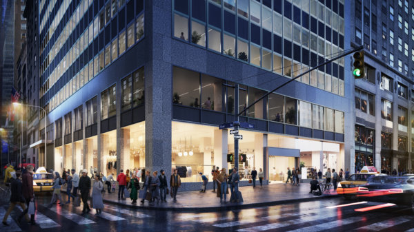
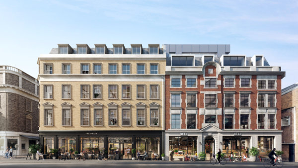
The Rebirth of 111 West Monroe: A New Chapter for Chicago’s Historic LaSalle Street Corridor

The Rebirth of 111 West Monroe: A New Chapter for Chicago’s Historic LaSalle Street Corridor
In September 2022, the ambition to revitalize the historic LaSalle Street Corridor in Chicago was announced. Plagued with vacancies, the corridor is filled with empty historic office buildings that no longer meet the current market demands of new office tenants. A joint venture between Prime/Capri Interests LLC. The Prime Group, Inc. and Capri Investment Group rose to the occasion and proposed a conversion of 111 West Monroe to a mix-use building that will house 349 apartments and 226 hotel rooms.
To allow natural light to reach the new apartments and hotel rooms, the plan includes carving out a 60-foot by 70-foot atrium inside the building, avoiding any alterations to the street-facing facades.

On the ground floor, hotel guests will enter through the historic lobby off W. Monroe St., with the residential entry located adjacent to the hotel entrance. A new fine dining restaurant is planned for the lobby, and parking spaces will be built underground.


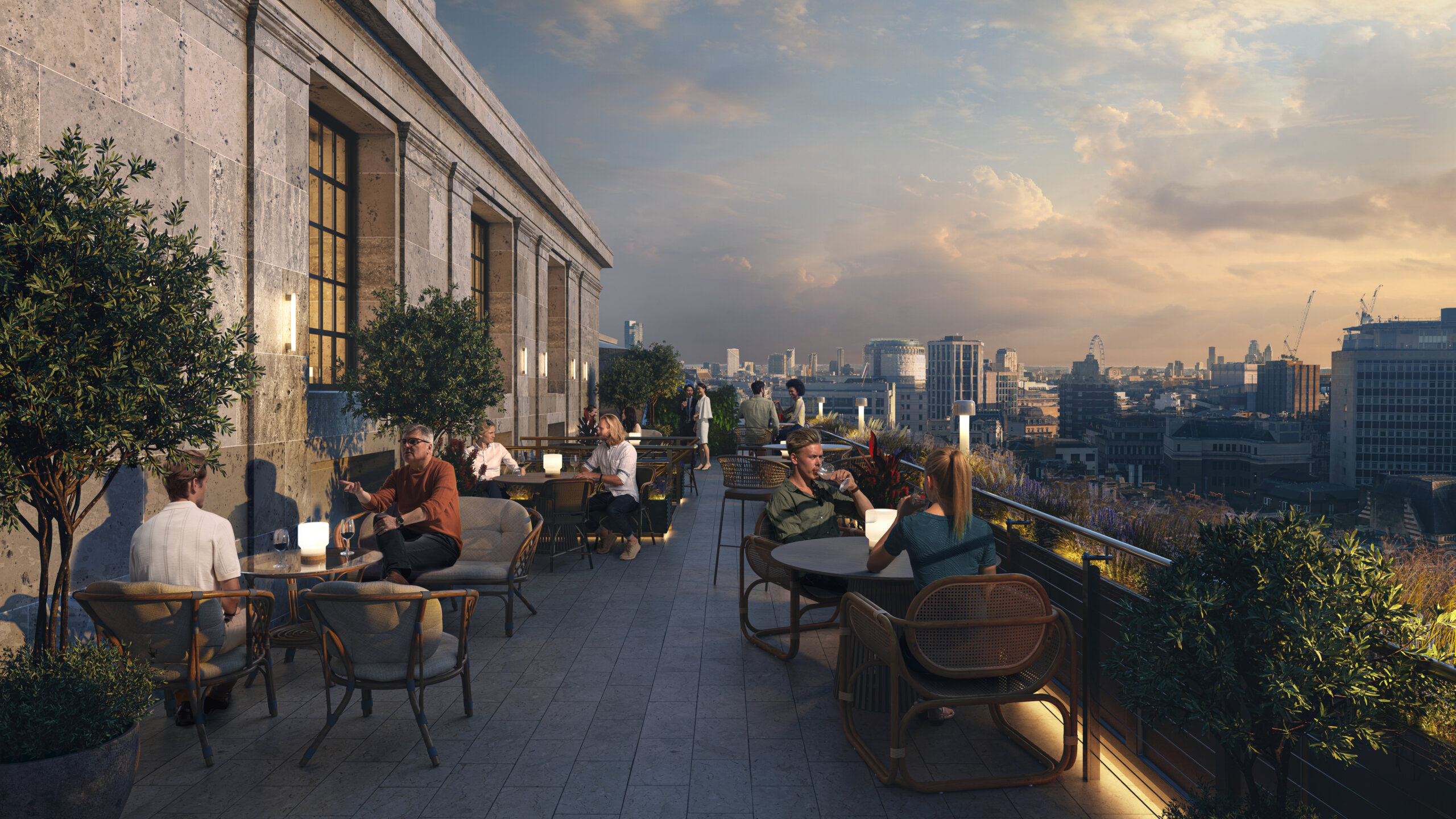
Two floors will be turned into a world-class spa and fitness center, and on the rooftop, the original Monroe Club will be reopened as an amenity for residents and hotel guests.


Combining a modern, international theme against a neo-classic setting will create an eclectic expression, continuing the contribution to the LaSalle Street Historic District and achieving the landmark status of an Orange Designated Building.
Consisting of three towers, the proposal will rehab two of them, with the third tower at 115 S. LaSalle set to hold state workers moved from the Thompson Center, another development by Prime/Capri Interests, LLC.


The project will create 400+ construction jobs, providing employment opportunities for all Chicagoans and committing to a minimum of 26% MBE and 6% WBE hiring. Additionally, over 200 permanent jobs will be created in hotel, food and beverage, and apartment operations.


Thank you for the opportunity to work on such an exciting project, and congratulations to all involved!

Beyond Four Walls: Catering to Researchers in Real Estate

Beyond Four Walls: Catering to Researchers in Real Estate
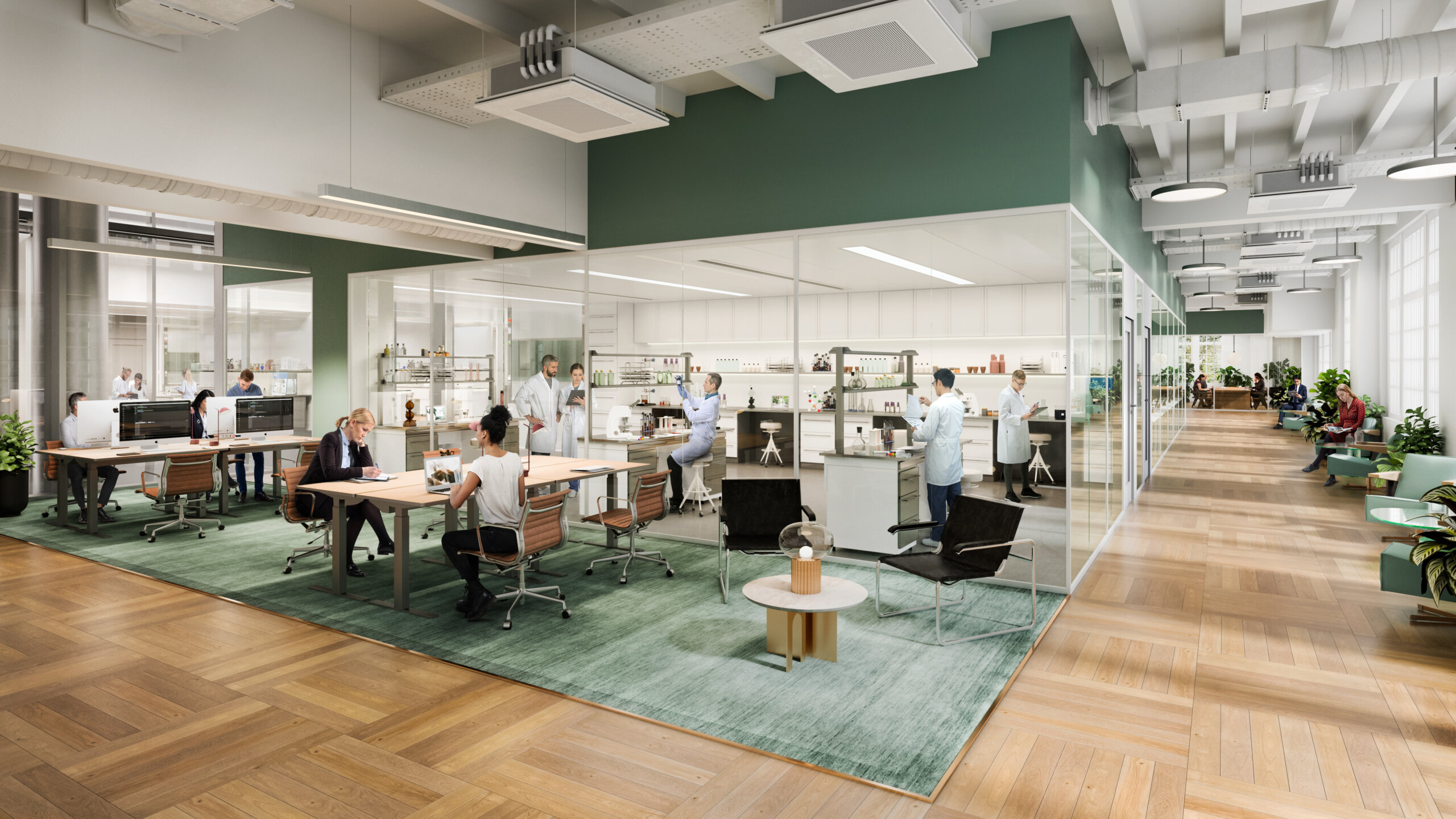
In recent years, life science and scientific research have become driving forces in real estate development. Scientific breakthroughs, the impact of the COVID-19 pandemic, and evolving industry dynamics have led to a surge in demand for cutting-edge laboratory facilities and innovation hubs. As the expansion of life science real estate development is now extending to emerging regions and cities the competition is stiffening.
In this blog post we dive into what is on the minds of researchers and scientists, and what they look for in their next locale:
Scientist-Centric Design:
Unlike many companies with common needs like desks, meeting rooms, and breakout areas, the world of science is vastly different. Ensure that the lab supports smart workflows and can adapt to various lab types.

State-of-the-art Facilities:
Scientists can quickly discern a genuine state-of-the-art lab from the rest, mere claims of cutting-edge equipment fall short. Developers and owners must showcase their expertise by providing specialized labs with features like clean rooms, high biosafety levels, mass spectrometry facilities, and more, tailored to meet specific research needs.

IT Infrastructure:
The ability to protect and patent research findings is paramount and thus, good IT infrastructure is indispensable. By providing robust data management and security systems, researchers can better safeguard intellectual property and sensitive research data.
The ideal working environment:
Heating, ventilation, air conditioning, and lighting tailored to the lab’s purpose, all play a part in creating a safe and comfortable working environment. Beyond the lab, areas designated for relaxation and restoration are just as crucial as they are in any other workplace, promoting the overall well-being of researchers.

Safety and regulatory standards:
By ensuring that the facility complies with all relevant standards, including chemical management, biosafety cabinets, fire protection, and emergency equipment, administrative burden is removed from researchers.

Sustainable practices:
As many chemicals and materials used in scientific research can be hazardous to both human health and the environment, proper waste management is crucial. Ensures that there is a proper system for how hazardous materials are handled, stored, and disposed of safely, minimizing the risk of accidents and exposure.
Tenant satisfaction:
The importance of client support and feedback mechanisms becomes pivotal in ensuring a low client churn rate. It is essential to demonstrate in a tangible manner how ongoing support and continuous improvements will be offered to keep your tenants satisfied as they continue to evolve and grow.
Collaboration:
Areas for formal and informal collaboration, within the facility, encourages interdisciplinary interactions and idea sharing among researchers. By providing seminars, workshops, and networking events, the value of your facilities will be counted beyond price per sq ft²/m².

As life science and scientific research continue to shape the future, developers and owners must keep pace with the ever-evolving needs of the scientific community. The laboratories of tomorrow must be designed to empower researchers, foster innovation, and drive meaningful progress, we’re more than happy to help start conversations in the right way, with the right visual material.
From History to Cutting-Edge: A tour of Victoria House

From History to Cutting-Edge: A tour of Victoria House
Oxford Property Group, a seasoned player in the Life Science sector with an impressive portfolio of over 5 million sq ft worldwide, recently partnered with us on their exciting new project, Victoria House.
Situated in London's vibrant Knowledge Quarter, this historic Grade II listed building is set to become the hub for established players and promising rising stars in the Life Sciences arena. Join us as we explore the remarkable 300,000 sq ft of cutting-edge spaces that will soon house the future leaders of the Life Science industry.
A Sensitive Transformation
With its iconic presence on Bloomsbury Square, Victoria House enjoys a rich history, heritage, and exceptional architectural beauty. However, inside, a sensitive transformation is underway to create a one-of-a-kind ecosystem for London’s Life Sciences and Technology start-ups and scale-ups. The stunning atrium is at the heart of the building creating a memorable first impression.
Fostering Innovation and Expertise at Victoria House
With a rich history as the birthplace of genetic science and ecology, this location has been home to numerous pioneering institutions. It offers a unique environment for individuals to learn, network, and commercialize science. In essence, this is where aspiring entrepreneurs can connect with experienced venture builders. To further support this ambition, Victoria House offers expertise in areas such as finance, M&A, international markets, IP, supply chains, scale-up leadership, and talent management.
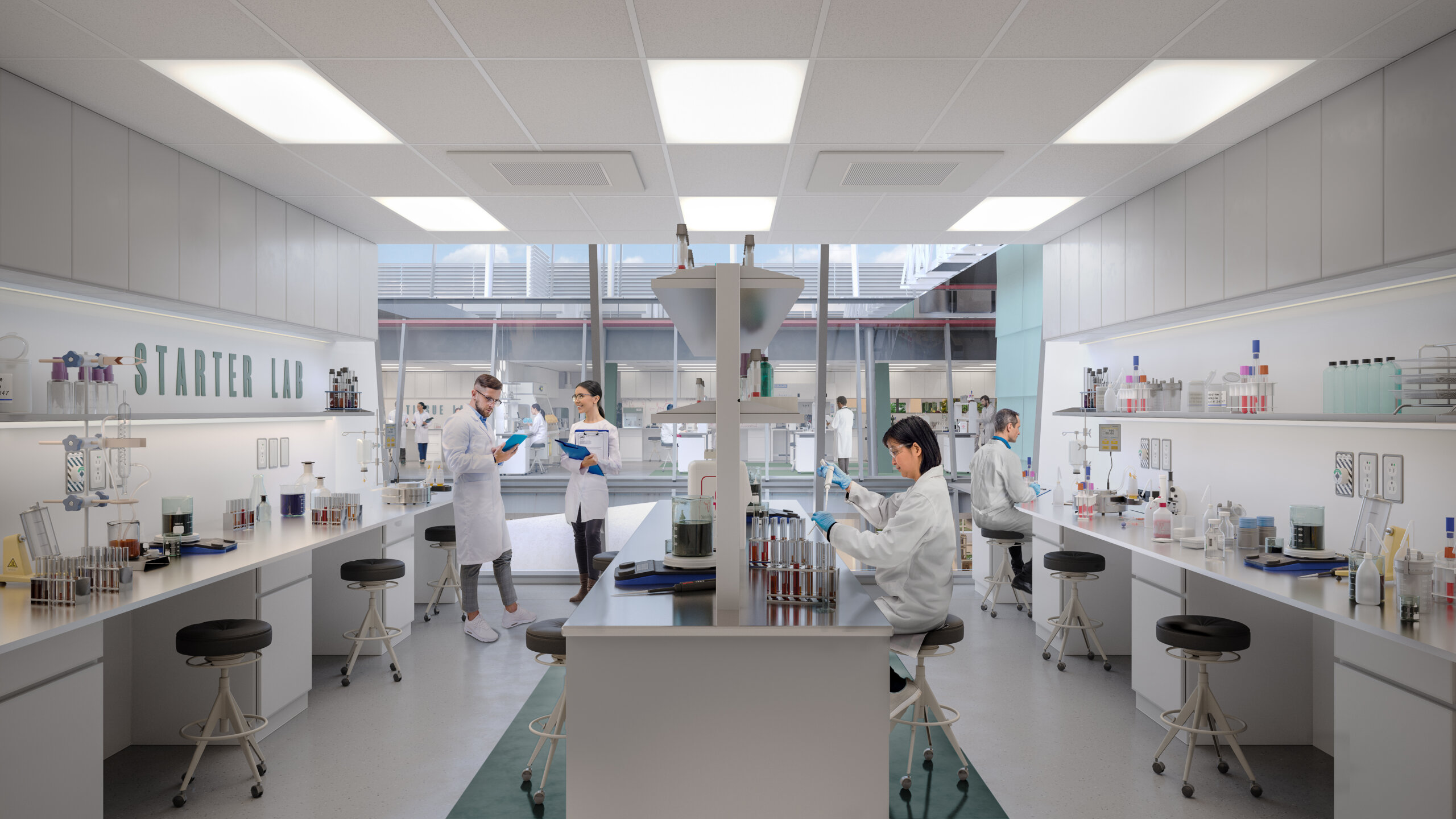
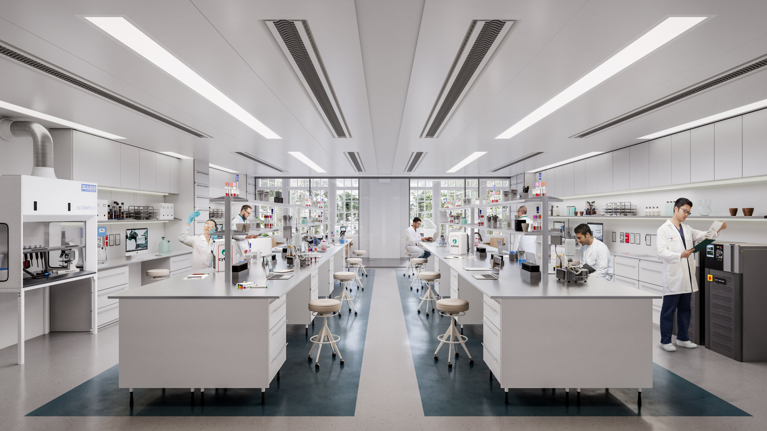
Functional and Inspiring Laboratories
From fitted and managed incubator space to CAT A laboratories, companies will be able to adjust floorplans for bespoke fit-outs and operations. Among the features, Victoria House offers six air changes per hour and up to 65% CL2 laboratories. If, like us, you didn’t know what CL2 laboratories were, you’ll be pleased to learn that the renders of laboratory facilities resulted from a close collaboration with our clients and Ph.D. students on everything from floor plans to the placement of various tools and items. To attract a discerning audience we took no shortcuts, making sure the spaces look equal parts functional and inspirational.
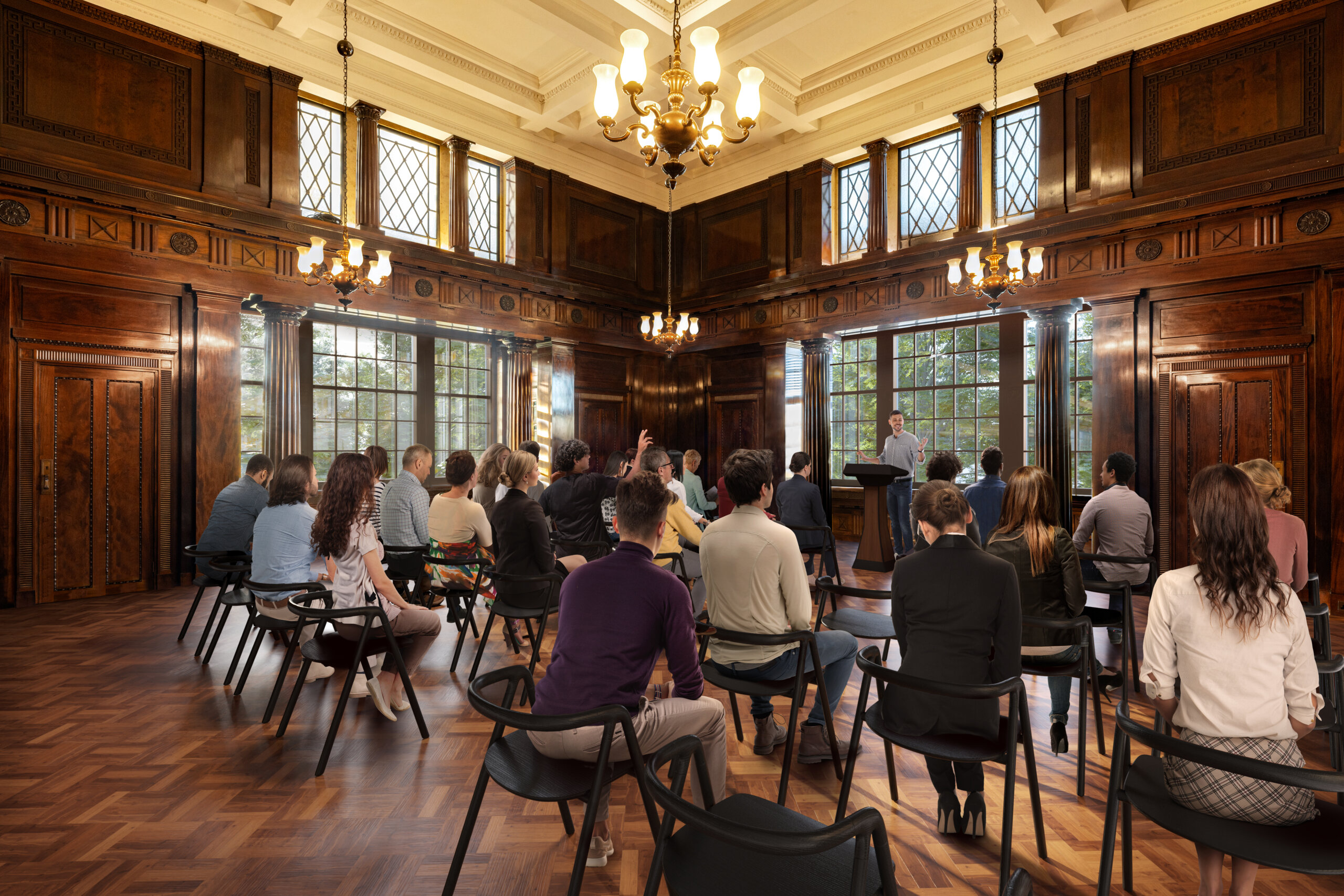
Preserving Elegance, the Long Room’s Original Interiors
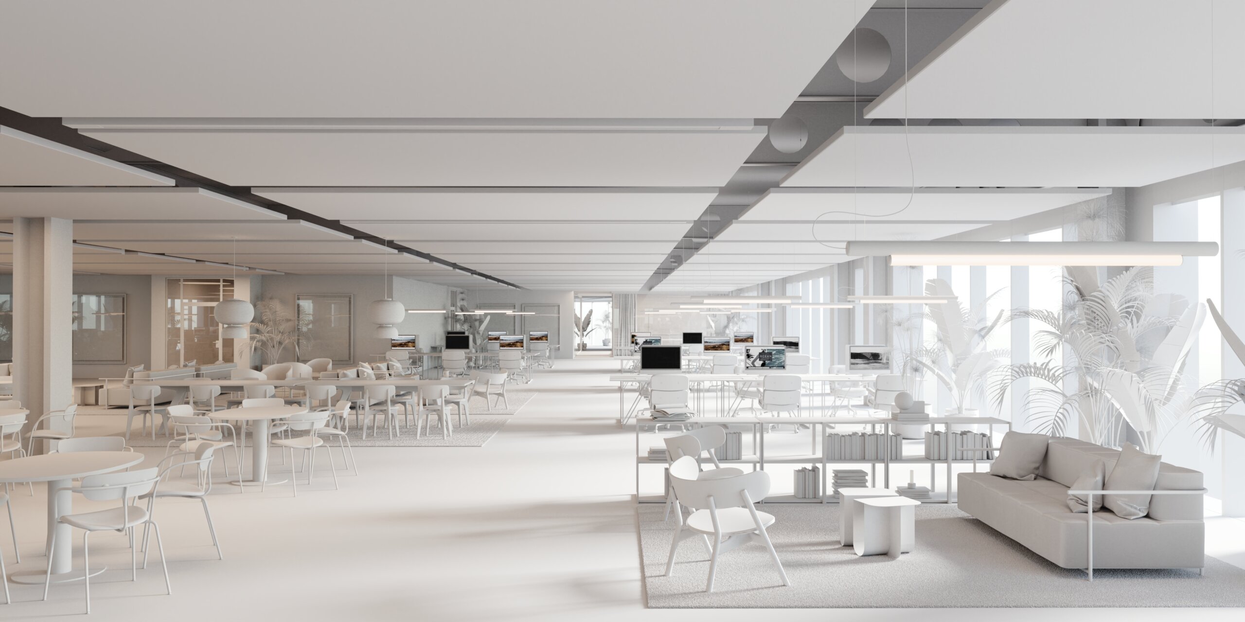
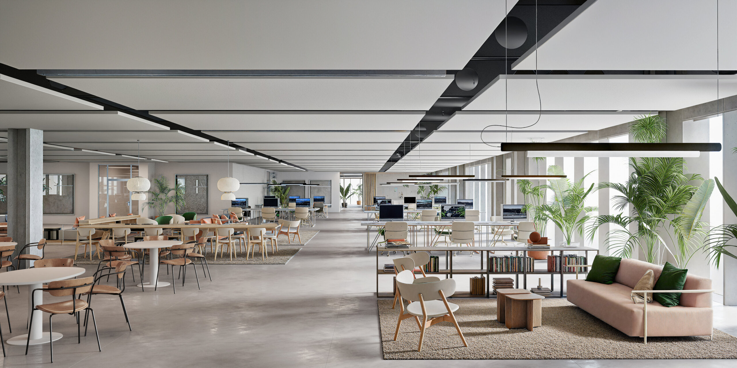
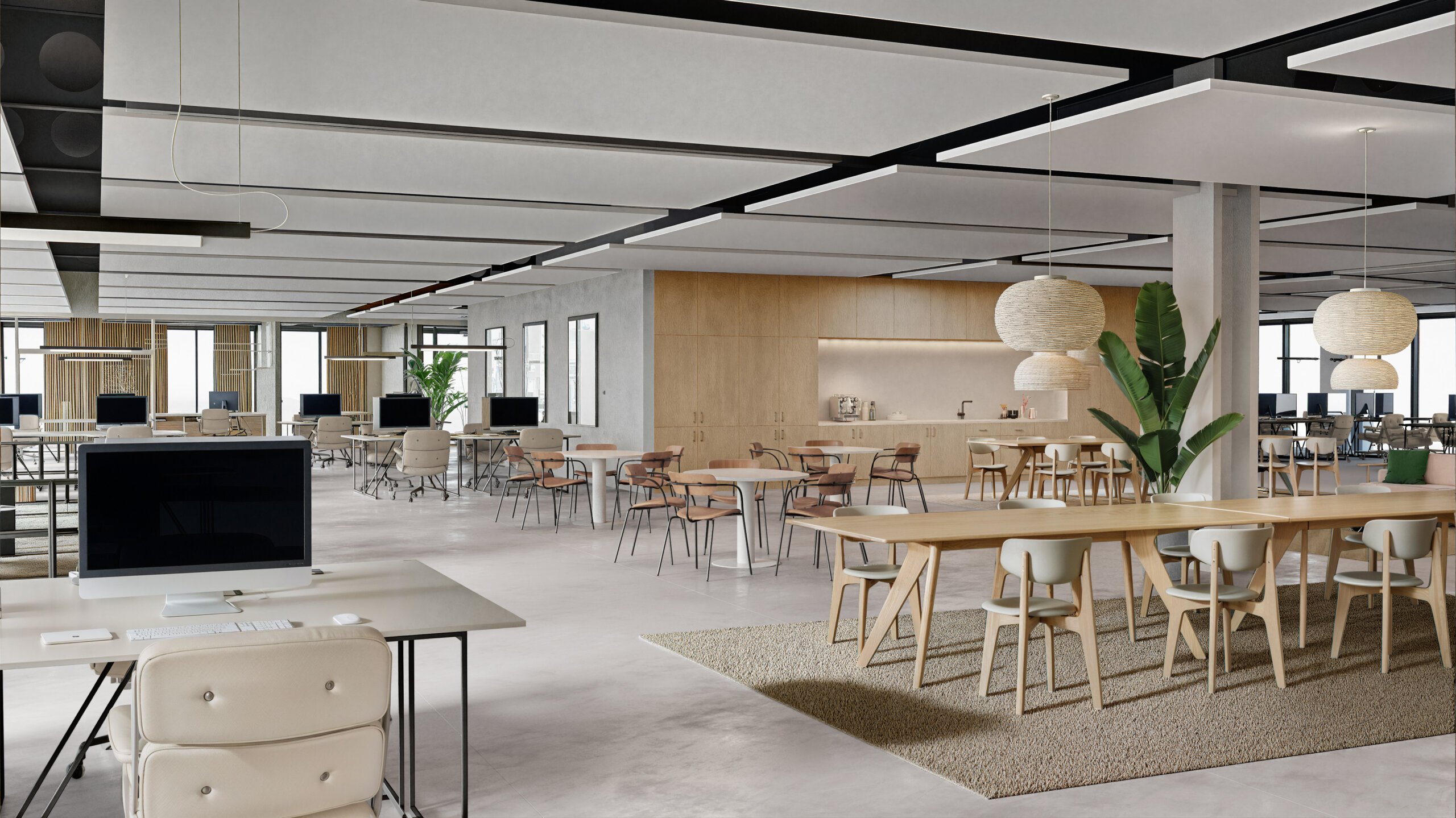
Featuring original wood-panelled interiors, The Long Room is one of the most impressive meeting rooms. To efficiently create a visualization of the room, we decided not to invest time in modelling all the details. Instead, we used a photo and enhanced it with AI, meticulously matching all the people into the image with the utmost attention to detail.
Sustainability Beyond Green
Oxford and Pioneer have joined forces with top ESG specialists to enhance the operational efficiency of Victoria House, aiming for EPC A and BREEAM Excellent certifications. Their strategy involves electrifying the entire building using an innovative air-source heat pump system, implementing variable air flow systems to curtail energy usage, modernizing the central infrastructure, incorporating smart meters, and actively promoting biodiversity on the premises.
But sustainability goes beyond the ecology and the physical environment. Victoria House has put programmes and policies in place to welcome people from all genders, backgrounds, identities, and physical abilities, including Ada Lovelace Day, which increases the visibility of women in STEM.
Continuing the legacy, Victoria House will bring together today’s thought leaders to help build a better tomorrow, and we couldn’t be happier to have played a small part in the history of this impressive institution.
Thank you and J2 and Pioneer Group for a great collaboration!
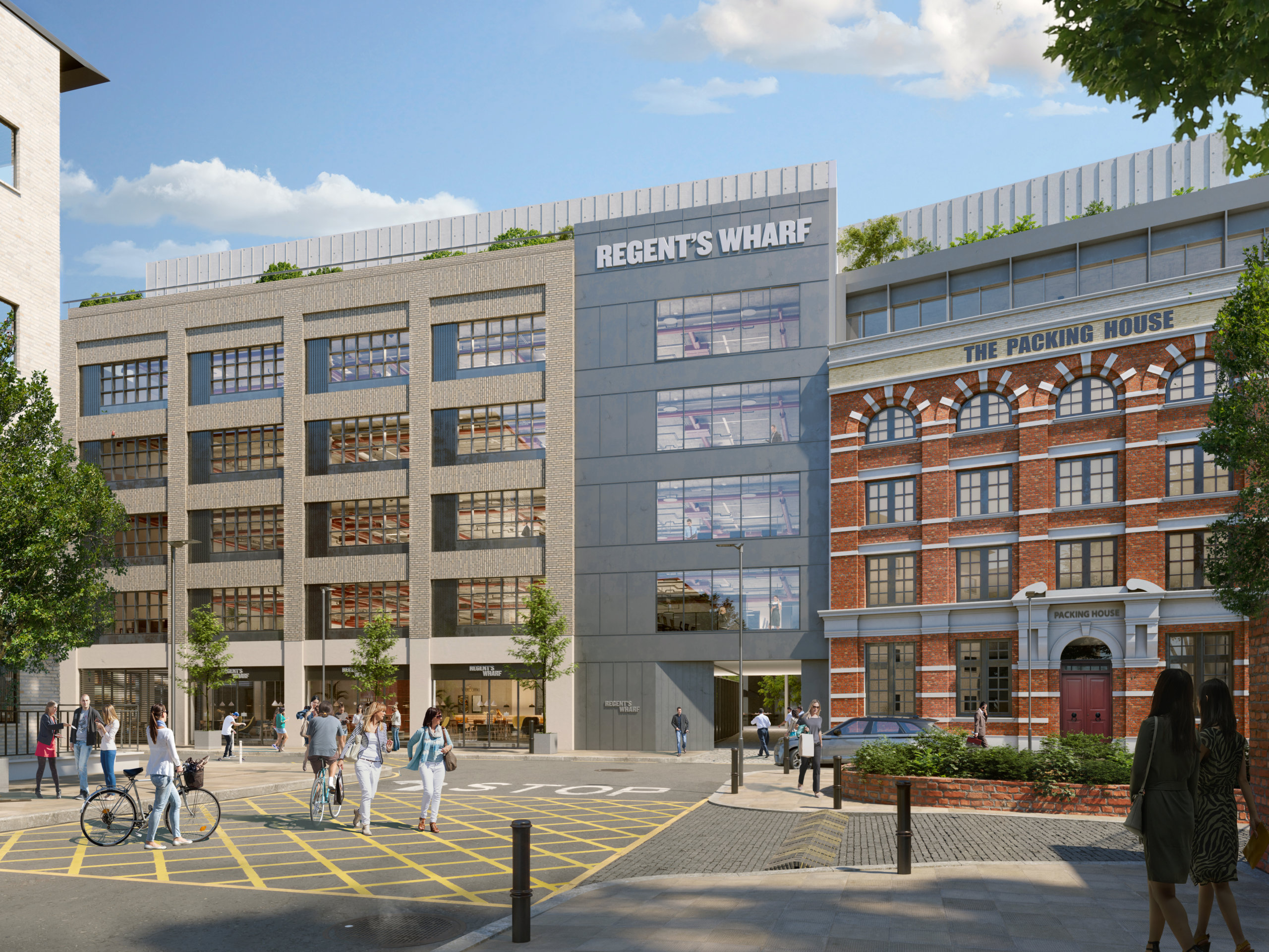
Regent’s Wharf: Where History Meets Innovation

Regent’s Wharf: Where History Meets Innovation
By the waters of Regent's Canal in King's Cross, a remarkable transformation is taking place - a cutting-edge canalside campus.
A Legacy Rooted in Industry
In the annals of London’s industrial history, the story of Regent’s Wharf is one of resilience, adaptation, and innovation. The Industrial Revolution and the birth of North London’s railway network, made Regent’s Canal a lifeline for the city.
Originating from Paddington and extending to Camden Town before reaching the Thames in 1820, Regent’s Canal attracted enterprising visionaries who seized the opportunity to establish warehouses, workshops, and mills at what would become Regent’s Wharf. Its strategic location, where waterways met railways at King’s Cross, made it an ideal hub for commerce and trade.
As rail transport gained prominence throughout the 19th century, some contemplated converting the canal into railway tracks, but these plans thankfully never materialized.
A Glimpse into the Past
By 1849, maps began to depict Regent’s Wharf, which included a timber yard housing ‘Haggis and Sons The Caledonian Patent Sawing and Planing Mills.’ The site also served as the premises of Coles, Shadbolt and Company, known for their quicklime, a crucial component in the extensive construction projects catering to London’s booming population. Interestingly, this bright white lime was used to illuminate theaters at the time, coining the term ‘limelight.’
In 1857, Thorley’s Food for Cattle took over the site, transforming it into stables, a spice mill, packing offices, and warehouses. Over the years, Regent’s Wharf continued to evolve, attracting a diverse range of industries from packing to publishing, benefitting from its canal connections and the central King’s Cross location.
For over a century, Joseph Thorley’s Ltd, a family-owned business, reigned supreme in the industrial realm, creating and distributing ‘spicy aromatic condiments’ that enhanced the vitality of livestock worldwide. Their inventive products, marketed with captivating advertisements and collectible branding, earned them royal recognition in 1892. The history of Thorley’s as the iconic pig and colors lives on in the Regent’s Wharf brand.
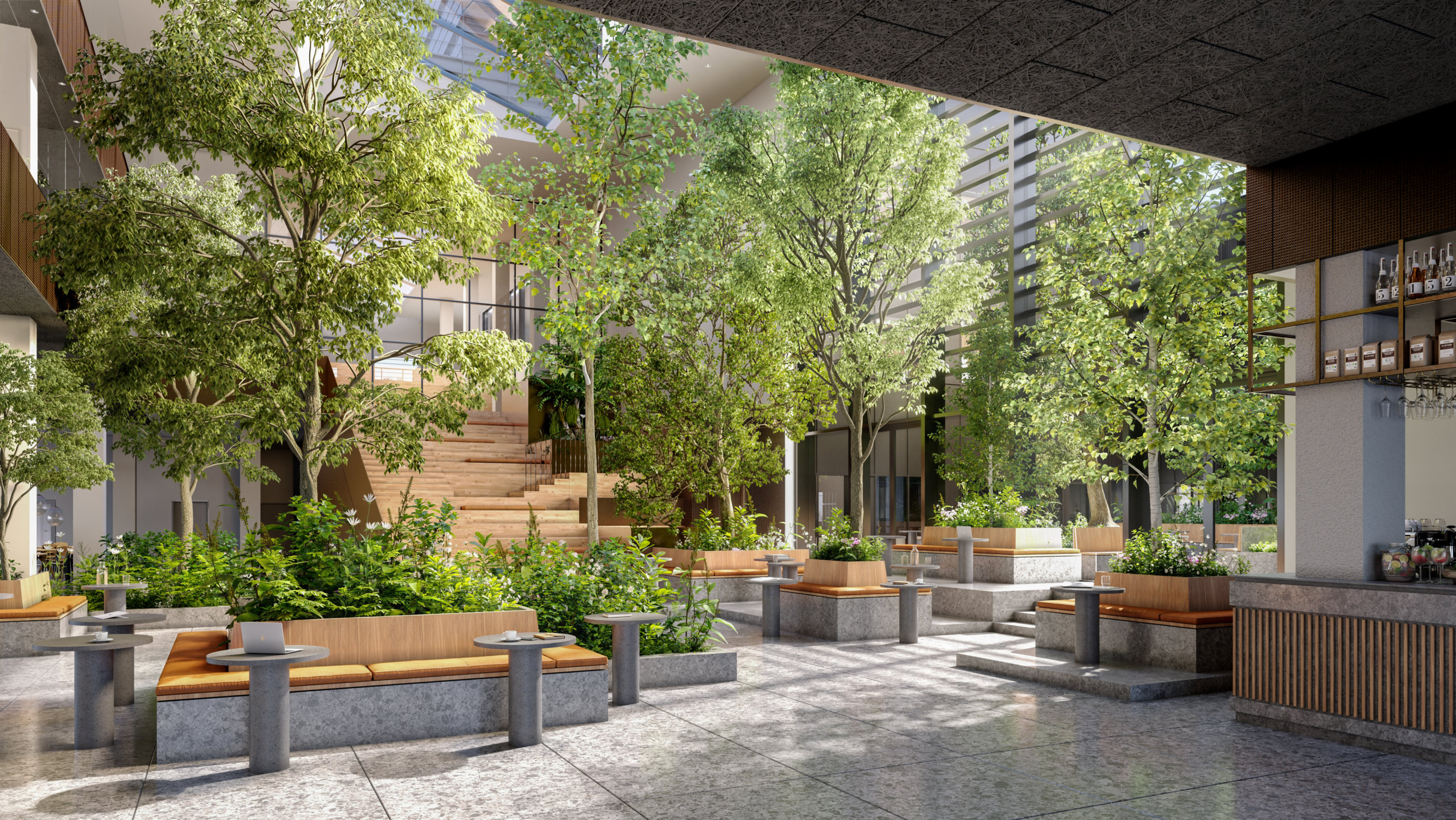
The chosen renders highlight the thoughtful blend of retrofitted historic buildings with modern architecture, showcasing the client and architects’ sensitive yet bold approach. Particularly, the 360 courtyard view stands out as a central point where old meets new, showcasing this connection by revealing both the sensitive external design and different internal characters of each building.
– Josh Molnar, Architect and Project Manager for Regent’s Wharf
A Glimpse into the Future
As we fast forward to the present day, Regent’s Wharf stands as a testament to history’s resilience and innovation’s potential. Three historic buildings, carefully restored, will be complemented by modern spaces, creating an inspiring environment for the trailblazers and innovators of tomorrow.
The rich layer of history has defined the project architecturally and as a place with character. This is celebrated by naming each of the 4 interconnected buildings after their historic uses, ‘Thorley Works, Canal Building, The Mill, The Packing House.’ This sensitive approach to the project as a placemaking strategy is where our VisionWalk Solution really comes into play, by offering an orbital perspective of the building using infographics and allowing the user to open up the floorplans to understand how the interior connections of these buildings work.
– Josh Molnar, Architect and Project Manager for Regent’s Wharf
You can explore the Regent’s Wharf Vision Walk here.
This next-generation warehouse conversion ushers in the future of progressive work environments, where history and innovation coexist harmoniously. Here, at the intersection of heritage and cutting-edge design, Regent’s Wharf welcomes an ecosystem of grafters, trend setters and inventors.
A dream opportunity for a business and a dream project for us, thank you BentallGreenOak for entrusting us with this gem!
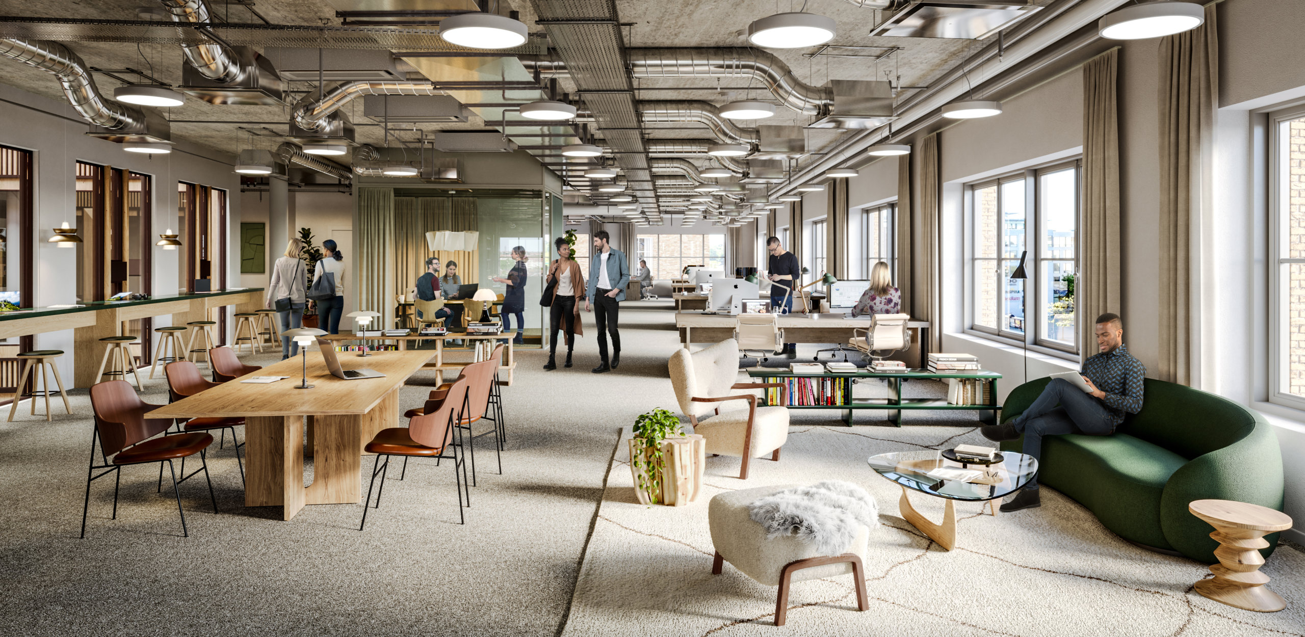
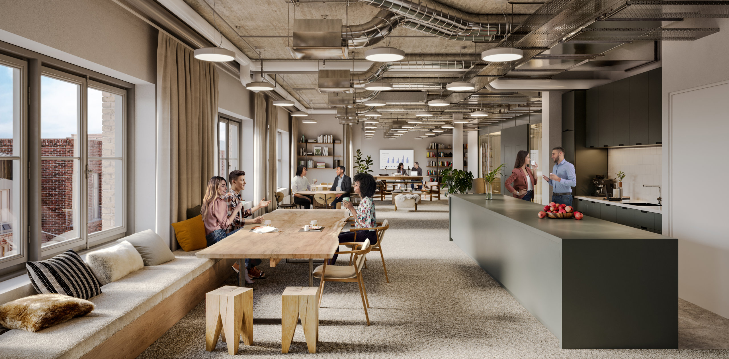
Public: Where Scandinavian Design Meets Timeless Luxury

Public: Where Scandinavian Design Meets Timeless Luxury
In the heart of the Ørestad region, close to the freeway, public transport, Copenhagen Airport, and city center, lies Public. The refurbishment, undertaken by Genesta, aimed to open up the building to the public while employing sustainable practices such as using recycled materials and establishing solar cells. Read on for our cover of Public!
Opening up to the Public
Public’s connections to transport are unparalleled, just 1 minute away from the train, bus, metro, and freeway, with private underground parking. Yet, there was an opportunity to make it even more inviting. The new name, ‘Public,’ not only references the building’s advantageous location but also the new ‘public garden’ on the ground floor. Under the skillful guidance of the architects, the arrival and ground floor have been thoughtfully transformed, seamlessly connecting it to the courtyard and creating a beautifully designed environment where nature blurs the boundaries between the outside and inside. Now home to four restaurants, a food store, and a coffee shop, tenants and visitors can enjoy everything from Asian cuisine to vegan delights, a bistro experience, or traditional Danish open sandwiches.
Embracing and Enriching the Architecture
Since 2002, the building has distinguished itself as one of the strongest architectural works in the district, and as such, the facade has been thoughtfully preserved. The reinvention primarily focuses on the interior, with a reinterpretation of the building’s original material palette, emphasizing a select few high-quality materials. The concept and plans bring Public a timeless sense of quiet luxury, appealing to an international audience and meeting the highest standards of quality.
A Fresh Perspective
When we were invited to work on Public, we were immediately struck by the geometric facade. To honor the architecture, we let the lines guide each view, resulting in a striking expression that draws the viewer in. This approach enhances consistency throughout the imagery, lending it a distinct aesthetic.
Services that Provide Extraordinary Convenience
Working at Public gives access to an international community in Ørestad. An impressive atrium sets the tone for a professional and welcoming environment with a dedicated reception area that provides excellent service and assistance.
There’s direct access to various-sized meeting rooms equipped with screens for presentations and video conferencing, catering, and access to on-site restaurants for convenient dining options.
The versatile office spaces encourage focus and creativity in a relaxed working environment and are suitable for all kinds of companies, from large corporations to small startups sharing space. The space can be customized to meet specific needs, accommodating different working styles and company cultures.

A range of services includes take-away, laundry service, room service, and flower ordering, on-site bike storage and showers, and a large auditorium with a capacity for 150 people!
A Perfect Example of Quiet, Timeless Luxury
Embodying a minimalist yet warm aesthetic, Scandinavian design emphasizes simplicity, functionality, and a deep connection with nature. Characterized by clean lines, neutral color palettes, and natural materials, this design philosophy seeks to create spaces that evoke a sense of tranquility and comfort. Paired with beautiful and elaborate details, which permeate and connect all functions and areas of the house, Public is a perfect example of quiet, timeless luxury.
From Unbuilt Space to Urban Oasis: The Story of Haga Norra

From Unbuilt Space to Urban Oasis: The Story of Haga Norra
Welcome to our blog post about Haga Norra, the gateway to Arenastaden. Join us as we delve into the pivotal role of Haga Norra, exploring its position as a bridge between communities and the innovative vision that is shaping its future as an integral part of Stockholm's urban landscape.
Connecting the Dots: The Inception and Evolution of Haga Norra
Haga Norra is nestled between two prominent areas, Hagaparken and Arenastaden. Hagaparken, founded by King Gustav III, covers 144 hectares of lush nature, offering a serene setting with exquisite pavilions and architectural gems. Arenastaden, located in Solna, is a vibrant urban district renowned for its dynamic blend of sports, entertainment, and modern living. Anchored by the impressive Friends Arena, a multifunctional stadium hosting concerts and sporting events, Arenastaden has become a hub of activity. With its strategic location and excellent public transportation connections, Arenastaden has evolved into a sought-after destination for both business and leisure, symbolizing the convergence of contemporary urban lifestyle and excitement. This innovative district stands as a testament to Solna’s commitment to urban development and community engagement.
Haga Norra: The New Social Hub in Stockholm
Fabege and its subsidiary, Birger Bostad, are the proud owners of eight blocks in the district, and we were thrilled to collaborate on their ambitious project called Haga Norra. Haga Norra consists of over 70,000 m2 commercial office and retail spaces and over 1,000 apartments. The project began by focusing on the public areas, Mathildatorget, and the office buildings, welcoming coworkers, clients, and visitors to a place that provides as much inspiration and experiences outside the buildings as they do inside the offices. Adhering to the UN’s sustainable development goals, the project features solutions such as geothermal heating, solar cells, and recycled materials.
The aim has been to imbue the district with an authentic continental atmosphere by incorporating classic qualities into the architecture while keeping an eye on the future.
The first block has an industrial feel, with recycled bricks displaying patina, large paned windows, and timeless materials. The building, measuring 27,000 m2 and divided into 8 floors, is planned to be finalized in 2024.
The next phase of the project was to illustrate the restaurant offerings in the area. To create the sought-after atmosphere, we treated each visualization as an opportunity to showcase how people will be enjoying themselves, escaping the typical render where people are implemented in strategic locations to avoid the space looking abandoned.
In essence, Haga Norra presents a thoughtfully curated blend of cafes, restaurants, offices, and residences, with a strong emphasis on creating inclusive spaces where people can come together and enjoy their time, regardless of whether they live, work, or are simply visiting the area.

Far from an enclave!
A new city park will enhance the green structure and establish connections between the large parks surrounding the area. A new subway station and space for buses is added along with bike lanes and pedestrian streets, in keeping with the overarching plans for Stockholm. What has impressed us most is how quickly Stockholmers have embraced this new part of the city, surely a result of smart planning and great execution by all involved parties.
Digital Property Marketing: 13 Details That Ensure You Stand Out

Digital Property Marketing: 13 Details That Ensure You Stand Out
Most industries have been revolutionized by digitalization, and marketing is no exception. An ever-growing amount of marketing takes place online, and brands all over the world have spent years fine-tuning how to optimize their content for digital, and small mobile screens in particular. It begs the question - are we marketing properties in outdated ways? And are there ways to improve content for digital?
Optimizing property marketing for today’s audience
Google “best performing ads” on social media and a few common denominators will quickly appear. Striking colors, movement, short and catchy copy, the absence of complex information to process and digest. Google high-end commercial real estate visualizations, renders, or CGIs, and the majority of the images that come up follow a different logic, mostly displaying gorgeous, sophisticated, detailed images. This is not to say that these kinds of images and animations don’t have a place, but do they effectively capture people’s attention online?
B2B Marketing can still be emotion-driven
Some may argue that B2B marketing is different, less emotional, more about numbers. While there may be some truth to that, the dynamics of grabbing and holding the target audience’s attention are the same – we are, after all, still human. What can be done to complement commercial property imagery created for traditional media like billboards, printed folders and large screens? Details. Zeroing in on a detail – a dining table, a view, an exercise room, or even a chair – can help you grab the viewer’s attention to initiate a conversation and proceed to talking about the project as a whole.

Money well spent
Is it worth the extra money? Well, when the traditional images have already been created, the most expensive parts, meaning the model, the design, and the lighting have already been paid for. If the resolution is set to only work for a small format, spending that extra bit of cash can actually help increase the ROI on the visualization part of the marketing budget.

It’s all about the details
So why do details work? They’re human scale, and they help people imagine what it would actually be like to spend time in a space. Details make the dream tangible. But all details aren’t created equal, they need to stand out from the noise, and they need to speak to the viewer on an emotional level. We’ve compiled a list of stand-out images from projects we’ve worked on to showcase these 13 details for you, and to inspire you when planning your next project.
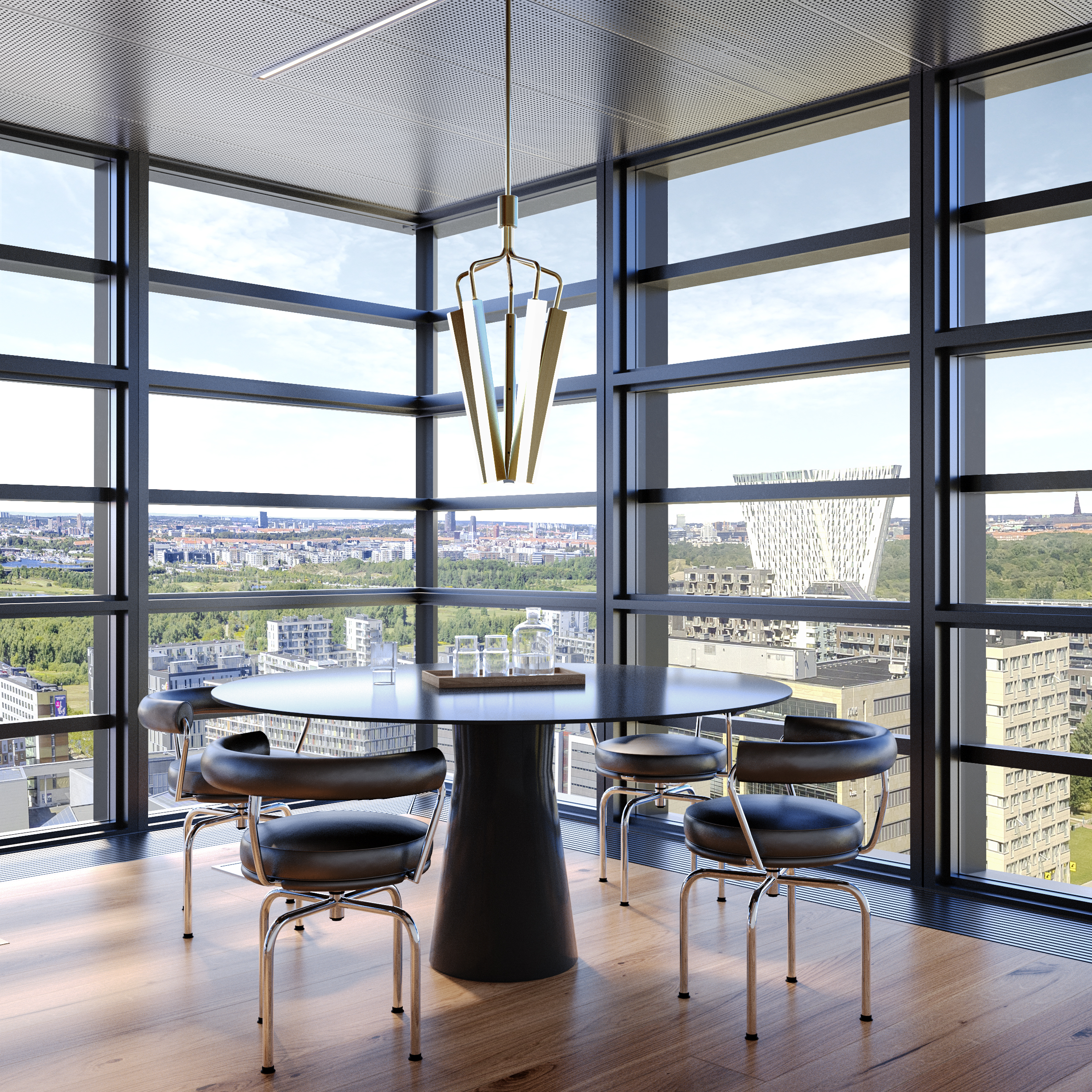
1. Showcase those spectacular views
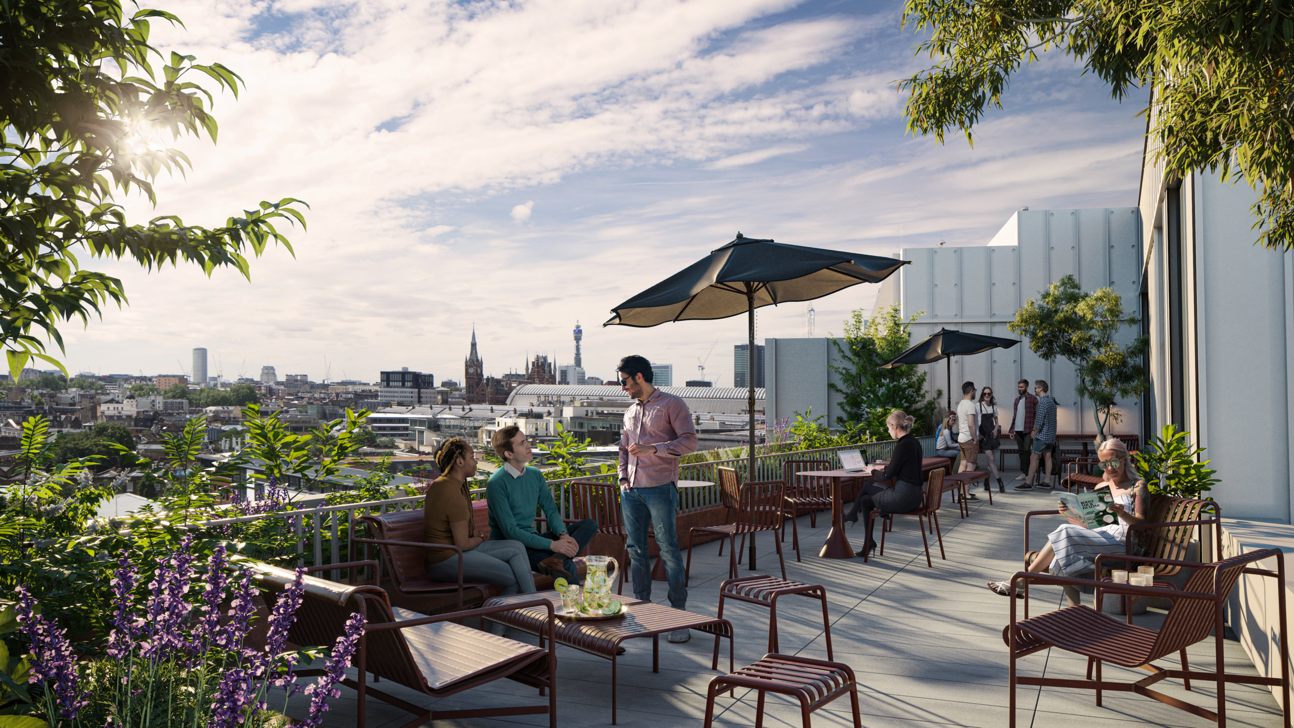
Is there any better way to “sell” a commercial property than with stunning views? It may be clear from an exterior image of a building that it’s sure to have amazing views, but that’s not the same as putting your audience in the room and actually showing them that view. Add people to the mix – because what interests people most are people – and you’ve just sold the benefits of those top floor spaces in milliseconds.

2. Location, location, location
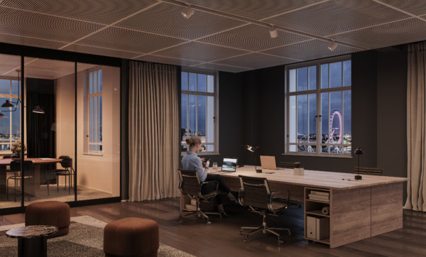
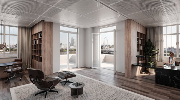
We all know that location is one of, if not the most important selling point of any project. Demonstrating the location on a map is both informative and functional, but showing it from the inside, using landmarks and recognizable areas connects to people’s emotions. Borrow the wow-factor from those nearby places, and just like that, your property goes from good to great. Who wouldn’t want a workspace with a view of the London Eye?
3. Make the most of unique features in your architectural visualizations
You’re just about to spend an unholy amount of money on restoring a facade to its original glory, or to build a staircase worthy of a Hollywood scene. Make sure those jaw-dropping features don’t get lost in the grand scheme of things by showcasing them in the way they were meant to be experienced. And ensure it pays off at the bottom line.

4. Tailor property marketing to audience interests
It’s notoriously hard to get people to read anything online, let alone interact with it. Part of the trick, of course, is to target your marketing to your audience’s interests. Larger images need to appeal to a broad audience with a diverse set of interests, but zeroing in on the details can help you speak directly to a sub-target audience like retailers, restaurateurs, or co-working spaces. They’ll appreciate you going the extra mile by taking their specific needs and wants into consideration.
5. Position the project using the right brands
By including brands and products that have the right associations, renders can signal the project’s future potential. It roots the project in the area, supporting local brands, or appealing to the audience of the featured brands. Whether it’s Apple, Four Seasons, or our local coffee shop, we all have brands we love. That makes us feel all the right things. Take advantage of that when marketing your property.
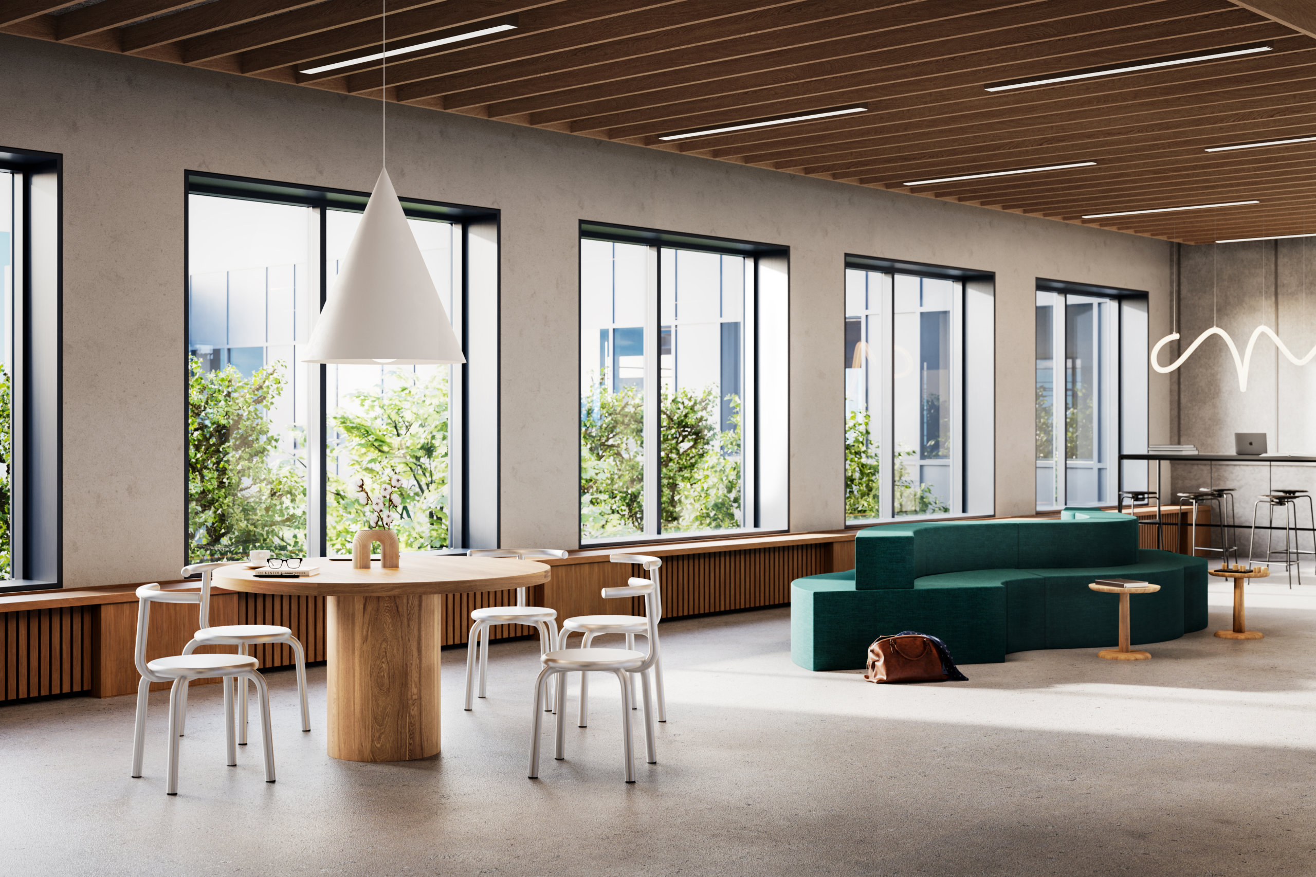
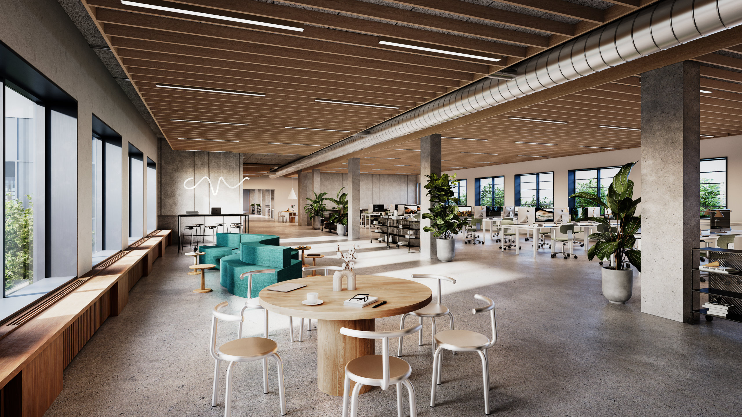
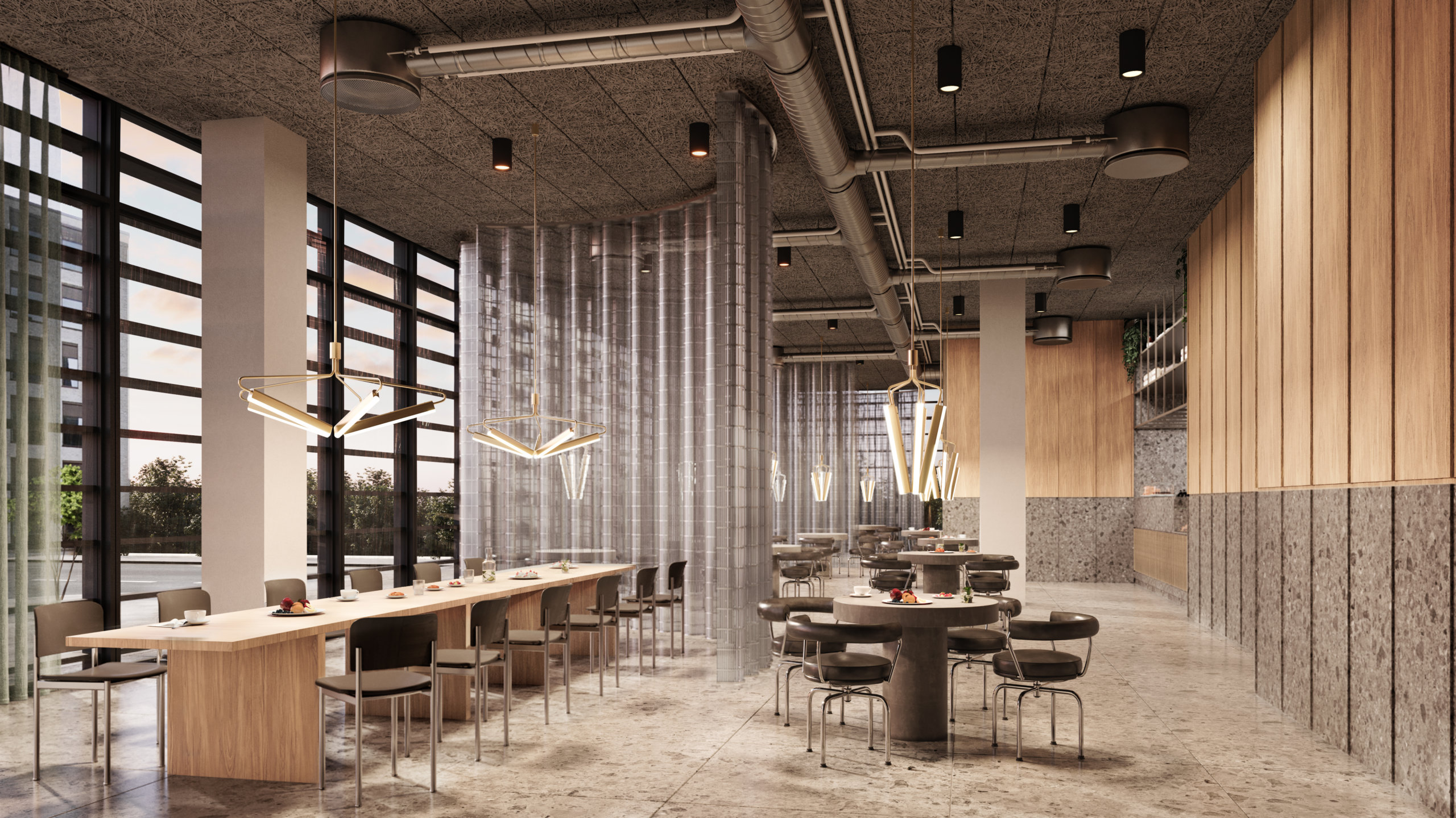
6. Feature iconic designs
We’re not saying everyone is a sucker for design, but we’re kind of saying everyone is a sucker for design. Whether people are knowledgeable enough to name specific chairs or lamps, most people know high quality interior design when they see it. Using iconic pieces of furniture draws the viewer in by being equally familiar and desirable, and it paints the space in the right light.

7. Use strong shapes or colors
The human eye and mind navigates the (overwhelming) amount of impressions we encounter daily in a number of ways, but generally, we humans favor things that don’t require a large amount of brain power, such as reading. That means that strong shapes and colors have a powerful effect on us in the same way “stop signs” do. By including strong shapes and colors in details, you ensure your image grabs your audience from the get-go.
8. Look for unique angles
A trick of the trade to optimize strong shapes and colors, as mentioned in the previous point, is to look for interesting angles and showcase them in your 3D visualizations. Those angles create a “What am I looking at? I need to figure this out.” moment in the viewer and establish interest in the image. That’s half of your job finished already.

9. Fine tune the atmosphere and ambience
Before we can even get to square meter price and desk capacity, the oh so important desire for the space must be established. Create an atmosphere or ambience so vivid that the viewer can almost touch it, and you’ve just sold a lifestyle (and a property). Be bold and be specific. It’s better to be clearly cool, refreshing, cozy, or lively than to try to be a little bit of everything.
10. Make it move
Animations can be costly, but there’s also a nifty way of adding movement to still images that grabs attention on small screens. Make the color of a typewriter change from blue to red to green and back, and you immediately capture attention without it costing an arm and a leg. Complement it with smart copy and you’ve got yourself a great asset for your property marketing efforts! Better yet, include movement in a way that ensures your potential customer imagines just how your space benefits their business.

11. Incorporate the latest trends
You know how the items worn on the catwalks of the most prestigious fashion brands are bought by few, but seen by many? And how that goes on to help them sell the white t-shirts or mascaras that often make up the bulk of their business? Well, we think of restaurants and bars as the catwalks of commercial real estate projects. The bulk of the building may be office spaces, but it’s the restaurateurs and retail spaces that help build the perception and vibe of the building as a whole. Use those details to convey that the space will be the talk of the town, and your customer will understand that this prestige rubs off on the rest of the spaces and tenants as well.
12. Art for the sake of art – and business
Art doesn’t require a reason for being, but in this context, it has one nonetheless. It’s a good place to inject color in an image and create a focal point – without using strong color in furniture which may be polarizing or come across as too much. While it may not appeal to everyone on a personal level, it will most certainly capture their attention.


13. Employ inviting textures
Speaking to as many senses as possible is a way of ensuring that no stone is left unturned in the quest to attract the engagement of the viewer. Using highly tactile materials in the space, both in surface layers and in furniture, is a way to create ambient atmospheres without dimming the lights – especially useful in daytime places such as office spaces.

Ready to take your property marketing efforts to the next level by utilizing these tips? Get in touch to discuss your next project! We’d love to discuss how we can help you showcase your commercial property to your target audience on the right channels.