Digital Property Marketing: 13 Details That Ensure You Stand Out
Digital Property Marketing: 13 Details That Ensure You Stand Out
Optimizing property marketing for today’s audience
Google “best performing ads” on social media and a few common denominators will quickly appear. Striking colors, movement, short and catchy copy, the absence of complex information to process and digest. Google high-end commercial real estate visualizations, renders, or CGIs, and the majority of the images that come up follow a different logic, mostly displaying gorgeous, sophisticated, detailed images. This is not to say that these kinds of images and animations don’t have a place, but do they effectively capture people’s attention online?
B2B Marketing can still be emotion-driven
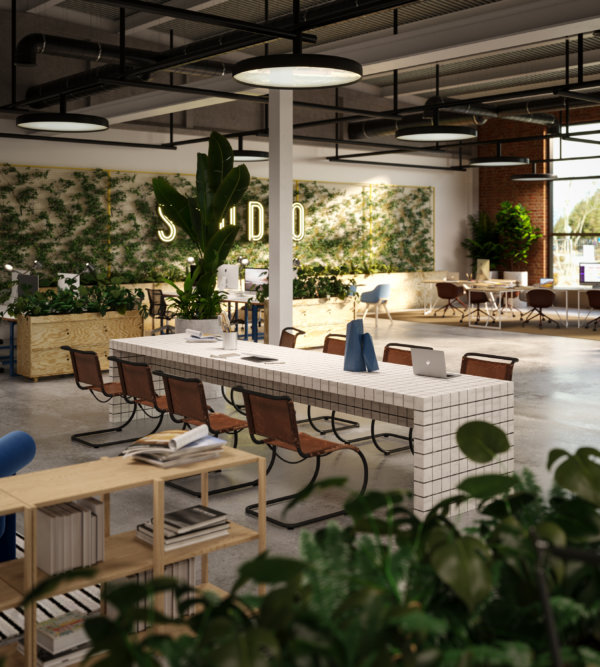
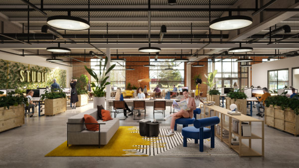
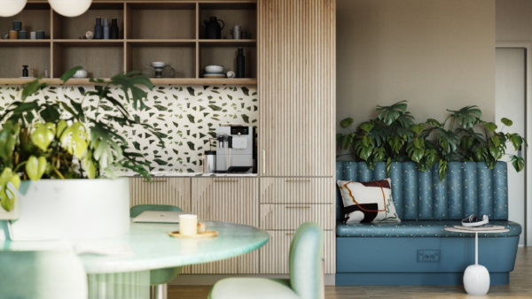
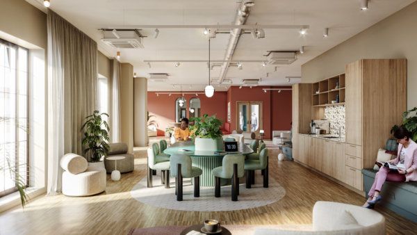
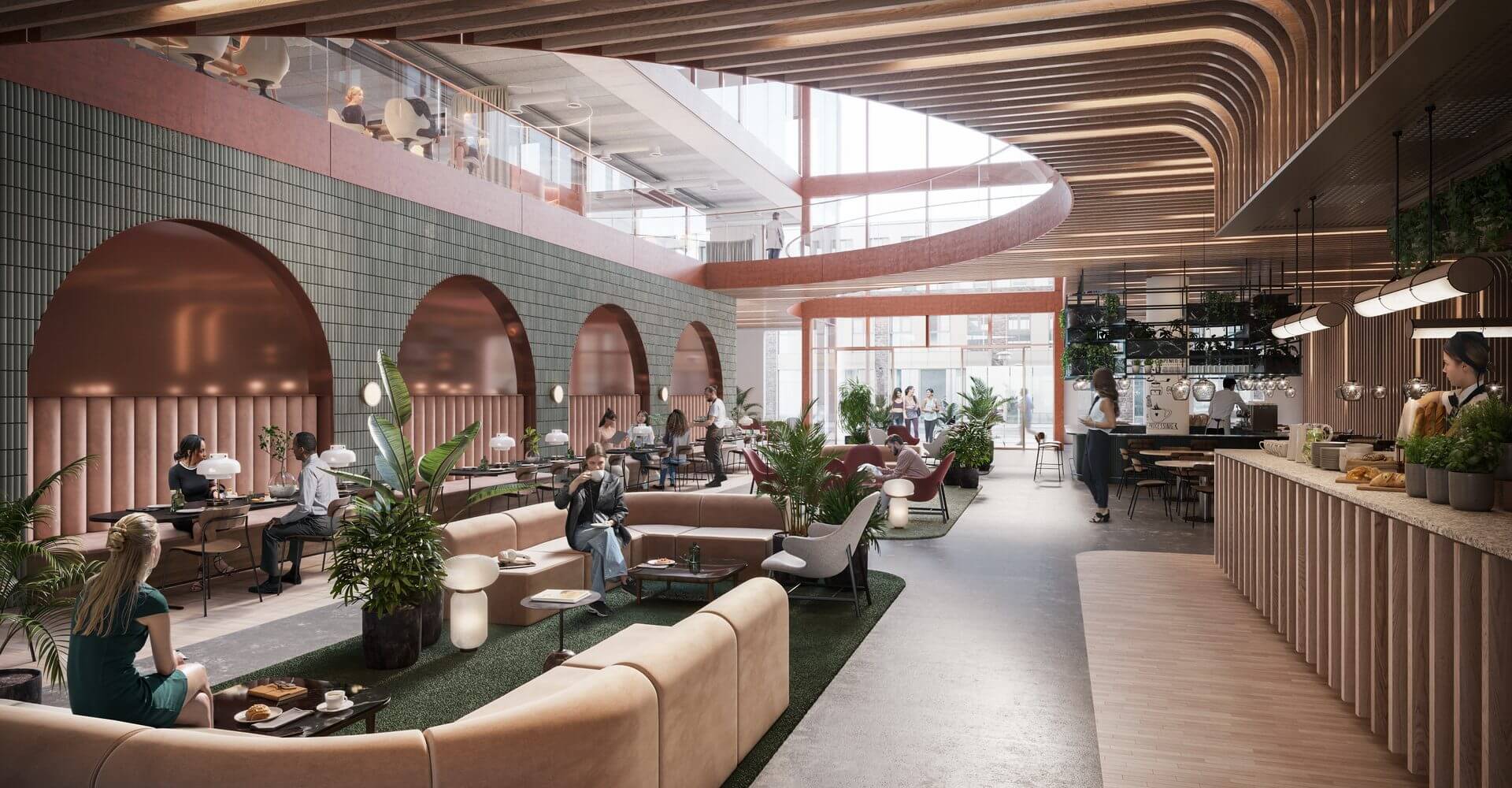
Some may argue that B2B marketing is different, less emotional, more about numbers. While there may be some truth to that, the dynamics of grabbing and holding the target audience’s attention are the same – we are, after all, still human. What can be done to complement commercial property imagery created for traditional media like billboards, printed folders and large screens? Details. Zeroing in on a detail – a dining table, a view, an exercise room, or even a chair – can help you grab the viewer’s attention to initiate a conversation and proceed to talking about the project as a whole.
Money well spent
Is it worth the extra money? Well, when the traditional images have already been created, the most expensive parts, meaning the model, the design, and the lighting have already been paid for. If the resolution is set to only work for a small format, spending that extra bit of cash can actually help increase the ROI on the visualization part of the marketing budget.
It’s all about the details
So why do details work? They’re human scale, and they help people imagine what it would actually be like to spend time in a space. Details make the dream tangible. But all details aren’t created equal, they need to stand out from the noise, and they need to speak to the viewer on an emotional level. We’ve compiled a list of stand-out images from projects we’ve worked on to showcase these 13 details for you, and to inspire you when planning your next project.
1. Showcase those spectacular views
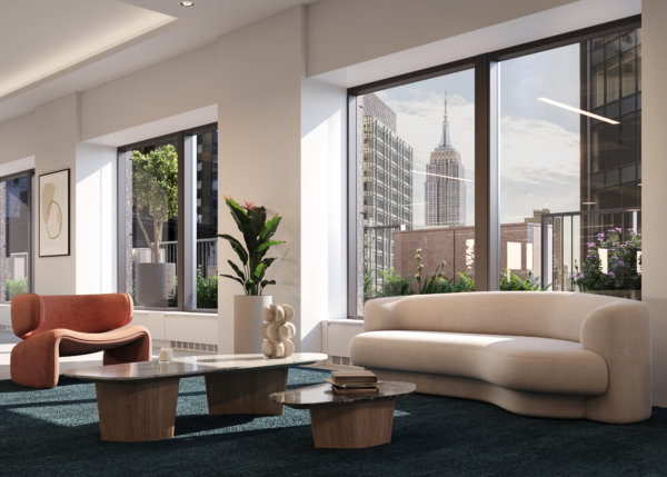
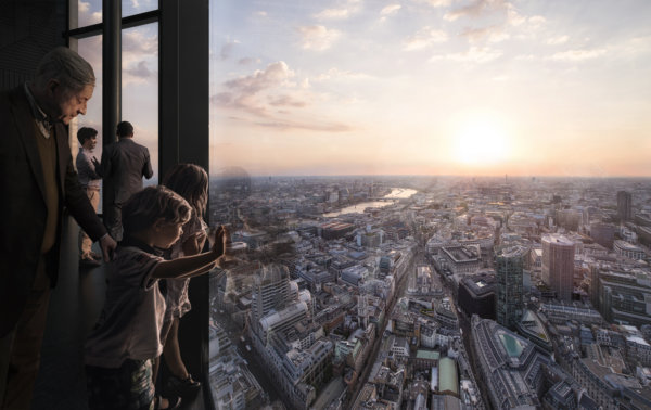
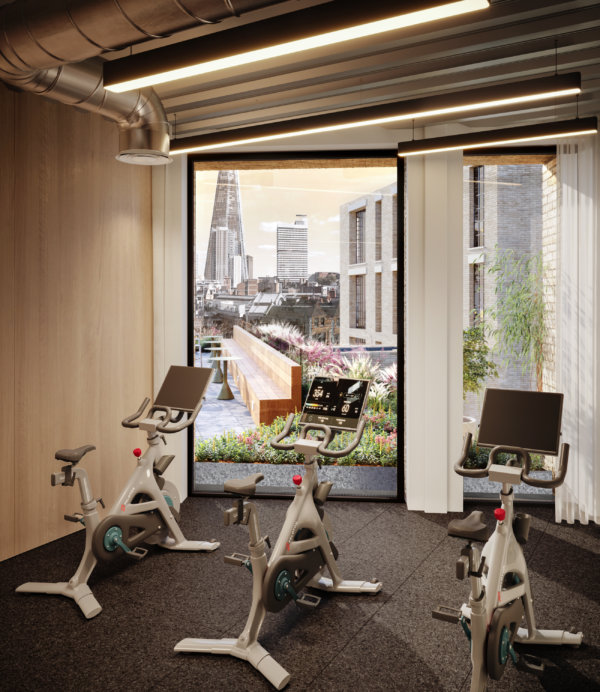
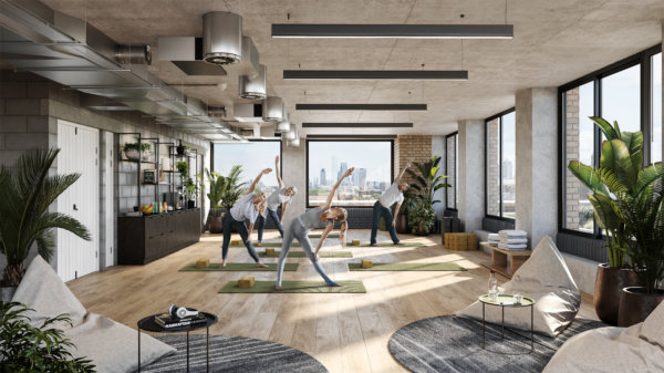
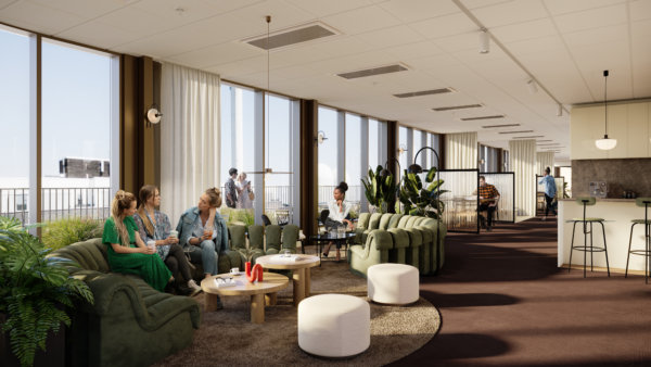
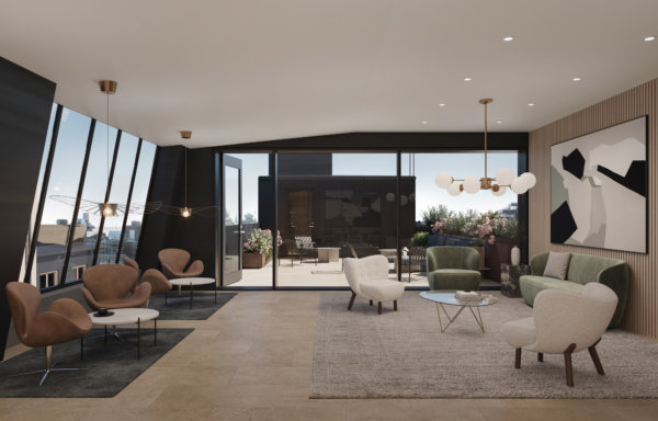
Is there any better way to “sell” a commercial property than with stunning views? It may be clear from an exterior image of a building that it’s sure to have amazing views, but that’s not the same as putting your audience in the room and actually showing them that view. Add people to the mix – because what interests people most are people – and you’ve just sold the benefits of those top floor spaces in milliseconds.
2. Location, location, location
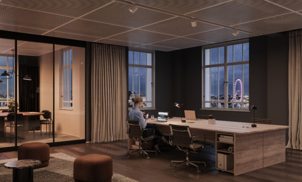
We all know that location is one of, if not the most important selling point of any project. Demonstrating the location on a map is both informative and functional, but showing it from the inside, using landmarks and recognizable areas connects to people’s emotions. Borrow the wow-factor from those nearby places, and just like that, your property goes from good to great. Who wouldn’t want a workspace with a view of the London Eye?
3. Make the most of unique features in your architectural visualizations
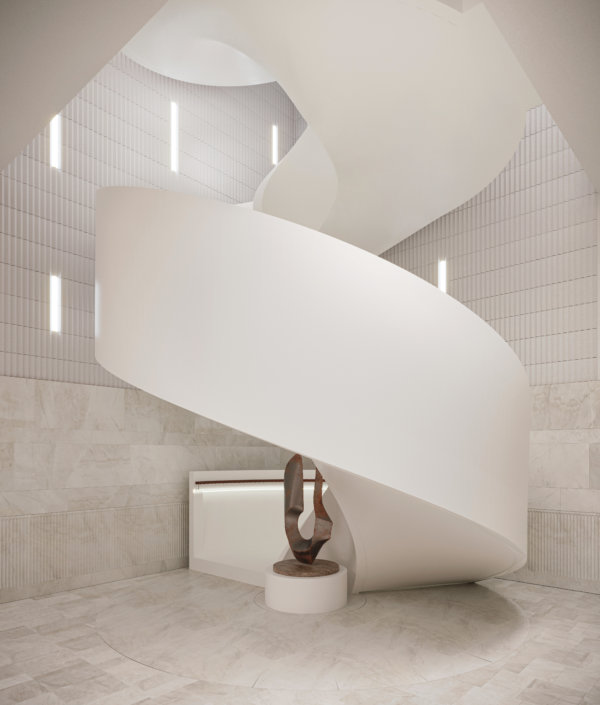
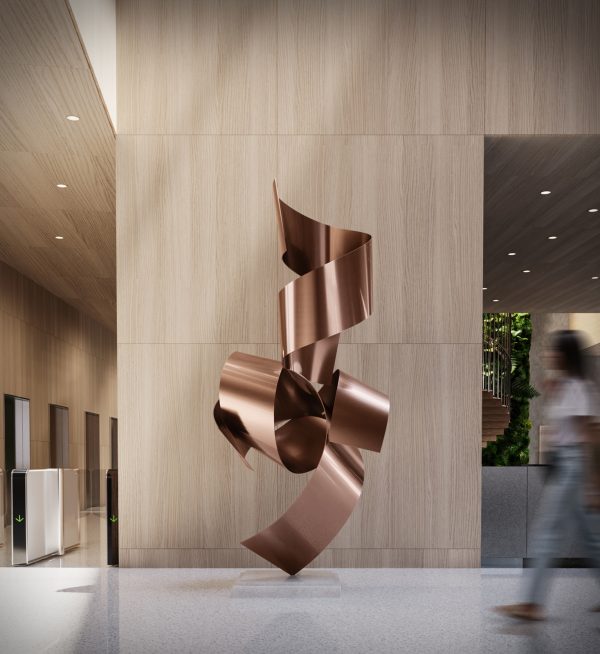
You’re just about to spend an unholy amount of money on restoring a facade to its original glory, or to build a staircase worthy of a Hollywood scene. Make sure those jaw-dropping features don’t get lost in the grand scheme of things by showcasing them in the way they were meant to be experienced. And ensure it pays off at the bottom line.
4. Tailor property marketing to audience interests
It’s notoriously hard to get people to read anything online, let alone interact with it. Part of the trick, of course, is to target your marketing to your audience’s interests. Larger images need to appeal to a broad audience with a diverse set of interests, but zeroing in on the details can help you speak directly to a sub-target audience like retailers, restaurateurs, or co-working spaces. They’ll appreciate you going the extra mile by taking their specific needs and wants into consideration.
5. Position the project using the right brands
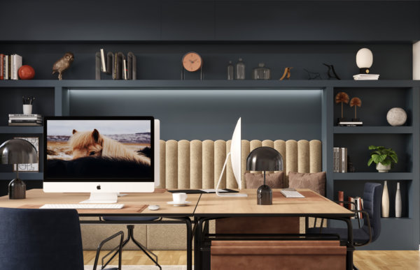
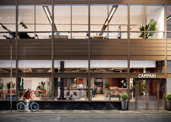
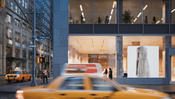
By including brands and products that have the right associations, renders can signal the project’s future potential. It roots the project in the area, supporting local brands, or appealing to the audience of the featured brands. Whether it’s Apple, Four Seasons, or our local coffee shop, we all have brands we love. That makes us feel all the right things. Take advantage of that when marketing your property.
6. Feature iconic designs
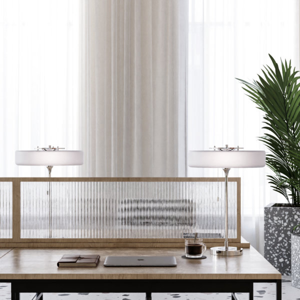
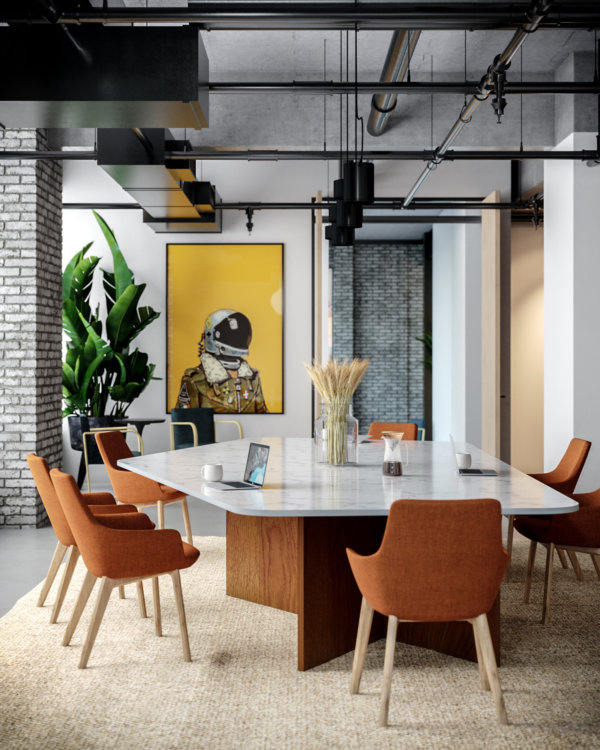
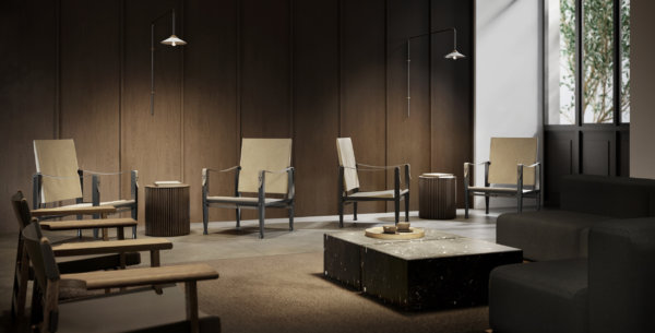
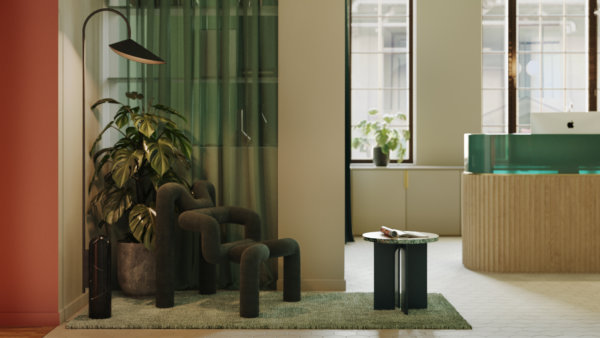
We’re not saying everyone is a sucker for design, but we’re kind of saying everyone is a sucker for design. Whether people are knowledgeable enough to name specific chairs or lamps, most people know high quality interior design when they see it. Using iconic pieces of furniture draws the viewer in by being equally familiar and desirable, and it paints the space in the right light.
7. Use strong shapes or colors
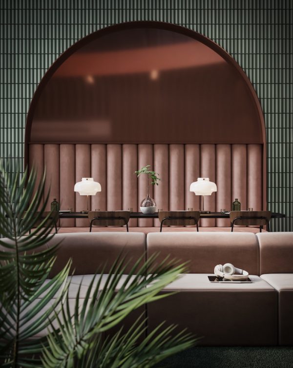
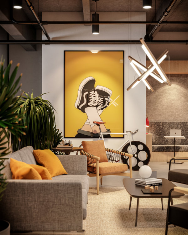
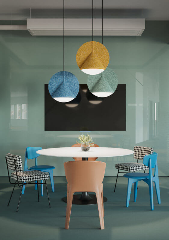
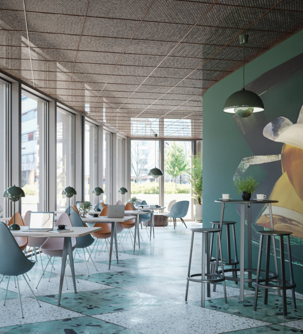
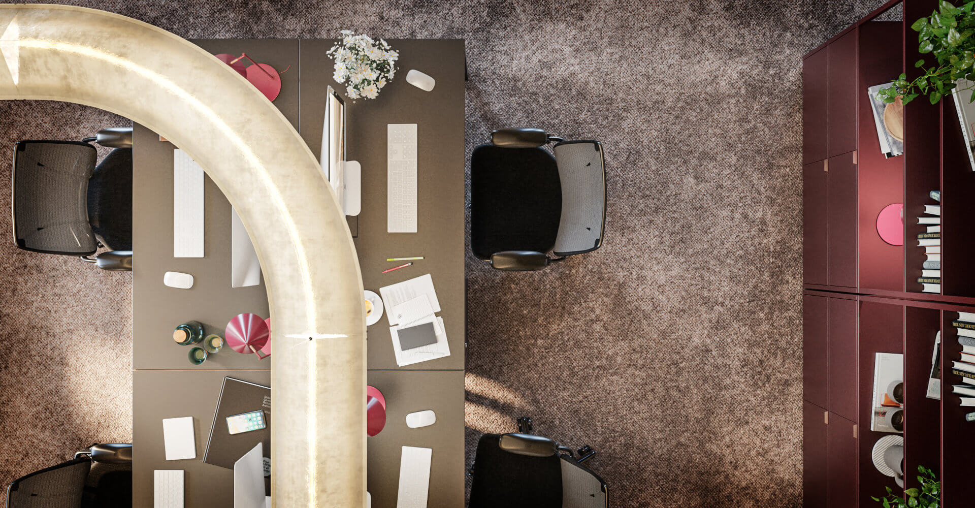
The human eye and mind navigates the (overwhelming) amount of impressions we encounter daily in a number of ways, but generally, we humans favor things that don’t require a large amount of brain power, such as reading. That means that strong shapes and colors have a powerful effect on us in the same way “stop signs” do. By including strong shapes and colors in details, you ensure your image grabs your audience from the get-go.
8. Look for unique angles
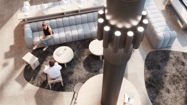
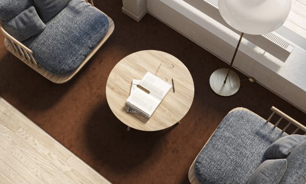
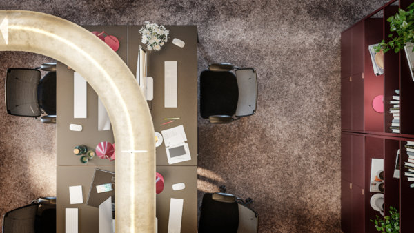
A trick of the trade to optimize strong shapes and colors, as mentioned in the previous point, is to look for interesting angles and showcase them in your 3D visualizations. Those angles create a “What am I looking at? I need to figure this out.” moment in the viewer and establish interest in the image. That’s half of your job finished already.
9. Fine tune the atmosphere and ambience
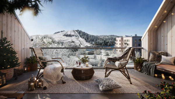
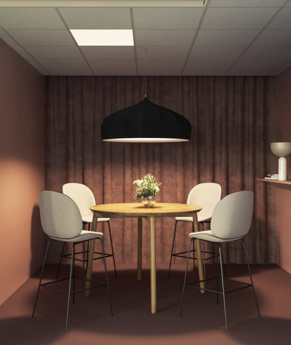
Before we can even get to square meter price and desk capacity, the oh so important desire for the space must be established. Create an atmosphere or ambience so vivid that the viewer can almost touch it, and you’ve just sold a lifestyle (and a property). Be bold and be specific. It’s better to be clearly cool, refreshing, cozy, or lively than to try to be a little bit of everything.
10. Make it move
Animations can be costly, but there’s also a nifty way of adding movement to still images that grabs attention on small screens. Make the color of a typewriter change from blue to red to green and back, and you immediately capture attention without it costing an arm and a leg. Complement it with smart copy and you’ve got yourself a great asset for your property marketing efforts! Better yet, include movement in a way that ensures your potential customer imagines just how your space benefits their business.
11. Incorporate the latest trends
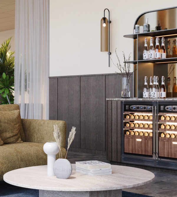
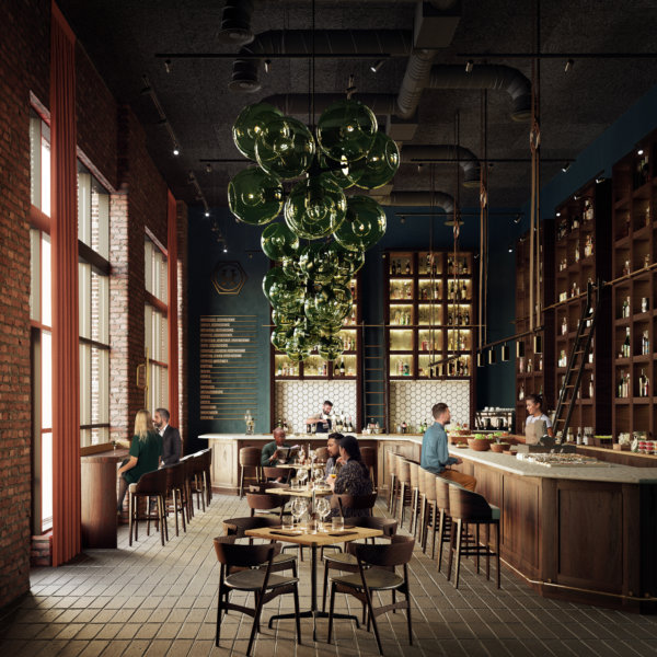
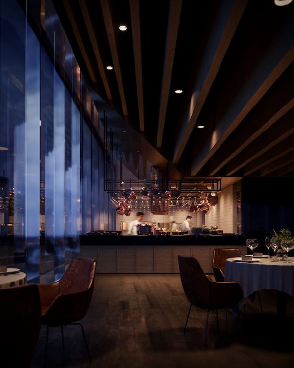
You know how the items worn on the catwalks of the most prestigious fashion brands are bought by few, but seen by many? And how that goes on to help them sell the white t-shirts or mascaras that often make up the bulk of their business? Well, we think of restaurants and bars as the catwalks of commercial real estate projects. The bulk of the building may be office spaces, but it’s the restaurateurs and retail spaces that help build the perception and vibe of the building as a whole. Use those details to convey that the space will be the talk of the town, and your customer will understand that this prestige rubs off on the rest of the spaces and tenants as well.
12. Art for the sake of art – and business
Art doesn’t require a reason for being, but in this context, it has one nonetheless. It’s a good place to inject color in an image and create a focal point – without using strong color in furniture which may be polarizing or come across as too much. While it may not appeal to everyone on a personal level, it will most certainly capture their attention.
13. Employ inviting textures
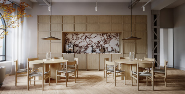
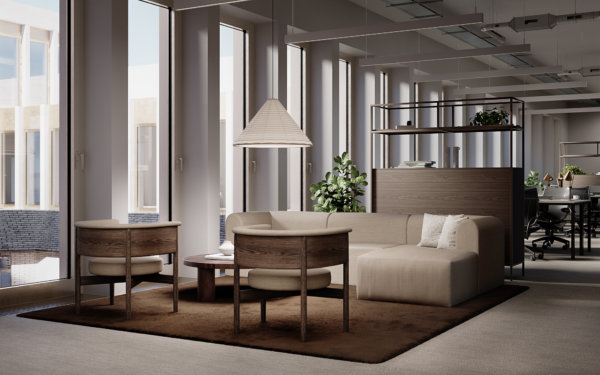
Speaking to as many senses as possible is a way of ensuring that no stone is left unturned in the quest to attract the engagement of the viewer. Using highly tactile materials in the space, both in surface layers and in furniture, is a way to create ambient atmospheres without dimming the lights – especially useful in daytime places such as office spaces.
Ready to take your property marketing efforts to the next level by utilizing these tips? Get in touch to discuss your next project! We’d love to discuss how we can help you showcase your commercial property to your target audience on the right channels.
10 Beautiful Office Spaces to Inspire Your Next CRE Project
10 Beautiful Office Spaces to Inspire Your Next CRE Project
Spaces Chicago
Chicago, USA
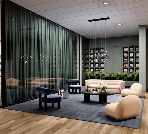
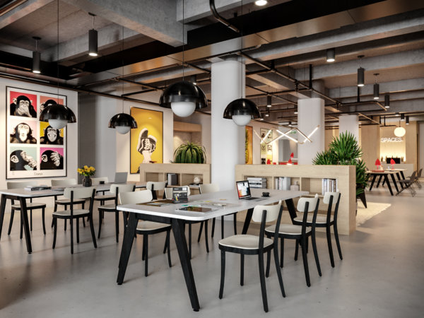
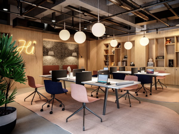
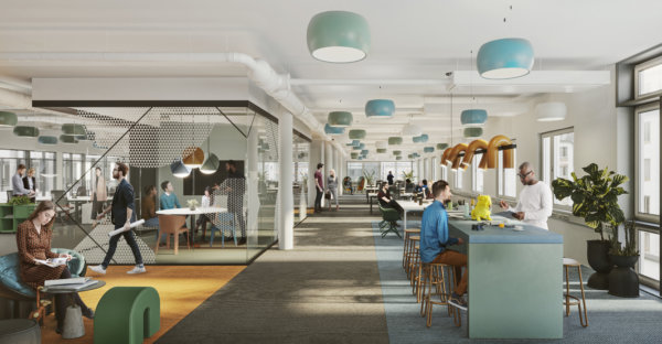
Chicago is home to a buzzing business scene and the perfect spot for this co-working office by Spaces. The goal was to capture the energy and vibrancy of Chicago in a comfy and stylish space that would appeal to everyone from aspiring novelists to tech startup founders. Designed for peak productivity as well as a place to unwind and network with like-minded peers, this space has it all. What does it inspire you to do?
Finnslätten
Västerås, Sweden
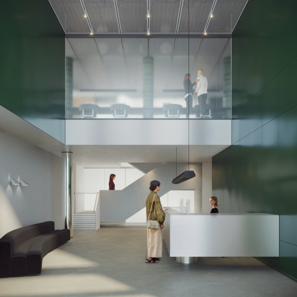
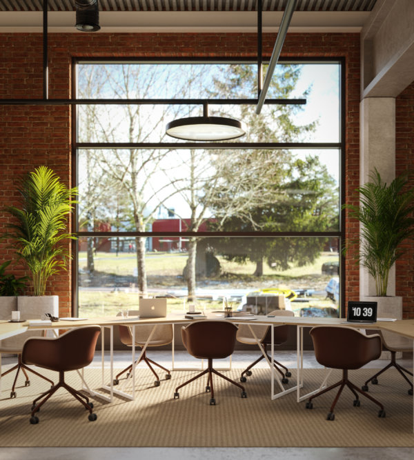
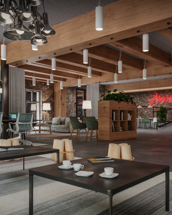
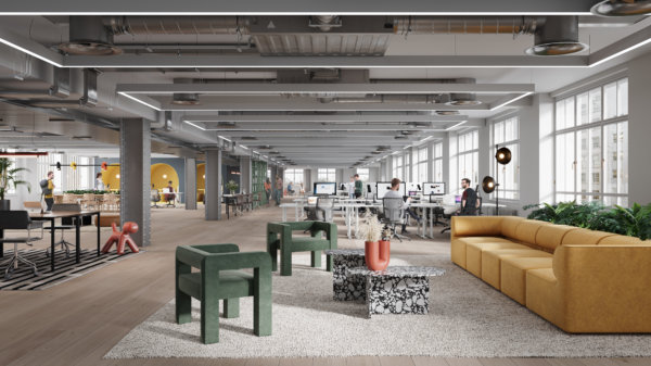
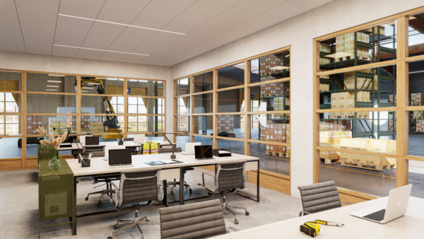
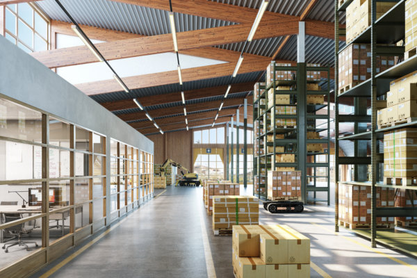
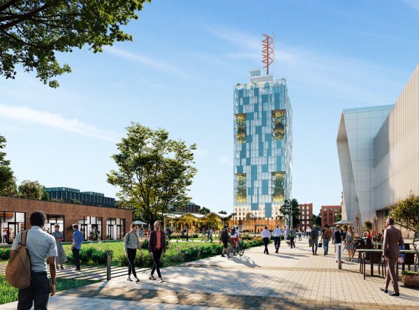
Tenants of Finnslätten, developed by Kungsleden and designed by Tovatt Architects & Planners, are industry leaders and expect their office space to be representative of that. Industrial elements in the design reflect the aim to create an aesthetically pleasing and functional meeting place for future technological inventions. Finnslätten is a place where research, development, and production join forces to meet societal challenges.
Great Suffolk Yard
London, UK
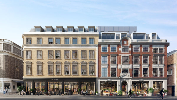
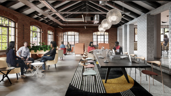
Tailored Living Solutions’ Great Suffolk Yard is a mix of contemporary office space showcasing a sensitive restoration of eclectic 19th century warehouse style buildings, where the very best of modern design meets the industrial charm, character, and personality of Southwark London. Thoughtfully designed by architecture studio TDO for today’s discerning workforce, Great Suffolk Yard has brilliantly thought-out office spaces that will provide both functionality and inspiration to those who work there.
Sthlm 02
Stockholm, Sweden
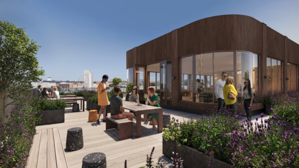
The workplace looks a little different these days, and Skanska has taken that to heart with their vision for Sthlm 02. It’s a place where style meets functionality and flexibility to create an office space that meets today’s evolving needs. Covering 81,806 square feet over 7 floors, Sthlm 02 offers the opportunity to create an office environment with plenty of common spaces to inspire those who work there. Will they stop to chat with a colleague over a coffee in the chic café, brainstorm and develop ideas in the creative studio, or go straight to the green rooftop for some fresh air and a company yoga class. At Sthlm 02, anything is possible.
Linden Palais
Berlin, Germany
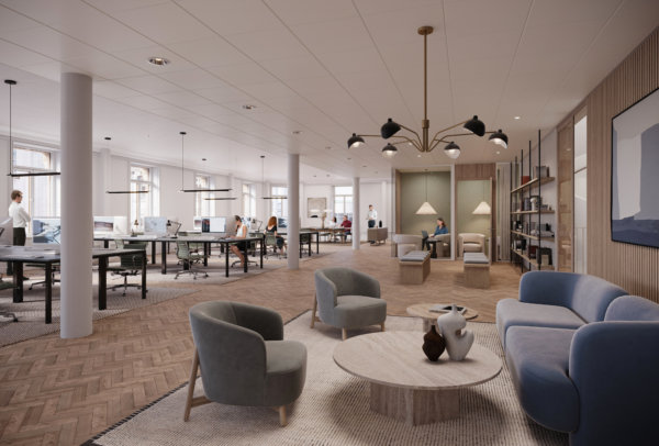
The Office Group (TOG) specializes in unique and beautifully designed co-working spaces around the world, and Linden Palais in Berlin doesn’t disappoint fans of TOG. One of the most important aspects for us as the 3D visualization partner was to convey the architectural history of the building by restoring the existing elements – herringbone parquet flooring, detailed ceilings, wall paneling, and curved archways – that tell the history of the building. Linden Palais is a very special space where the historical meets the modern in an office space that is a pleasure to both work and hang out in.
Frösunda Port
Solna, Sweden
Situated right in the mix of Solna, the Frösunda Port refurbishment project takes aim at strengthening the area’s identity both internally and externally. It will be transformed from a one-tenant house into one modern office building at the forefront, with sustainable solutions and common service functions for its tenants. FastPartner aims to revitalize the area, introducing modern amenities that will bring energized life to the people working there. Through the delivery of carefully positioned CGIs, we aimed to capture the magnitude of the eclectic mix of people and uses of the area.
Spaces Seattle
Seattle, USA
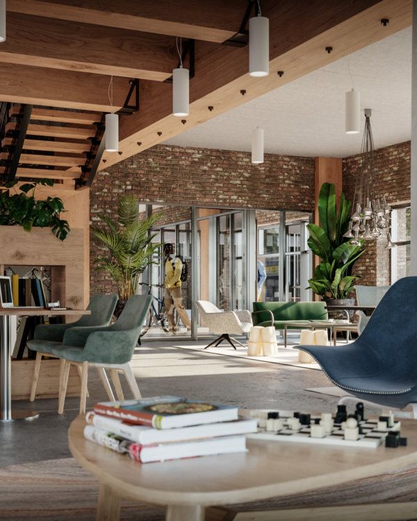
Creativity and beautiful brick buildings are abundant in Seattle, and this co-working office by Spaces utilizes both. Seattle is fast becoming a hotbed of growing startups, and Spaces Seattle offers a place for creative entrepreneurs and tech founders alike to flesh out their ideas and build their businesses. Brick and wood make up the bulk of the materials and give an earthy feel to this office space in a city synonymous with nature.
Liberty House
London, UK
Another co-working space from The Office Group makes our list of beautiful office spaces. Liberty House weaves together its creative heritage and iconic location to offer a vibrant place to work. Next to Liberty, the world-famous department store, Liberty House used to house stock and the employees of Liberty. Embracing the original character and charm of the space, we aimed to show it as it could be with restored original elements, such as the parquet floor, and reflect Liberty’s history with patterns, fabrics, and pops of color throughout.
Vildmannen
Stockholm, Sweden
From the ashes rises the phoenix of Vildmannen. This beautiful work of art located in central Stockholm, once the spot of a historical fire that was visible the entire city over, has undergone a massive renovation by Hufvudstaden & their partners. From tragedy rises one of Stockholm’s most beautiful office spaces to date. This new property is where cultural history meets the future. The opportunity to build something new from scratch inside a 120-year-old facade is very rare and working on these renders was a privilege.
80 Strand
London, UK
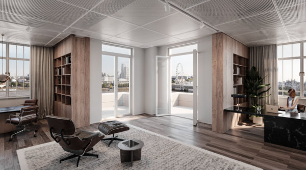
There are great office views, and then there’s 80 Strand. 80 Strand is a London icon, with 156,000 sq ft of flexible floor space in a beautiful and iconic riverside building. Stunning Art Deco features complemented by light-filled contemporary spaces with riverside views, positioned at the heart of a world-class cultural destination make this a highly sought-after office space. Who wouldn’t want a view of the London Eye from their desk?
Celebrating 4 Outstanding Architects and Designers from the LGBTQ Community
Celebrating 4 Outstanding Architects and Designers from the LGBTQ Community
Louis Sullivan
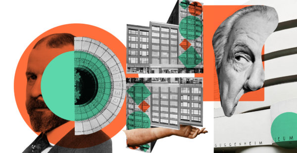
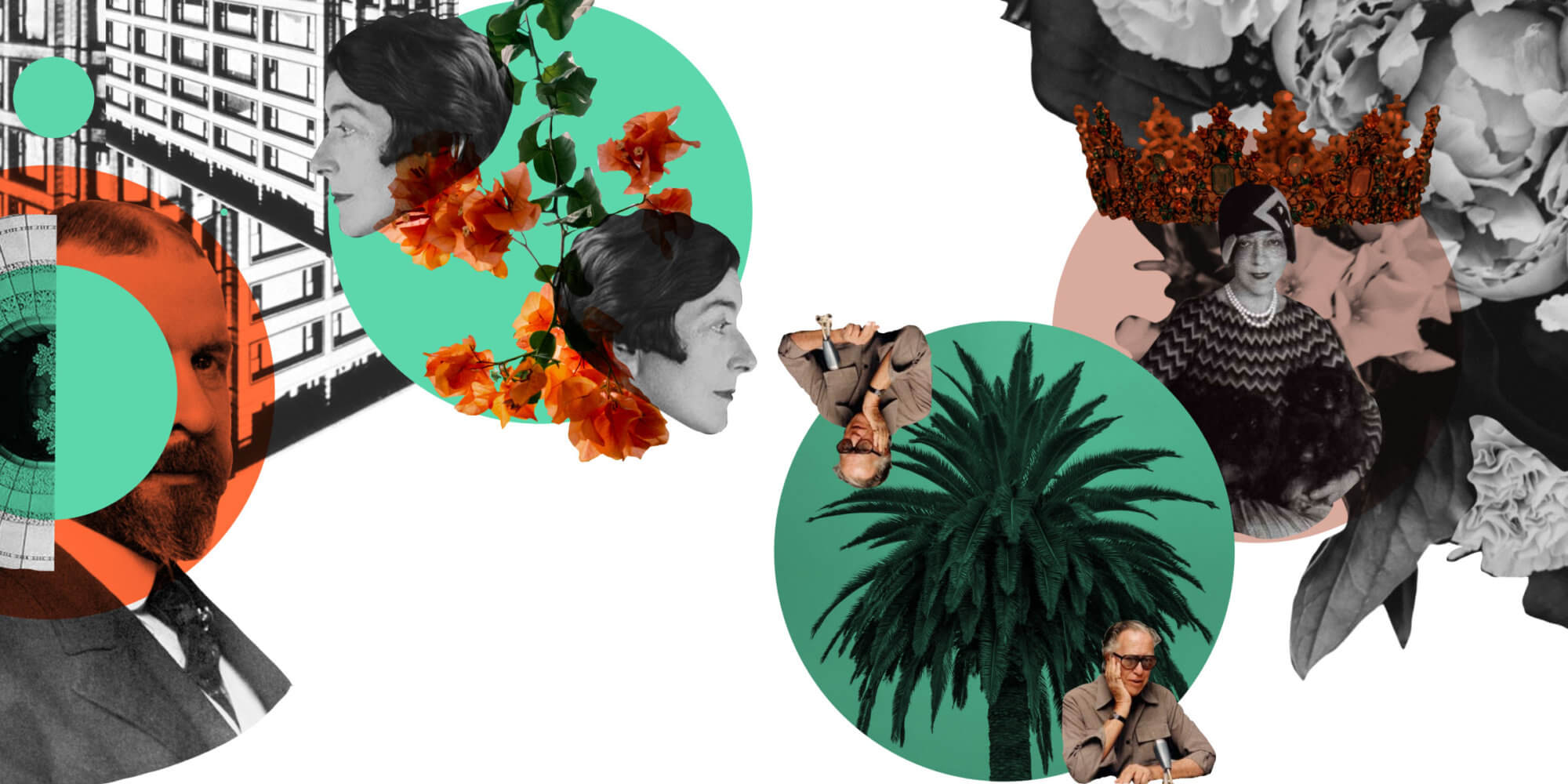
Louis Sullivan is known as the father of skyscrapers and his numerous works include the Auditorium Building in Chicago, the Guaranty Building (now the Prudential Building) in Buffalo, NY, and the Wainwright Building, St. Louis. Sullivan was a pioneer in designing steel-framed skyscrapers, but he’s also known for defining an architectural style unique to America. He believed a building should respond to its specific environment in the same way a plant would grow “naturally, logically, and poetically out of all its conditions.” You may have also heard his most famous quote – “form follows function”. As with many LGBTQ individuals of his era, his personal correspondence was destroyed toward the end of his lifetime. His legacy remains, not only in the form of revered architecture, but through his student, Frank Lloyd Wright, who apprenticed with him for six years.
Read more about him in Robert Twombly’s “Louis Sullivan: His Life & Work”.
Eileen Gray
Eileen Gray was an Anglo-Irish designer of decorative furniture and Modernist architecture. Gray came to architecture later in life after first studying drawing and painting at the Slade School of Fine Art. She was one of the first women to be accepted at The Slade, and that wasn’t the first time she’d carve out a space for herself in a male-dominated world. Ultimately, her passions lay elsewhere though, and she began experimenting with Japanese lacquerwork fused with geometry. She became interested in architecture in her late forties after a successful career in furniture design. She is best known for E-1027, a modernist villa in Cape Martin in Southern France. It’s an iconic seaside villa that she completed at the age of 51 with no formal architectural training. Gray was largely unrecognized in her own lifetime, but today she is regarded as a pioneer of the Modernist movement, and E-1027 is now a French National Cultural Monument.
Read more about her in “Eileen Gray: Her Life and Work: The Biography”.
Geoffrey Bawa
This is Geoffrey Bawa, Sri Lanka’s most renowned architect. He was born to a mother of German, Scottish, and Sinhalese descent and a father of Sri Lankan, Muslim, and French descent. It was these early influences that were instrumental in shaping his choices in both life and his future profession. He first studied and practiced law, but after the early deaths of his parents, he quit to spend time traveling. It was upon his return that he got his start in architecture after purchasing a rubber plantation called Lunuganga that he would go on to develop throughout his lifetime. Often called the father of the tropical modernist movement, Bawa’s style of architecture suited the hot, humid climate of Sri Lanka and focused on traditional materials. His influence can be seen across Sri Lanka, Bali, and Singapore. He’s perhaps best known for his hotel designs such as Kandalama Hotel. The structure of the luxury hotel was designed so that it hangs onto a cliff while facing Sigiriya rock.
Read more about him in “In Search of Bawa” by David Robson.
Elsie de Wolfe
This is Elsie de Wolfe, an American designer credited with creating interior design as a profession. Born in New York in 1865, de Wolfe was a socialite who spent her early years in Scotland and was presented to Queen Victoria at court – a rare honor for an American at that time. She originally trained as an actress, but became more famous for her on stage attire than her acting ability. She became a fashion icon and was even named “best-dressed woman in the world” in 1935. In 1887, de Wolfe settled into what was then called a “Boston marriage” with Elisabeth Marbury, a formidable figure in New York society who was wildly successful in her own right as a literary agent for the likes of Oscar Wilde, George Bernard Shaw, and many others. The two women shared a house on Irving Square, and it was there that de Wolfe discovered her talent and love for interior design. She was known for her hatred of the Victorian style of the time, which she considered hideous and dark. She opened up the space and redid the house in soft, warm colors to make it light, airy, and feminine. She became a professional decorator in 1905. That same year a group of powerful women, including Marbury, Anne Tracy Morgan, and Florence Harriman opened the first private club exclusively for women in NYC – The Colony Club. De Wolfe was commissioned to design the interiors. She was also active in the women’s suffrage movement and was awarded the Legion d’Honneur for giving the Red Cross the use of her villa in France during World War I.
Read more about her in her own book “The House in Good Taste”.
Did you enjoy our Pride Month campaign? Want to keep up with our latest news? Follow us on social media to stay up to date, meet interesting architects and designers, and to see beautiful 3D visualizations.
5 Unique CRE Ideas to Up-level Your Next Property
5 Unique CRE Ideas to Up-level Your Next Property
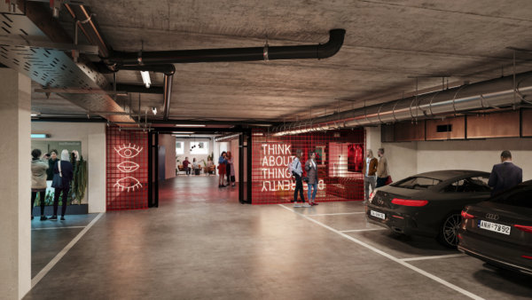
Car Park Transformation
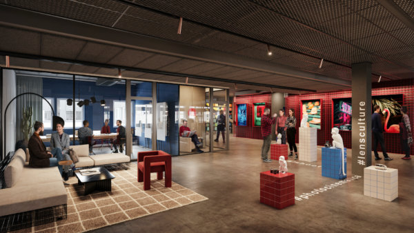
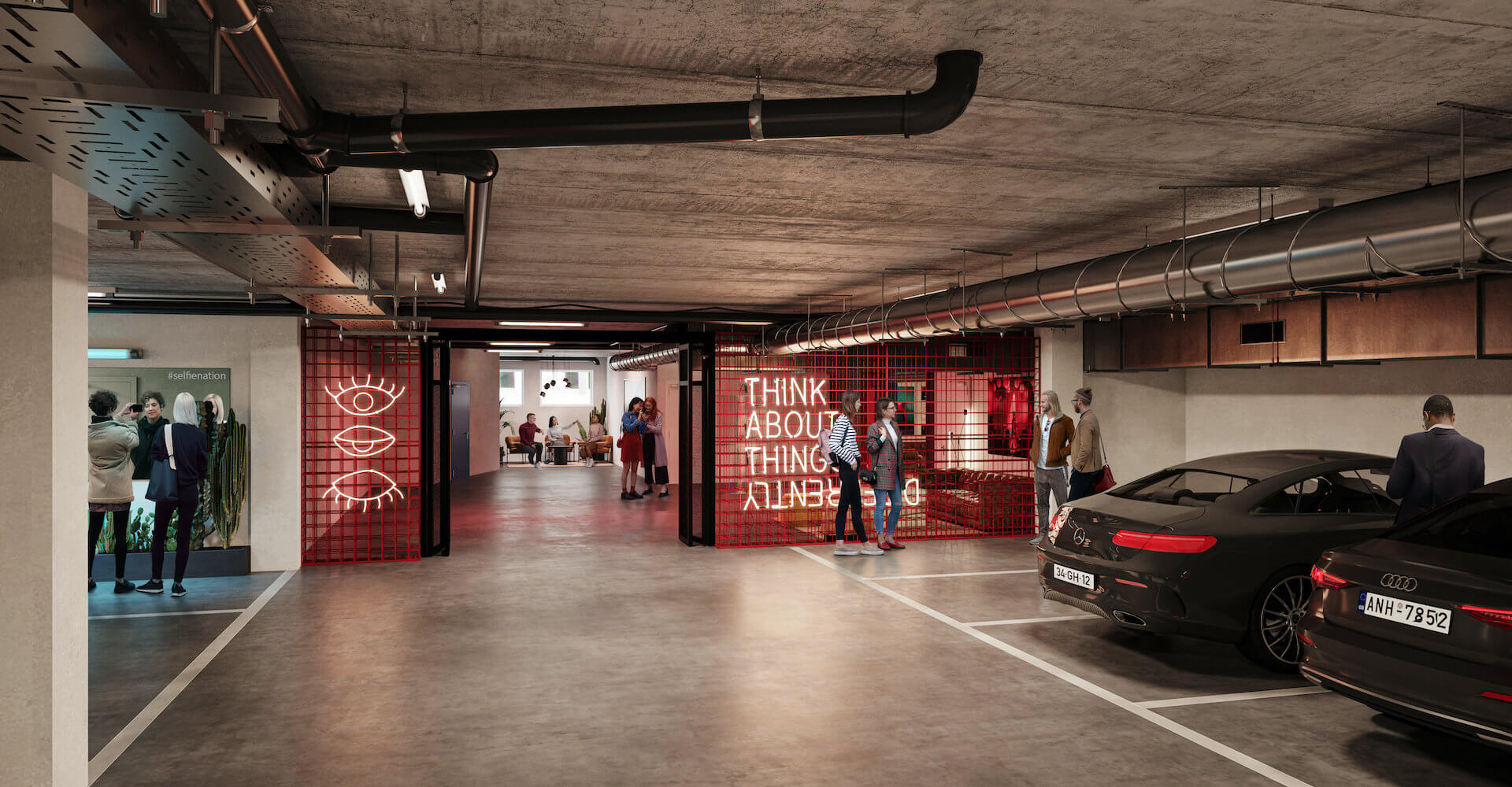
A car park is just a car park. Until it isn’t. Kungsleden got creative with this car park in Stockholm and transformed into a multi-purpose space. Need a place to work? You’ll find it here. Need space for an art exhibition? Check. Want to open a pop-up shop? No problem. Oh and you can park your car here too.
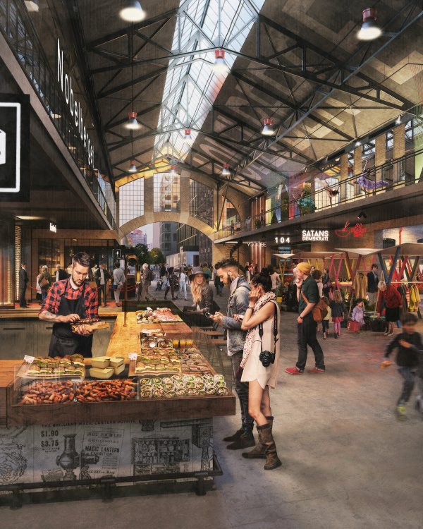
Meatpacking District
When the municipality of Stockholm decided it was time to develop the meatpacking district, it presented a unique opportunity for whichever property developer won the deal. The ideas and plans had to be presented to the council and the competition was fierce. The winning idea by Atrium Ljunberg and Gatun revitalizes the area while staying true to its roots by creating spaces for art and commerce and keeping food at the heart. This massive, ongoing project will be fully realized by 2030.
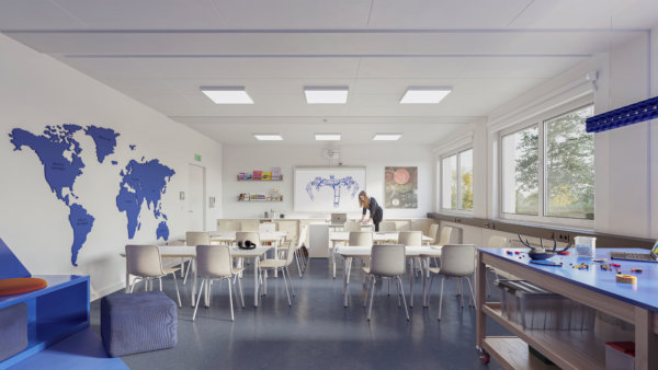
Adaptable Schools
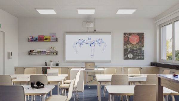
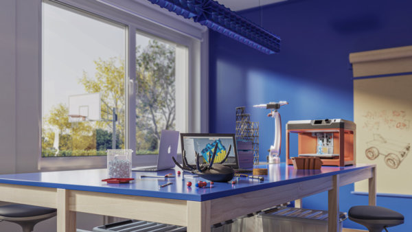
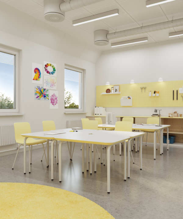
The world has changed and so have the schools. That’s the basis that Adapteo Group has created their adaptable, modular schools on. With modular technology, each school can be built according to specific needs and easily adapted when those needs inevitably change. Offering a cost-effective, low-maintenance, and quick solution, these school facilities can be provided for a few days or long-term. New ideas and mindsets call for flexibility – Adapteo ensures we’re ready for what the future brings.
The Terminal
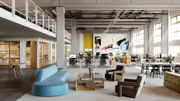
Industrial spaces don’t have to be boring. And this refurbishment of the largest postal sorting office in Sweden by JLL is the perfect embodiment of that. The goal was to refurbish the space with creative offices that offered fantastic access to industrial space and warehouse logistics. The project resulted in a light-filled, clean, and minimalist warehouse with fun, green, and spacious offices.
Oasis in Finnslätten
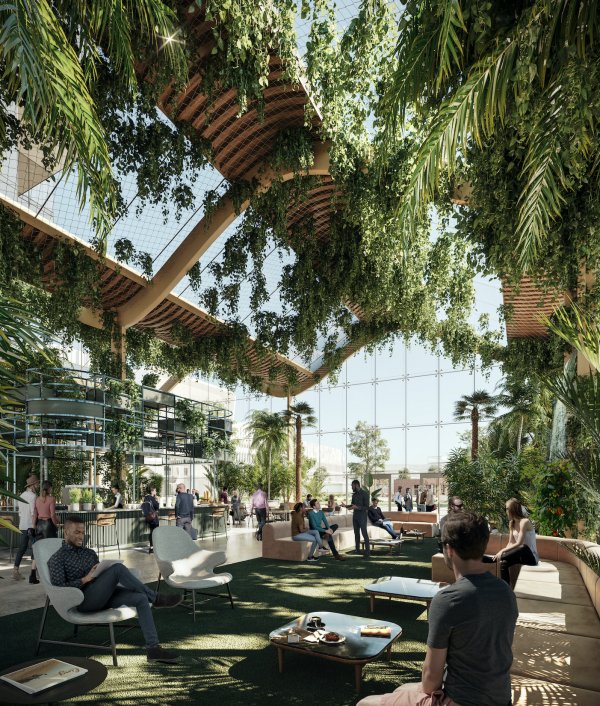
You could be forgiven for thinking you’re outside when sitting in the lobby of this building in the urban campus of Finnslätten. Developed by Kungsleden and designed by Tovatt Architects & Planners, Finnslätten is already unique as an urban campus where research, development, and production join forces to meet societal challenges. But this oasis is a destination in itself. Whether you need 10 minutes to yourself or a meeting place to discuss creative ideas, you’ll find what you need there.

