From Unbuilt Space to Urban Oasis: The Story of Haga Norra
From Unbuilt Space to Urban Oasis: The Story of Haga Norra
Connecting the Dots: The Inception and Evolution of Haga Norra
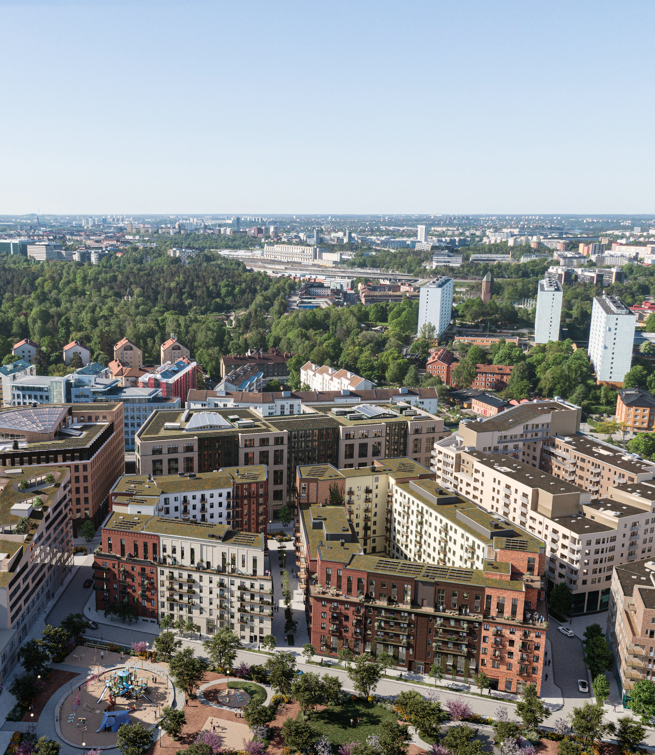
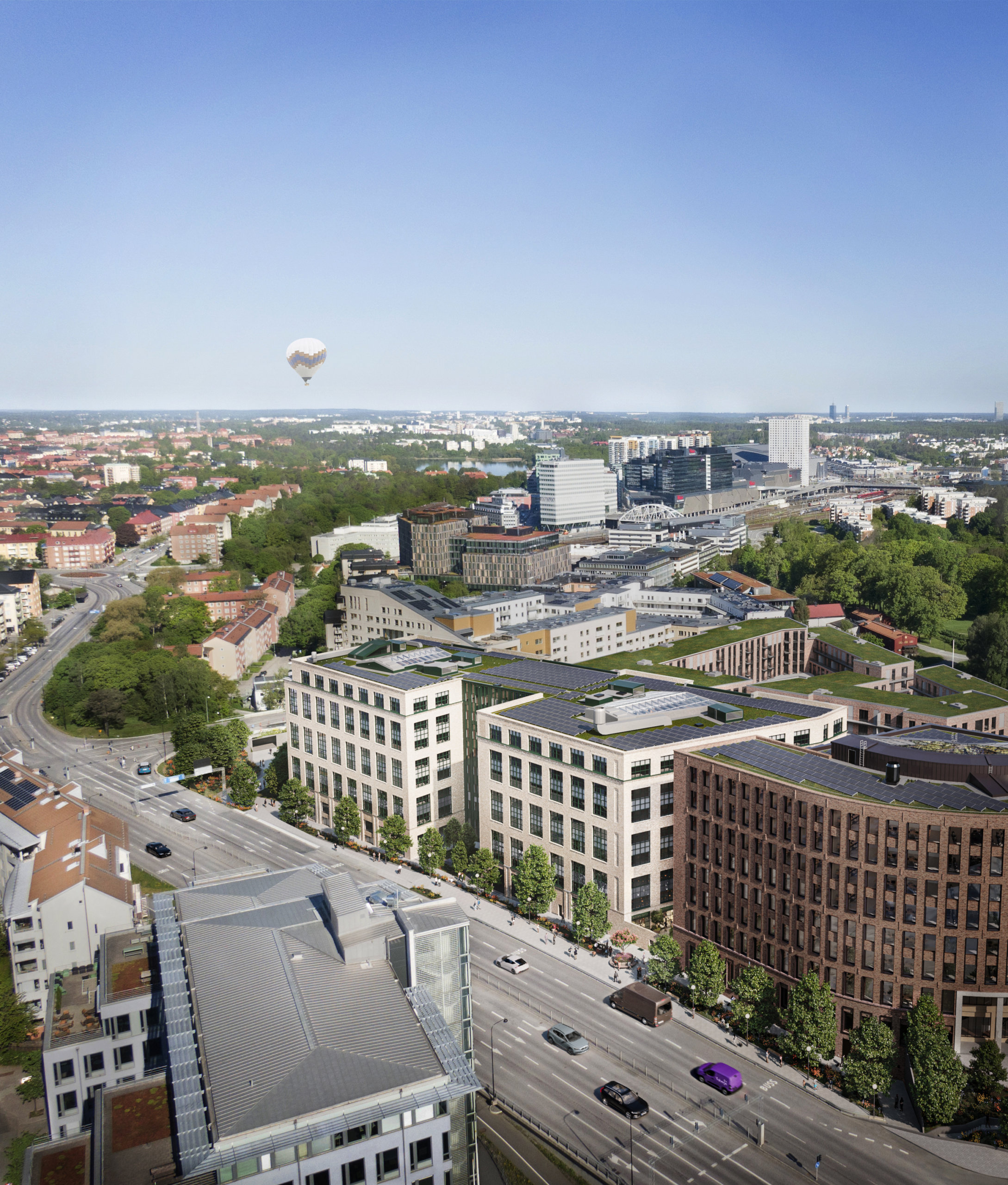
Haga Norra is nestled between two prominent areas, Hagaparken and Arenastaden. Hagaparken, founded by King Gustav III, covers 144 hectares of lush nature, offering a serene setting with exquisite pavilions and architectural gems. Arenastaden, located in Solna, is a vibrant urban district renowned for its dynamic blend of sports, entertainment, and modern living. Anchored by the impressive Friends Arena, a multifunctional stadium hosting concerts and sporting events, Arenastaden has become a hub of activity. With its strategic location and excellent public transportation connections, Arenastaden has evolved into a sought-after destination for both business and leisure, symbolizing the convergence of contemporary urban lifestyle and excitement. This innovative district stands as a testament to Solna’s commitment to urban development and community engagement.
Haga Norra: The New Social Hub in Stockholm
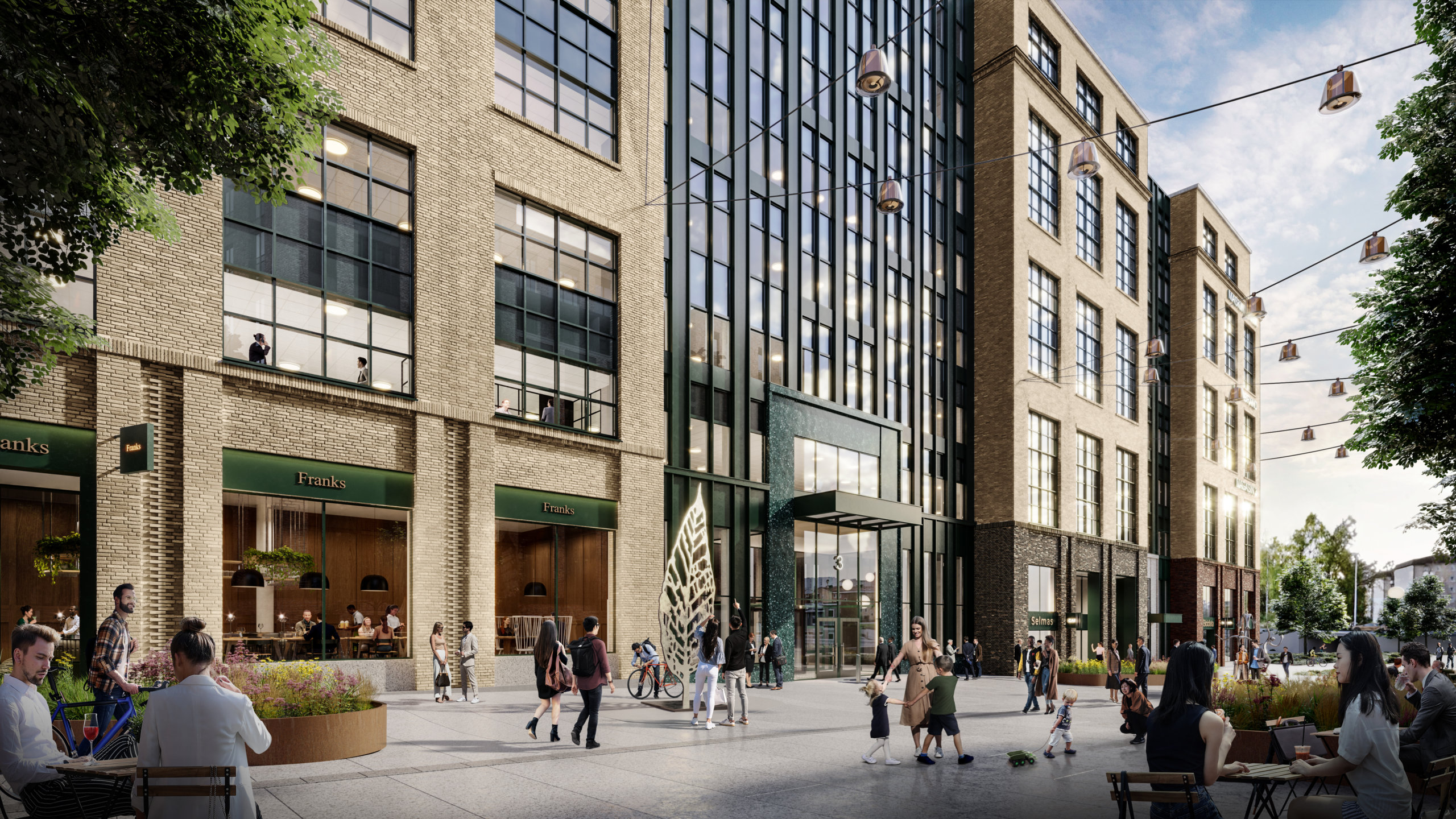
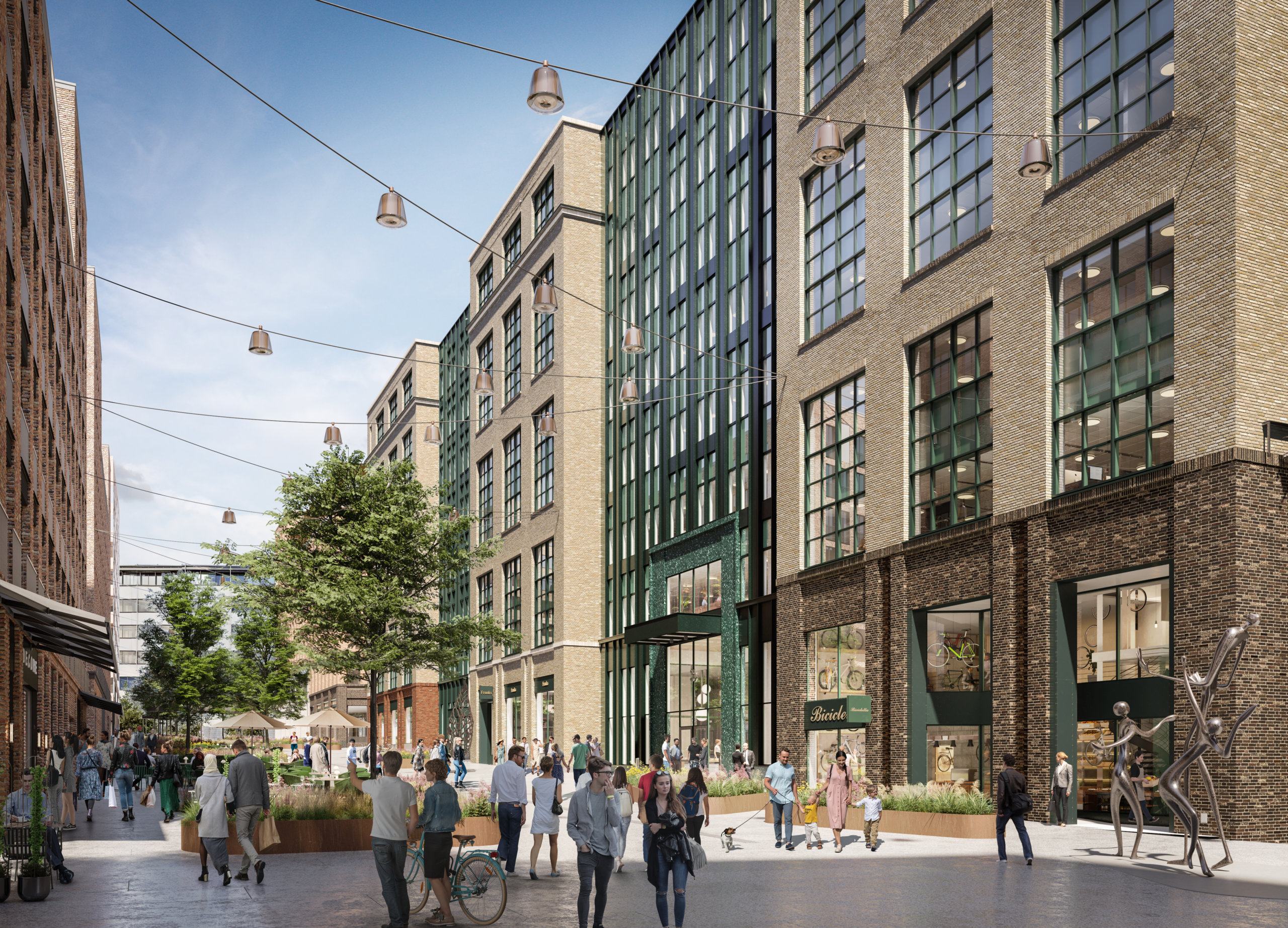
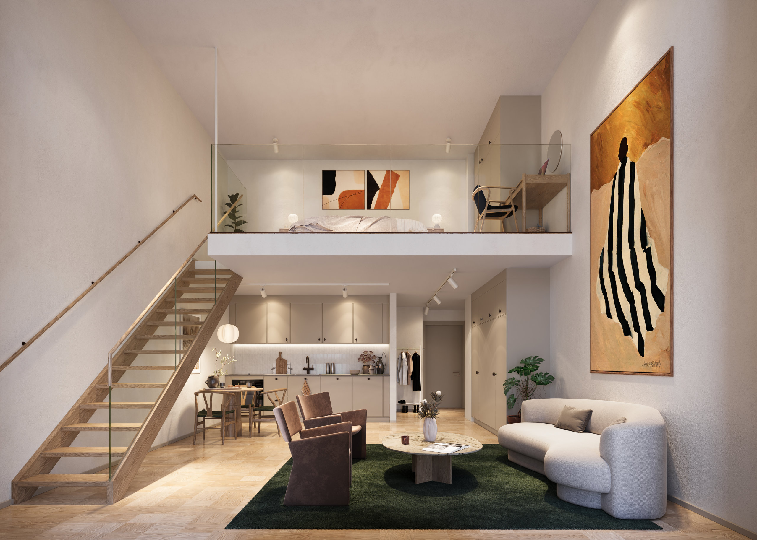
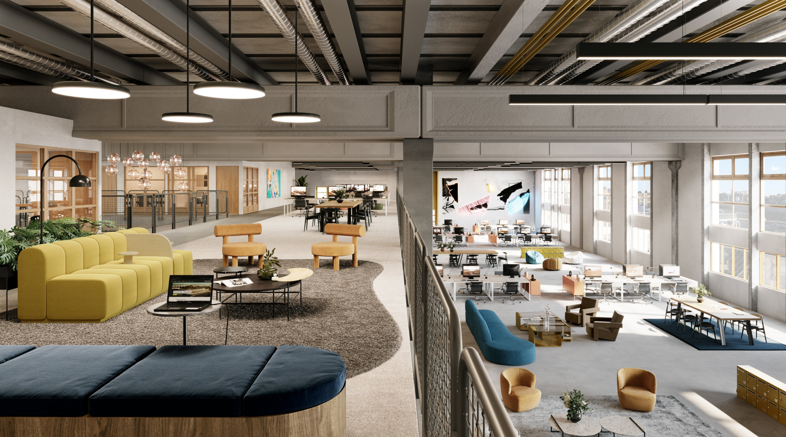
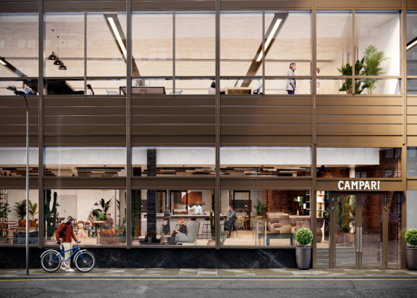
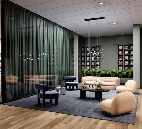
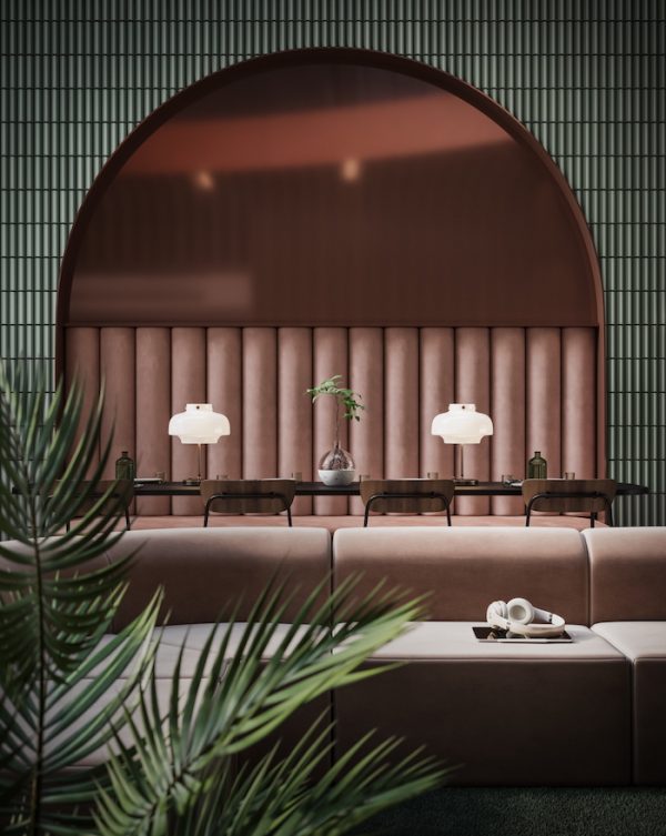
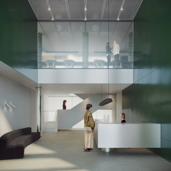
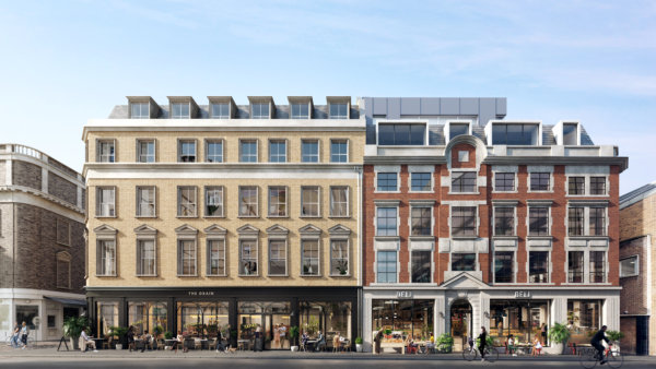
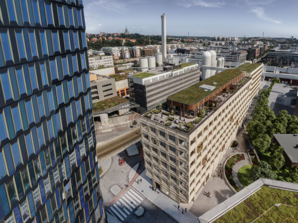
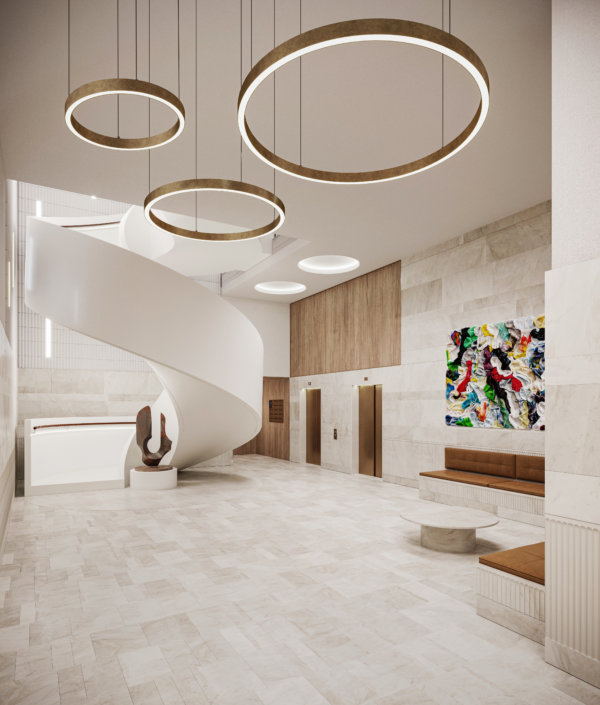
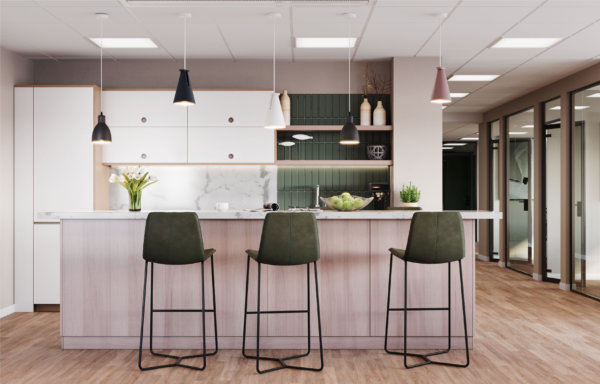
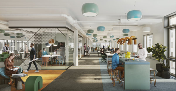
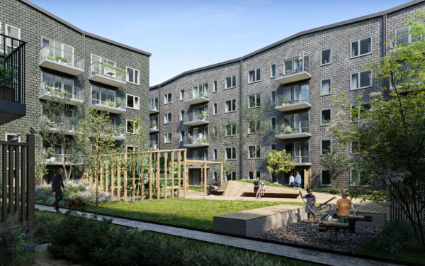
Fabege and its subsidiary, Birger Bostad, are the proud owners of eight blocks in the district, and we were thrilled to collaborate on their ambitious project called Haga Norra. Haga Norra consists of over 70,000 m2 commercial office and retail spaces and over 1,000 apartments. The project began by focusing on the public areas, Mathildatorget, and the office buildings, welcoming coworkers, clients, and visitors to a place that provides as much inspiration and experiences outside the buildings as they do inside the offices. Adhering to the UN’s sustainable development goals, the project features solutions such as geothermal heating, solar cells, and recycled materials.
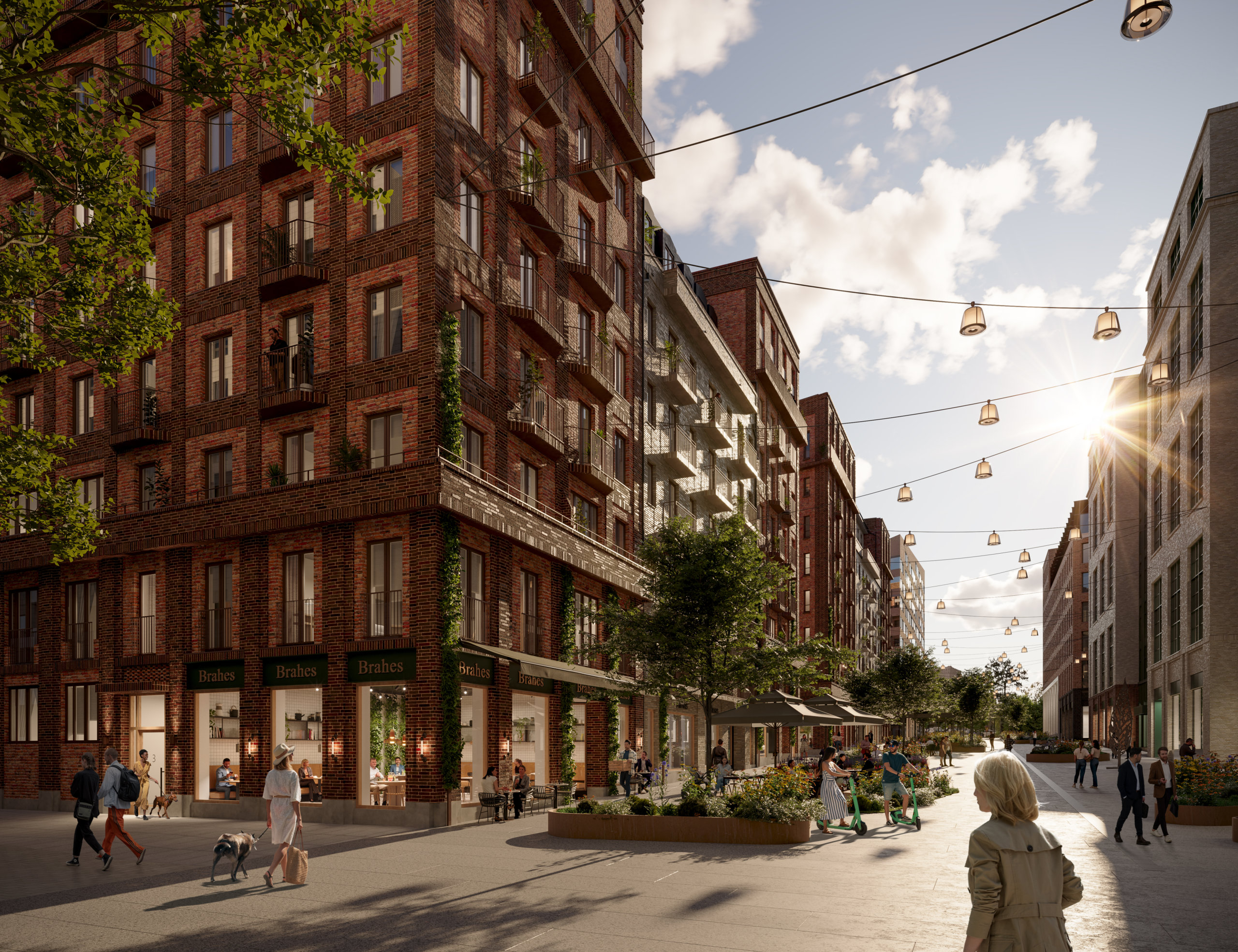
The aim has been to imbue the district with an authentic continental atmosphere by incorporating classic qualities into the architecture while keeping an eye on the future.
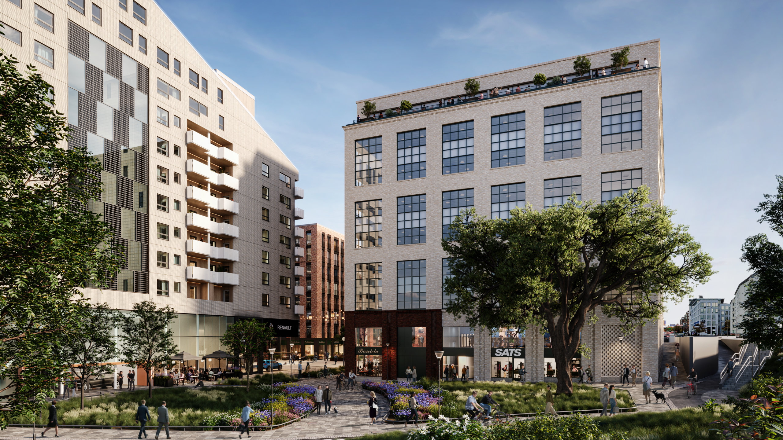
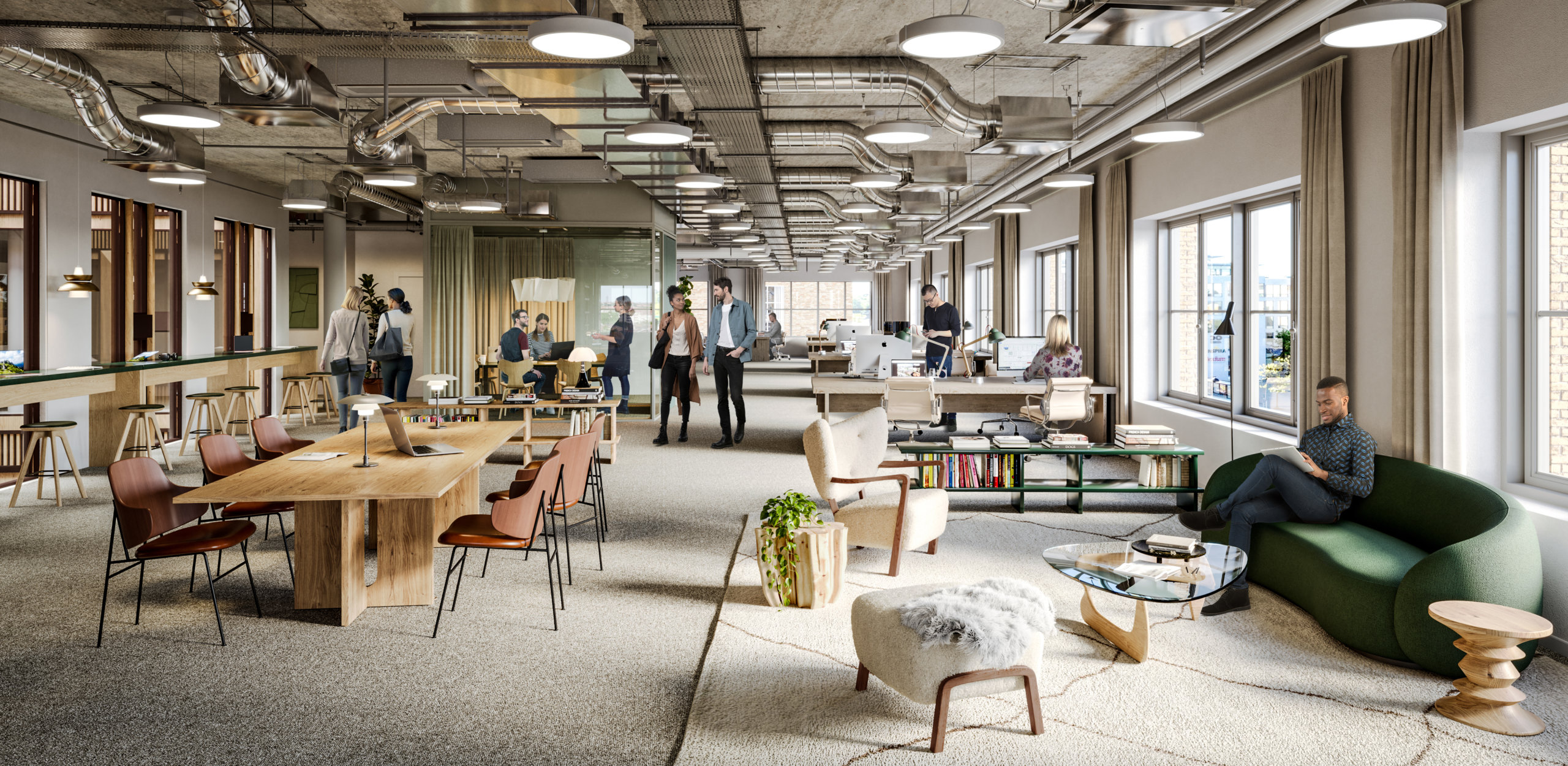
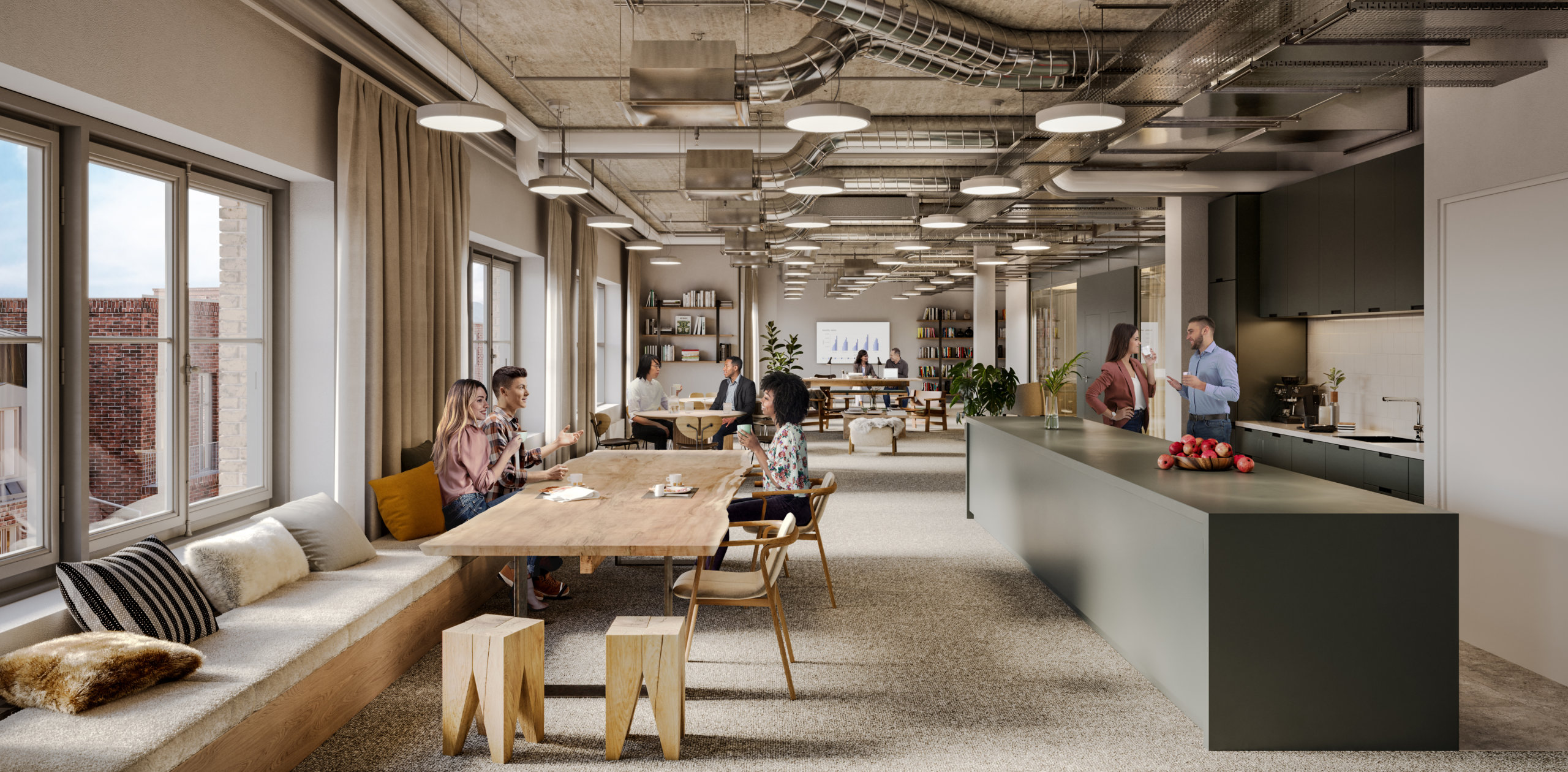
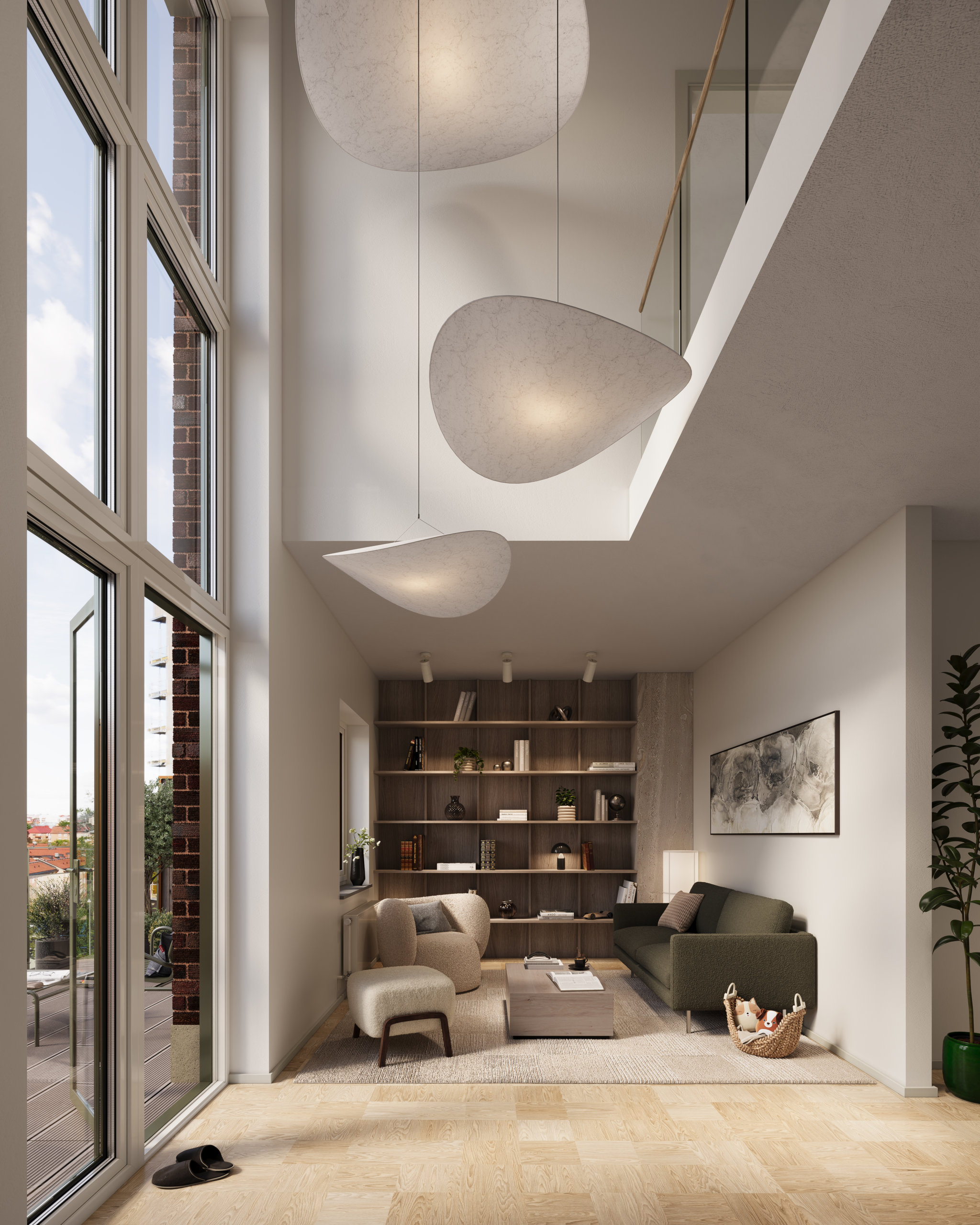
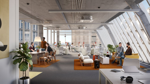
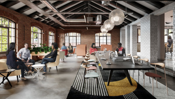
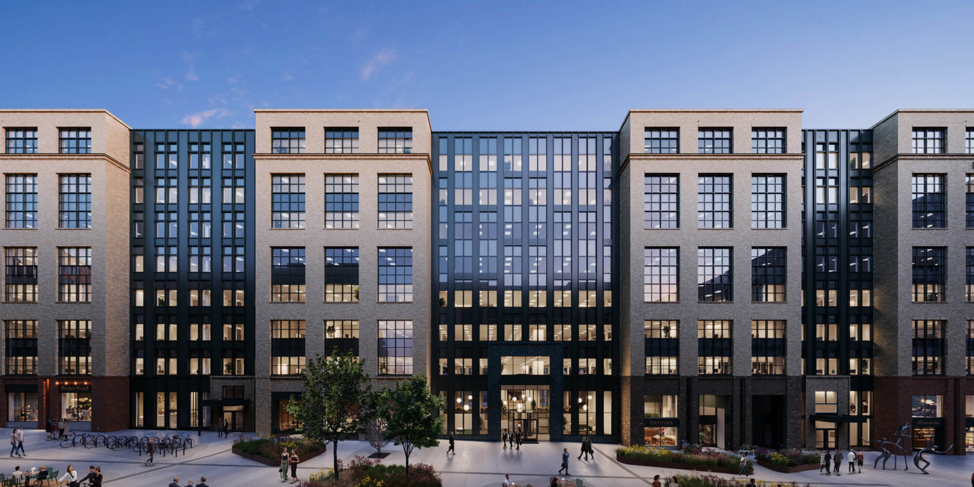
The first block has an industrial feel, with recycled bricks displaying patina, large paned windows, and timeless materials. The building, measuring 27,000 m2 and divided into 8 floors, is planned to be finalized in 2024.
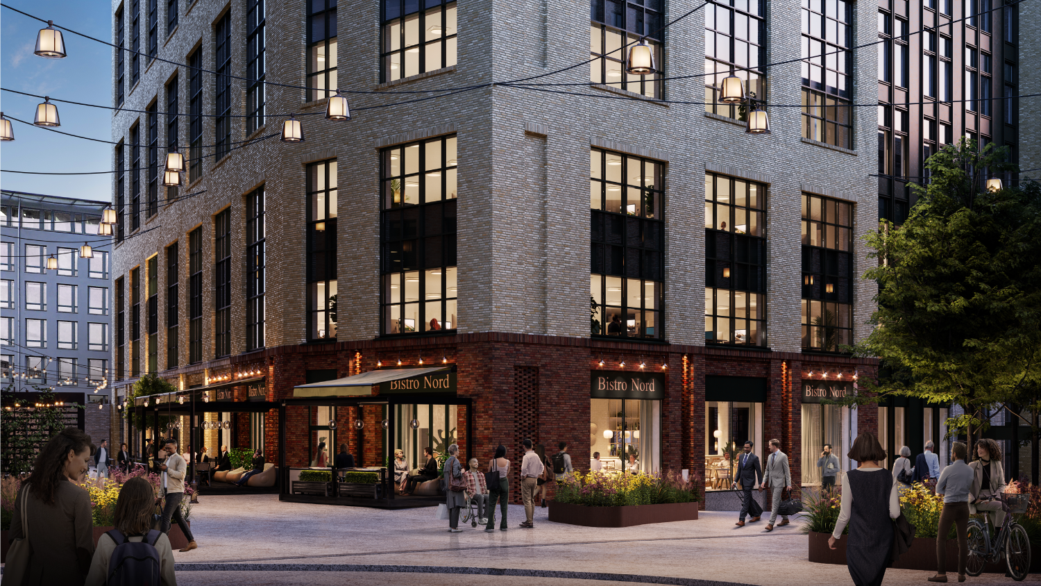
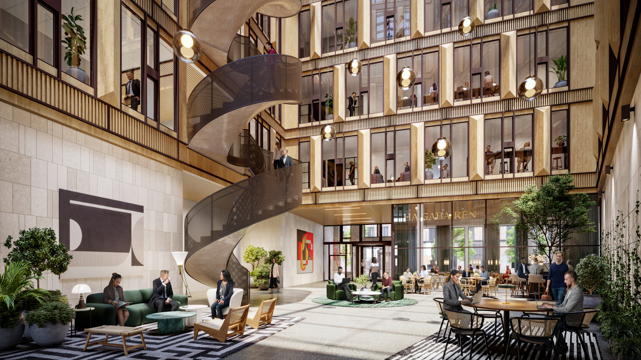
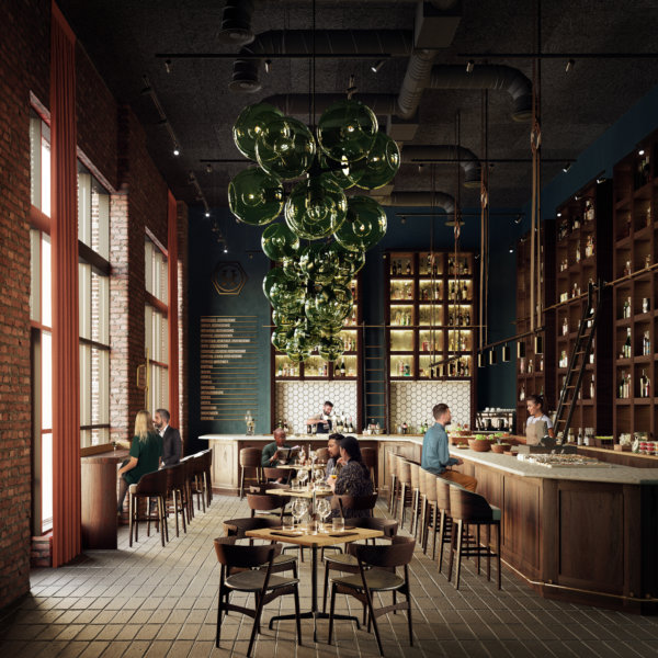
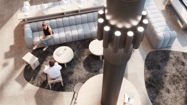
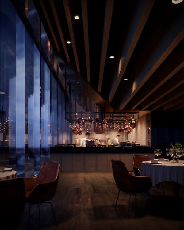
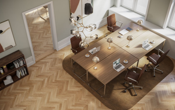
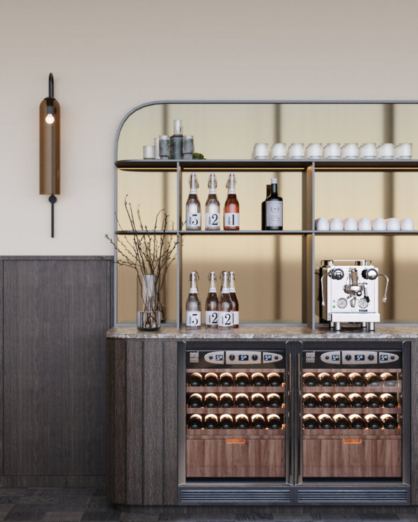
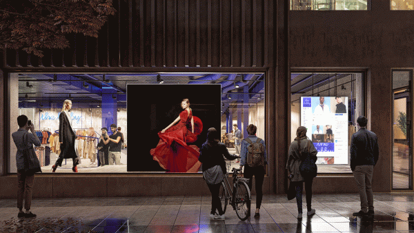
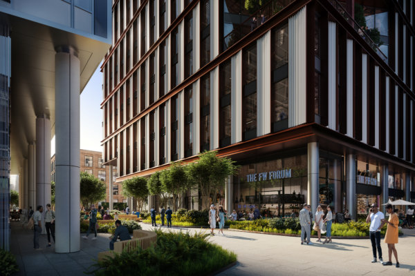
The next phase of the project was to illustrate the restaurant offerings in the area. To create the sought-after atmosphere, we treated each visualization as an opportunity to showcase how people will be enjoying themselves, escaping the typical render where people are implemented in strategic locations to avoid the space looking abandoned.
In essence, Haga Norra presents a thoughtfully curated blend of cafes, restaurants, offices, and residences, with a strong emphasis on creating inclusive spaces where people can come together and enjoy their time, regardless of whether they live, work, or are simply visiting the area.
Far from an enclave!
A new city park will enhance the green structure and establish connections between the large parks surrounding the area. A new subway station and space for buses is added along with bike lanes and pedestrian streets, in keeping with the overarching plans for Stockholm. What has impressed us most is how quickly Stockholmers have embraced this new part of the city, surely a result of smart planning and great execution by all involved parties.
WtR Conversations: Morten Wettergren
WtR Conversations: Morten Wettergren
Morten, tell us a little bit about Tomteboda
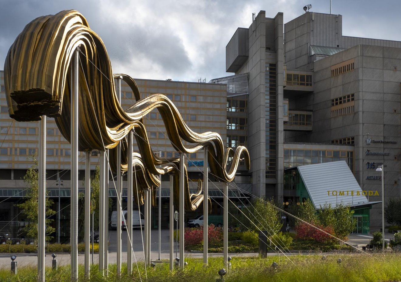
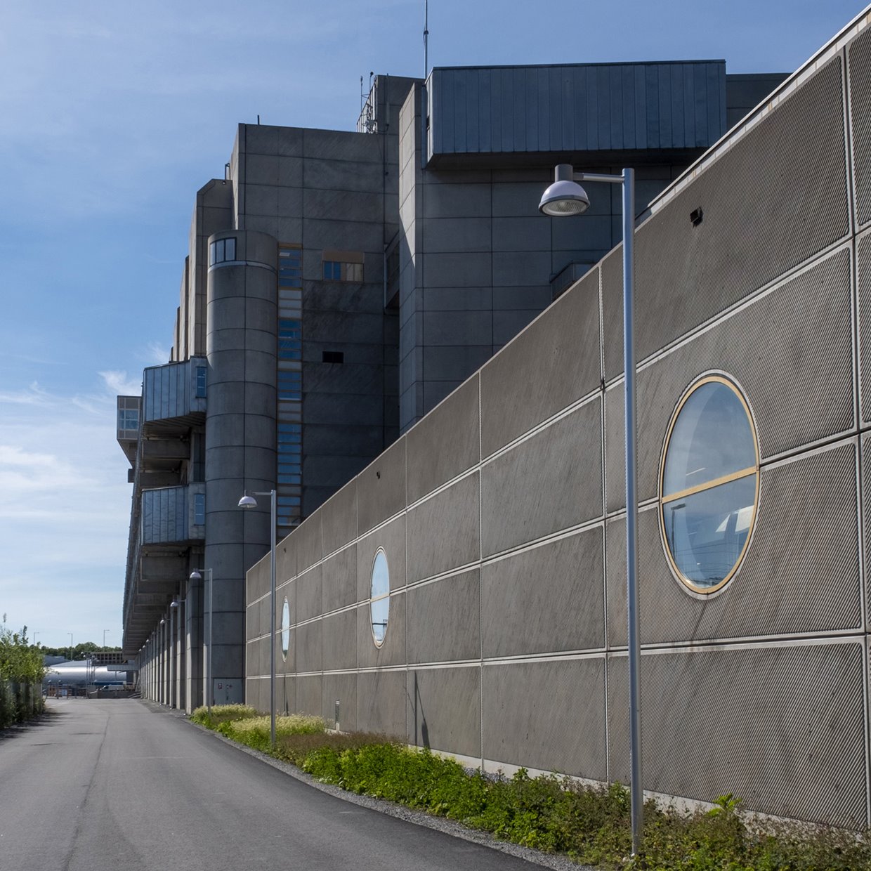
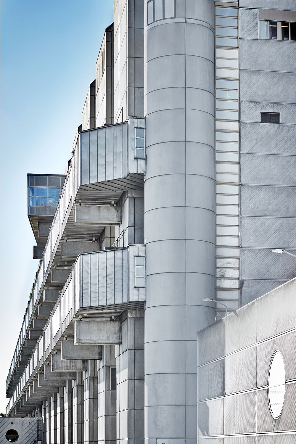
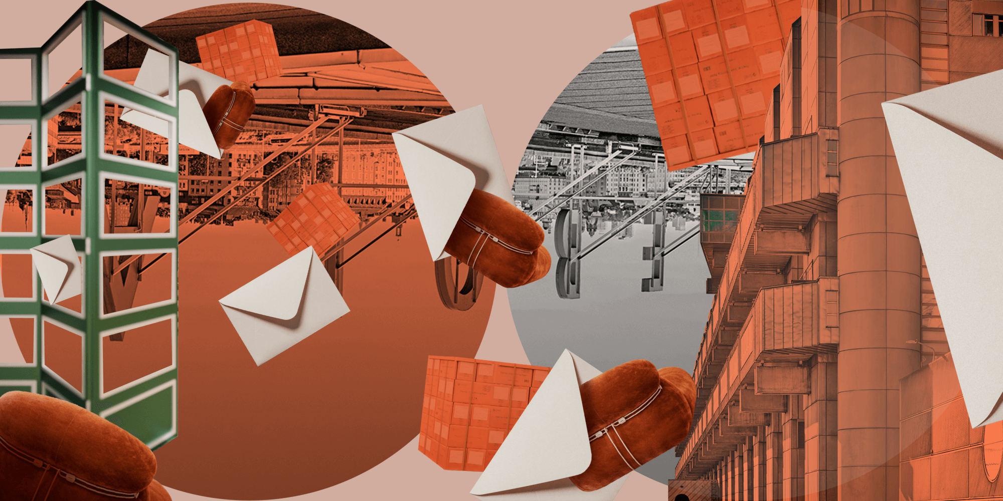
It’s really a gigantic building, 100 000 SQM (1 070 000 SQF). The facade is 400 meters long, and I think we have Europe’s longest corridors running alongside it. It’s unique in many ways, but one of the things that stands out is the massive structure, you simply don’t build like this any more. Then there’s the arts program. Introducing art in an industrial setting was unheard of at the time, and is still very uncommon. In June 2022 we added Ebba Bohlin’s spectacular artwork “Dispersal routes” to the collection, situated in the roundabout enteringing the main building. It’s eight meters high and 15 meters long. Everything is big when it comes to Tomteboda!
Photos by Anders Roth.
How did Obligo come to acquire the building?
It’s an icon! We acquired it in 2007, through a fund structure. Back then PostNord was the sole tenant, and a very stable one at that. Just 4 years later they announced that they were moving out and in 2015 we found ourselves with 100 000 SQM to fill. The news came as quite a shock to us, and the bank that financed the acquisition, as it changed the valuation of the building considerably. Unfortunately PostNord hadn’t been given the clearance to open a new exit from the highway and felt forced to move elsewhere. We’re very happy to have parts of their operation back now though!
Going back to the roots, what was the original intention behind Tomteboda?
Tomteboda was inaugurated in 1983. At the time it was the world’s most advanced postal facility. It was designed in the spirit of Corbusier’s philosophy of buildings as machines for living and working in. The architect behind it was Rosenberg & Stål Arkitektkontor, led by architect Gustaf Rosenberg. They successfully blended functionality with attention to every last detail, resulting in an iconic piece of modern architecture.
As much as I don’t want to think about it, that was 40 years ago. What’s happened since then?
Nothing lasts forever, and as amazing as Tomteboda may have been in the 80s, if you don’t evolve with your time, you will eventually become outdated and that’s what happened. In the 90s, Tomteboda suddenly wasn’t so modern anymore. The privatization of the postal service exposed it to competition, and the digital revolution was just beginning to take hold. People were sending fewer and fewer letters, and Tomteboda struggled to meet the changing demands. There were even thoughts of leveling the building. But a drastic measure like that wasn’t reasonable from any perspective, especially not from an environmental stand-point.
How did you start the reinvention of Tomteboda?
The solution was not immediately clear when we realized that Tomteboda needed a new purpose. But after sitting down with a diverse project team to review our options, we quickly understood that the building offered a level of flexibility and functionality that other structures in the area simply couldn’t match. Tomteboda’s unique construction allowed us to essentially rip everything out and recreate it to suit new tenants.
Fairly quickly we signed a lease with SL (Stockholms Public Transportation company) for 25 years. The bottom floor was the perfect location for Stockholm’s public buses, and with such a strong foundation, our confidence grew. We knew the type of tenants we should be targeting. At the time, rents in the city center were on the rise and many governmental departments and companies were looking for alternatives. Being located just 5 minutes away from central Stockholm, we were in a golden position and were happy to welcome MSB (The Swedish Civil Contingencies Agency) to Tomteboda in 2019.
Bringing a vision of this scale to life required the involvement of countless individuals, each playing a critical role in achieving the results we have today. Walk the Room joined us in early workshops and collaborated with us and the architects to discuss which details to preserve and how to uphold the original intention while reinventing it for a new era.
Can you give us an example of details that make Tomteboda so iconic?
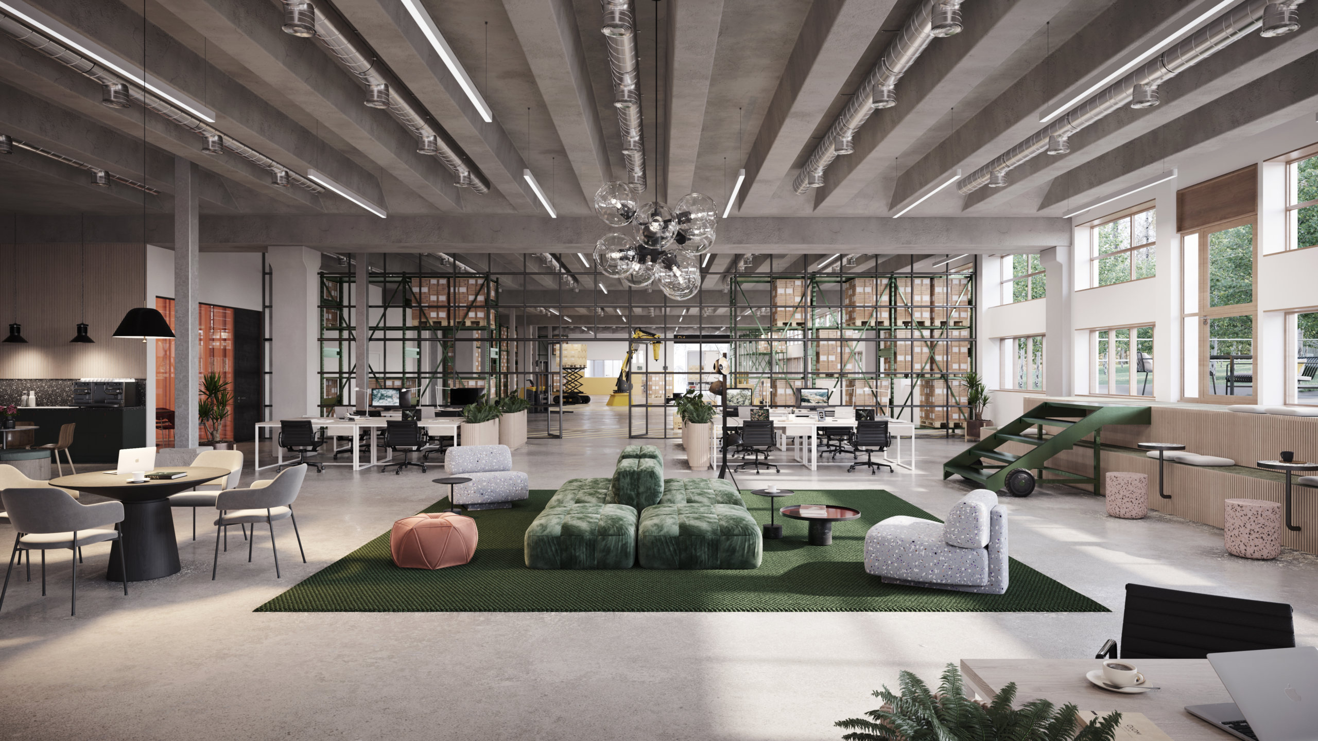
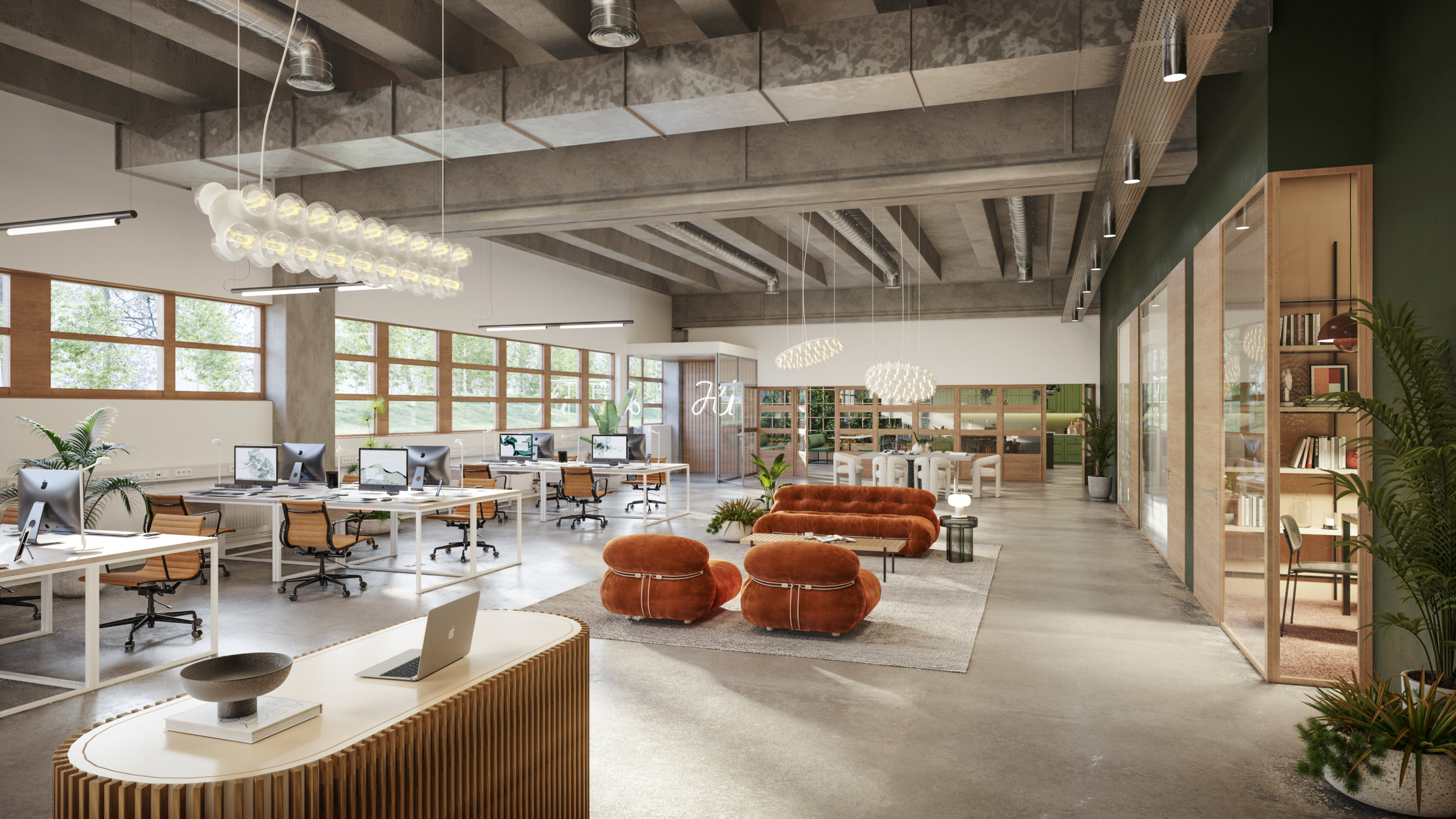
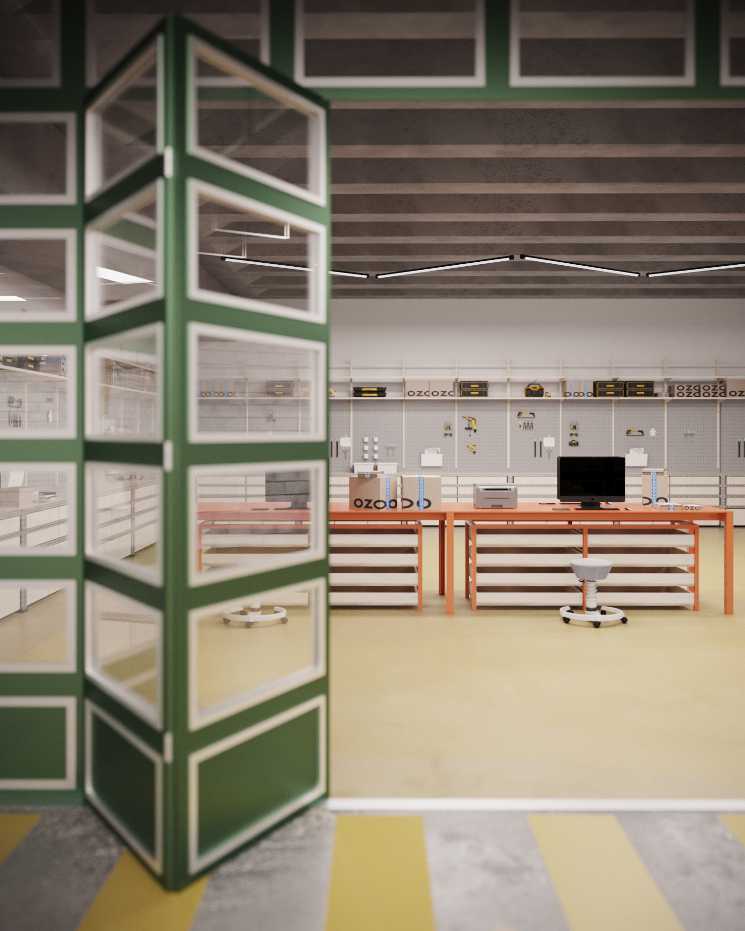
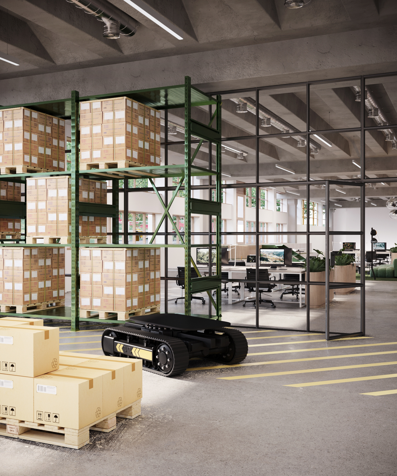
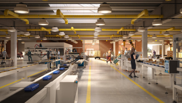
We actually wrote a whole book together with one of the original architects, historians, people working here in the 80s and many more, to honor the legacy of the building. Apart from the structure itself, a custom color palette with a signature orange-yellow, a green, and two blues was developed for Tomteboda. As you can see, the original color scheme is still here, and it was a vital part of the interior design and the visualizations. We also focused on highlighting the industrial elements of the building, concrete can be really beautiful when treated properly.
A challenging catch
Finding the right tenant for the old Train Hall proved to be a tricky task. For a long time, we had hoped that the building would once again serve as a train depot, but eventually we had to accept that this was not meant to be. Eventually Northvault, a battery manufacturer and Valneva, a vaccine company, expressed interest in the space and today they share the building. Valnevas operations are subject to extremely strict regulations, and the facility they have built is truly impressive!
What are you working on at the moment?
Honestly, we’re in a bit of a luxury position right now – we’re not actively seeking new tenants. Instead, we’re more focused on keeping some space available for our current tenants in case they need to expand. There is one piece of the puzzle that’s still missing, though – we’d love to find an arts association. It’s been such an important part of the Tomteboda’s history, and we think it’s important to keep that spirit alive.
Finally, congratulations on winning Building of the year! We’re guessing that the feat of reducing the energy consumption from 12,000MWh to 3,000MWh had something to do with it?
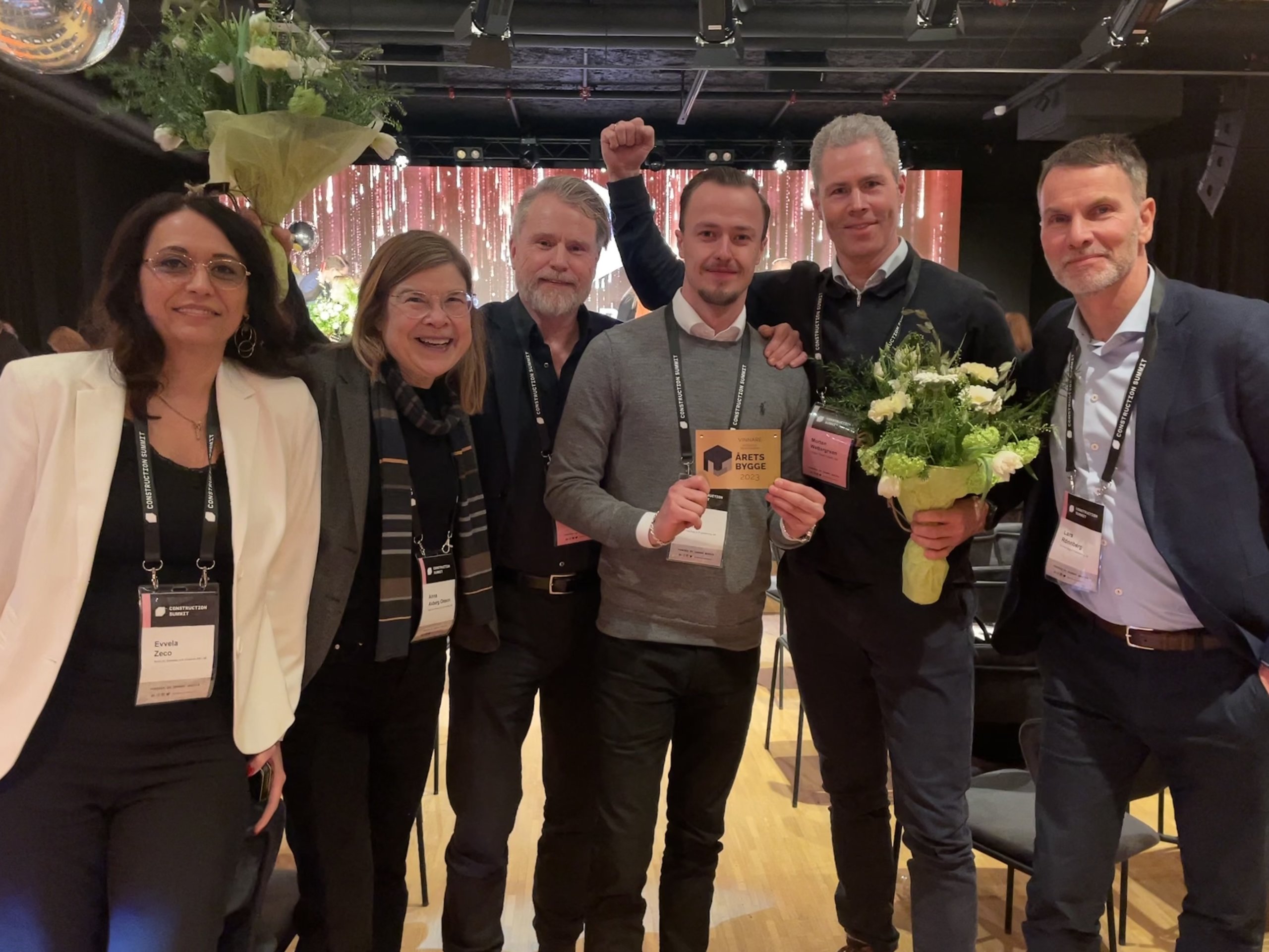
Thank you! We put as many solar cells on the ceiling as we were able to, a major factor in achieving these results. I think this project demonstrates that it is possible to take what we have and elevate it to house new functions. A large number of actors and specialists have collaborated closely, with great consideration, to transform this robust construction into a modern reference project. Everyone has been eager to explore new solutions which has resulted in a building that will last far into the future. We’re extremely proud of the recognition and award.
To read more about Tomteboda, visit: https://tomteboda.se/
WtR Conversations: Jens Rasmussen
WtR Conversations: Jens Rasmussen
Tell me about your office/practice!
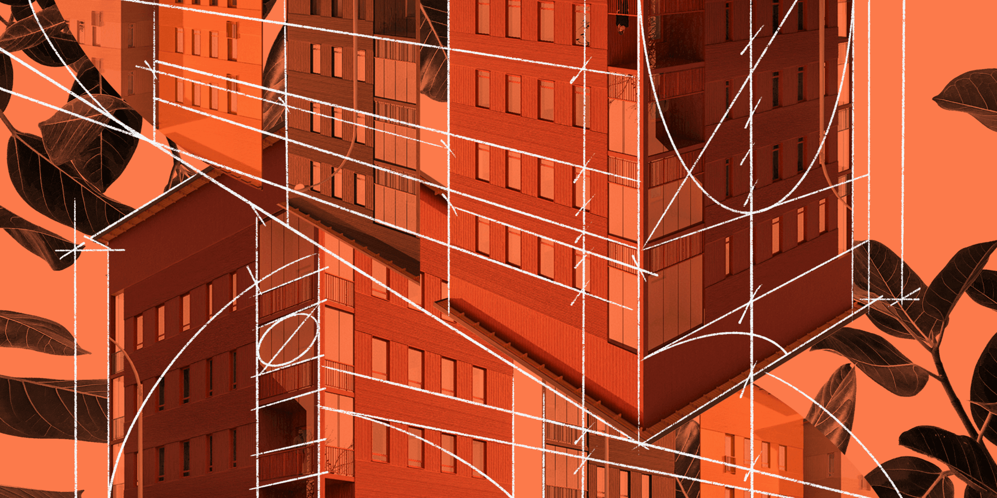
My colleague Rabbe and I were working in an office together, mainly on hospitals and other big projects. We were a bit tired of it and wanted to work on smaller and residential projects. Get to a more human scale if you will. We were prepared to do whatever. From the start we also did everything (our smallest project was a 2 m2 bathroom) but now we have scaled up into doing bigger projects like residential blocks / office buildings but still with one leg in Villa design.We’re now 6 coworkers and an office dog, with around a hundred projects under our belt.
Is there a specific project that captures the essence of Helst?
Well, perhaps more than a specific project we really found our way when we recruited our first coworker. Rather than a top down approach we wanted to include everyone already in the design phase. It stuck with us, and every project we undertake starts with a workshop where everyone pours all their ideas out on the table. After that it’s up to the lead architect to cherry pick the best ideas and incorporate them as they see fit. It’s fun, it’s collaborative, but most importantly it’s a rich place to start a project from.
Like many architects you are focused on creating sustainable architecture, but you took it one step further, why was that?
The footprint of this industry is something that needs to be taken very seriously. Being a small firm, we found that it’s very hard to understand the effect of different material choices or other decisions. In larger projects or firms you have whole teams calculating CO2, but even when you have access to experts for calculations, it’s time consuming. So you either “waste” time and money doing it early or you potentially need to waste time and money going back on ideas after they’ve proven not sufficiently sustainable very late in the process. We wanted to automate and simplify the process to make it accessible and usable throughout the process.
What is Laske?
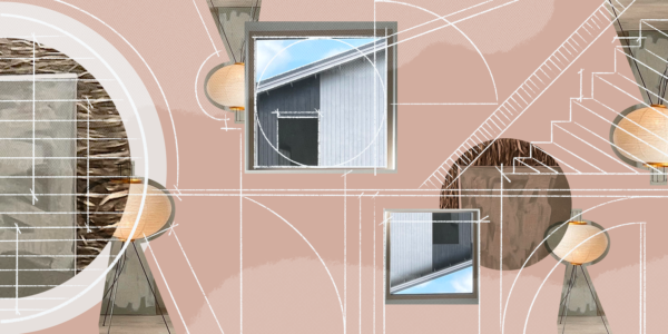
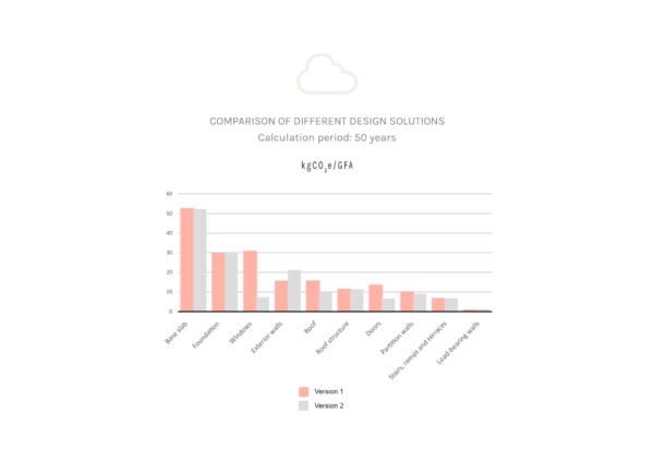
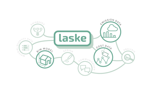
Laske is a plugin to Archicad that allows you to do calculations of the CO2 effect directly from the BIM model, with no more than three clicks. It generates diagrams and models on what building components create emissions, and simplifies investigating how much CO2 could be saved by for example changing the frame of a building, or the windows. Simply put, it enables architects, builders and clients to make more insightful decisions.
What’s next for Laske?
Building Laske was a team effort. Valter, who’s a wizard in calculations built the model, and Ninni, who is a researcher on circular buildings at Tampere University,, is a never ending source of information. At HELST architects we are already using LASKE in all our designs, but we want to spread the knowledge to more designers. Therefore we are now developing LASKE into a program that can be used by other companies.
We have been partly founded by the Ministry of Environment in Finland to develop LASKE into a program that we can sell and distribute in the Nordics. At the moment we are looking into different solutions to secure the rest of the funding for this phase of LASKE, hopefully with someone from our industry that understands the needs and possibilities of such a tool.
Read more about Laske and Helst Arkitekter here: click.
Digital Property Marketing: 13 Details That Ensure You Stand Out
Digital Property Marketing: 13 Details That Ensure You Stand Out
Optimizing property marketing for today’s audience
Google “best performing ads” on social media and a few common denominators will quickly appear. Striking colors, movement, short and catchy copy, the absence of complex information to process and digest. Google high-end commercial real estate visualizations, renders, or CGIs, and the majority of the images that come up follow a different logic, mostly displaying gorgeous, sophisticated, detailed images. This is not to say that these kinds of images and animations don’t have a place, but do they effectively capture people’s attention online?
B2B Marketing can still be emotion-driven
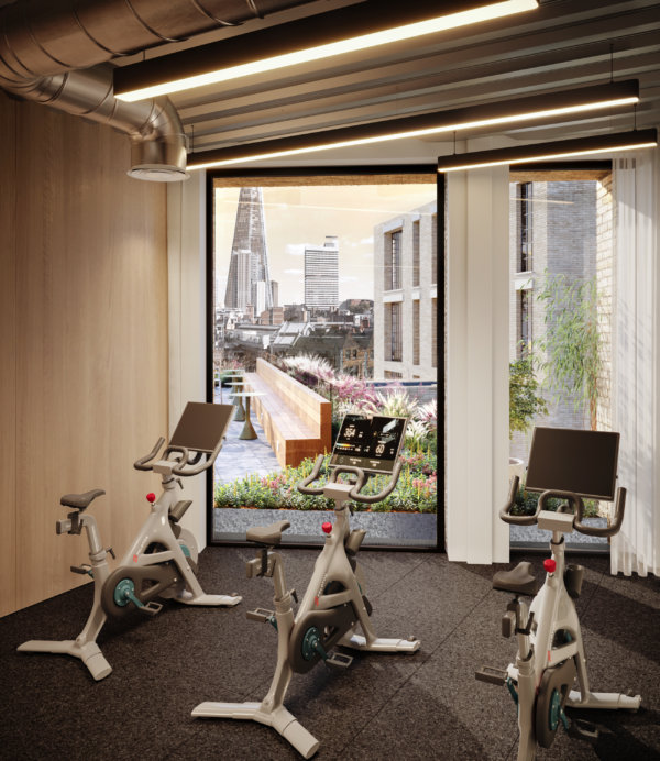
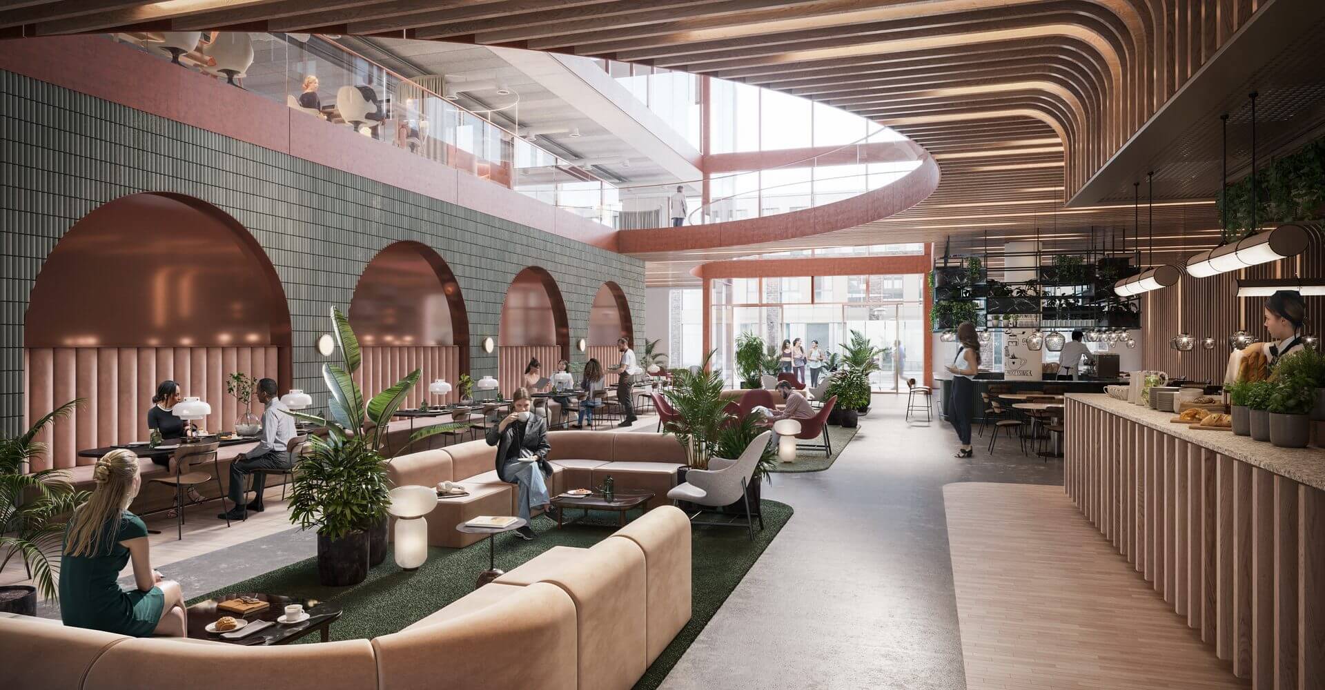
Some may argue that B2B marketing is different, less emotional, more about numbers. While there may be some truth to that, the dynamics of grabbing and holding the target audience’s attention are the same – we are, after all, still human. What can be done to complement commercial property imagery created for traditional media like billboards, printed folders and large screens? Details. Zeroing in on a detail – a dining table, a view, an exercise room, or even a chair – can help you grab the viewer’s attention to initiate a conversation and proceed to talking about the project as a whole.
Money well spent
Is it worth the extra money? Well, when the traditional images have already been created, the most expensive parts, meaning the model, the design, and the lighting have already been paid for. If the resolution is set to only work for a small format, spending that extra bit of cash can actually help increase the ROI on the visualization part of the marketing budget.
It’s all about the details
So why do details work? They’re human scale, and they help people imagine what it would actually be like to spend time in a space. Details make the dream tangible. But all details aren’t created equal, they need to stand out from the noise, and they need to speak to the viewer on an emotional level. We’ve compiled a list of stand-out images from projects we’ve worked on to showcase these 13 details for you, and to inspire you when planning your next project.
1. Showcase those spectacular views
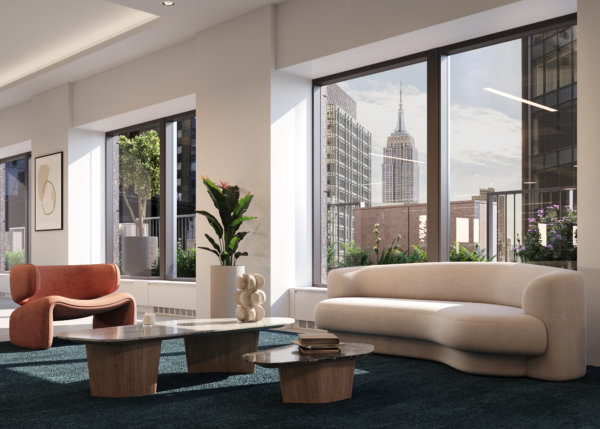
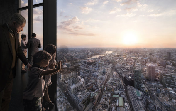
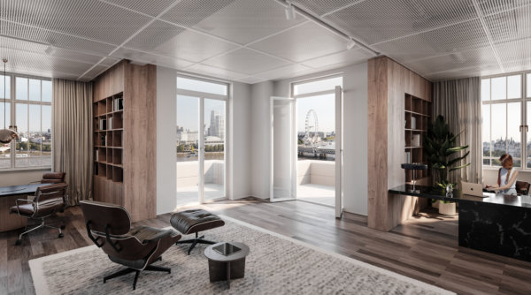
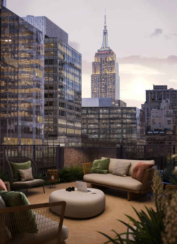
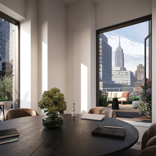
Is there any better way to “sell” a commercial property than with stunning views? It may be clear from an exterior image of a building that it’s sure to have amazing views, but that’s not the same as putting your audience in the room and actually showing them that view. Add people to the mix – because what interests people most are people – and you’ve just sold the benefits of those top floor spaces in milliseconds.
2. Location, location, location
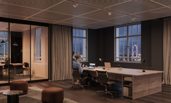
We all know that location is one of, if not the most important selling point of any project. Demonstrating the location on a map is both informative and functional, but showing it from the inside, using landmarks and recognizable areas connects to people’s emotions. Borrow the wow-factor from those nearby places, and just like that, your property goes from good to great. Who wouldn’t want a workspace with a view of the London Eye?
3. Make the most of unique features in your architectural visualizations
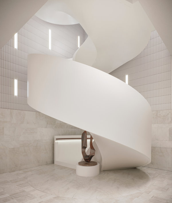
You’re just about to spend an unholy amount of money on restoring a facade to its original glory, or to build a staircase worthy of a Hollywood scene. Make sure those jaw-dropping features don’t get lost in the grand scheme of things by showcasing them in the way they were meant to be experienced. And ensure it pays off at the bottom line.
4. Tailor property marketing to audience interests
It’s notoriously hard to get people to read anything online, let alone interact with it. Part of the trick, of course, is to target your marketing to your audience’s interests. Larger images need to appeal to a broad audience with a diverse set of interests, but zeroing in on the details can help you speak directly to a sub-target audience like retailers, restaurateurs, or co-working spaces. They’ll appreciate you going the extra mile by taking their specific needs and wants into consideration.
5. Position the project using the right brands
By including brands and products that have the right associations, renders can signal the project’s future potential. It roots the project in the area, supporting local brands, or appealing to the audience of the featured brands. Whether it’s Apple, Four Seasons, or our local coffee shop, we all have brands we love. That makes us feel all the right things. Take advantage of that when marketing your property.
6. Feature iconic designs
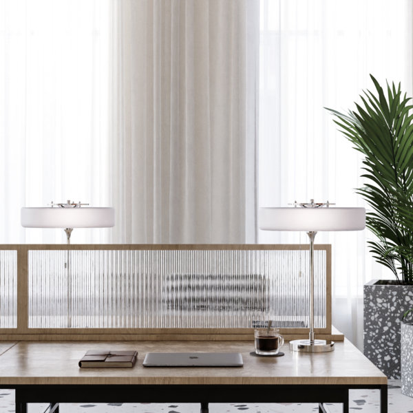
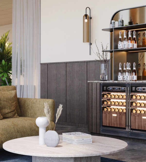
We’re not saying everyone is a sucker for design, but we’re kind of saying everyone is a sucker for design. Whether people are knowledgeable enough to name specific chairs or lamps, most people know high quality interior design when they see it. Using iconic pieces of furniture draws the viewer in by being equally familiar and desirable, and it paints the space in the right light.
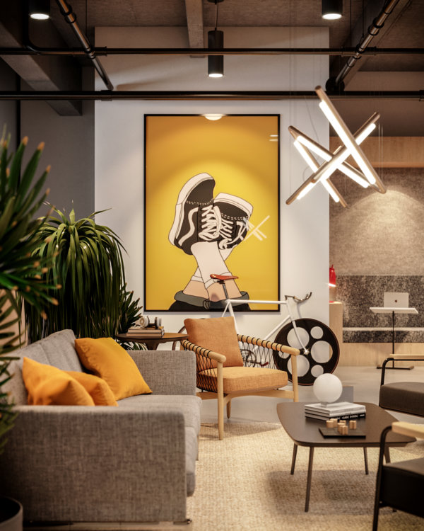
7. Use strong shapes or colors
The human eye and mind navigates the (overwhelming) amount of impressions we encounter daily in a number of ways, but generally, we humans favor things that don’t require a large amount of brain power, such as reading. That means that strong shapes and colors have a powerful effect on us in the same way “stop signs” do. By including strong shapes and colors in details, you ensure your image grabs your audience from the get-go.
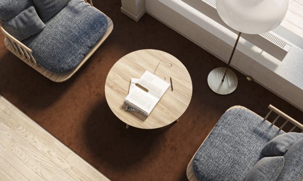
8. Look for unique angles
A trick of the trade to optimize strong shapes and colors, as mentioned in the previous point, is to look for interesting angles and showcase them in your 3D visualizations. Those angles create a “What am I looking at? I need to figure this out.” moment in the viewer and establish interest in the image. That’s half of your job finished already.
9. Fine tune the atmosphere and ambience
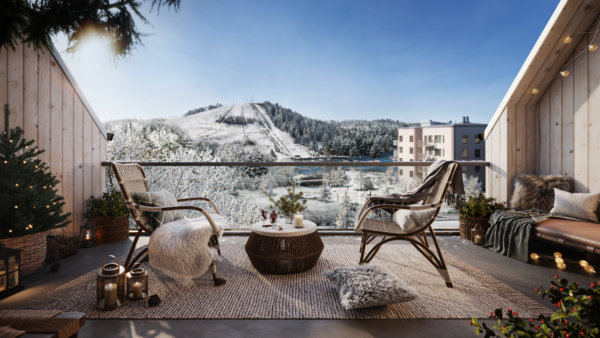
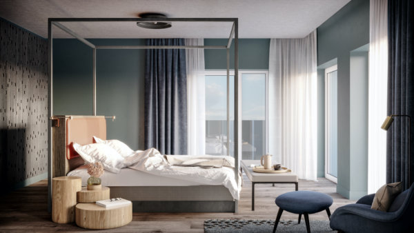
Before we can even get to square meter price and desk capacity, the oh so important desire for the space must be established. Create an atmosphere or ambience so vivid that the viewer can almost touch it, and you’ve just sold a lifestyle (and a property). Be bold and be specific. It’s better to be clearly cool, refreshing, cozy, or lively than to try to be a little bit of everything.
10. Make it move
Animations can be costly, but there’s also a nifty way of adding movement to still images that grabs attention on small screens. Make the color of a typewriter change from blue to red to green and back, and you immediately capture attention without it costing an arm and a leg. Complement it with smart copy and you’ve got yourself a great asset for your property marketing efforts! Better yet, include movement in a way that ensures your potential customer imagines just how your space benefits their business.
11. Incorporate the latest trends
You know how the items worn on the catwalks of the most prestigious fashion brands are bought by few, but seen by many? And how that goes on to help them sell the white t-shirts or mascaras that often make up the bulk of their business? Well, we think of restaurants and bars as the catwalks of commercial real estate projects. The bulk of the building may be office spaces, but it’s the restaurateurs and retail spaces that help build the perception and vibe of the building as a whole. Use those details to convey that the space will be the talk of the town, and your customer will understand that this prestige rubs off on the rest of the spaces and tenants as well.
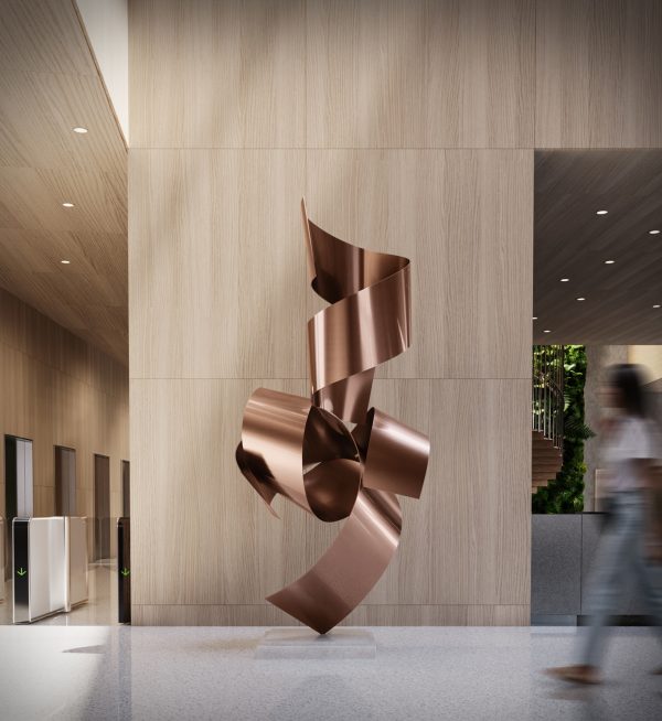
12. Art for the sake of art – and business
Art doesn’t require a reason for being, but in this context, it has one nonetheless. It’s a good place to inject color in an image and create a focal point – without using strong color in furniture which may be polarizing or come across as too much. While it may not appeal to everyone on a personal level, it will most certainly capture their attention.
13. Employ inviting textures
Speaking to as many senses as possible is a way of ensuring that no stone is left unturned in the quest to attract the engagement of the viewer. Using highly tactile materials in the space, both in surface layers and in furniture, is a way to create ambient atmospheres without dimming the lights – especially useful in daytime places such as office spaces.
Ready to take your property marketing efforts to the next level by utilizing these tips? Get in touch to discuss your next project! We’d love to discuss how we can help you showcase your commercial property to your target audience on the right channels.
8 Ways That 3D Visualizations Bolster Your Property Marketing Efforts
8 Ways That 3D Visualizations Bolster Your Property Marketing Efforts
Communicate your property
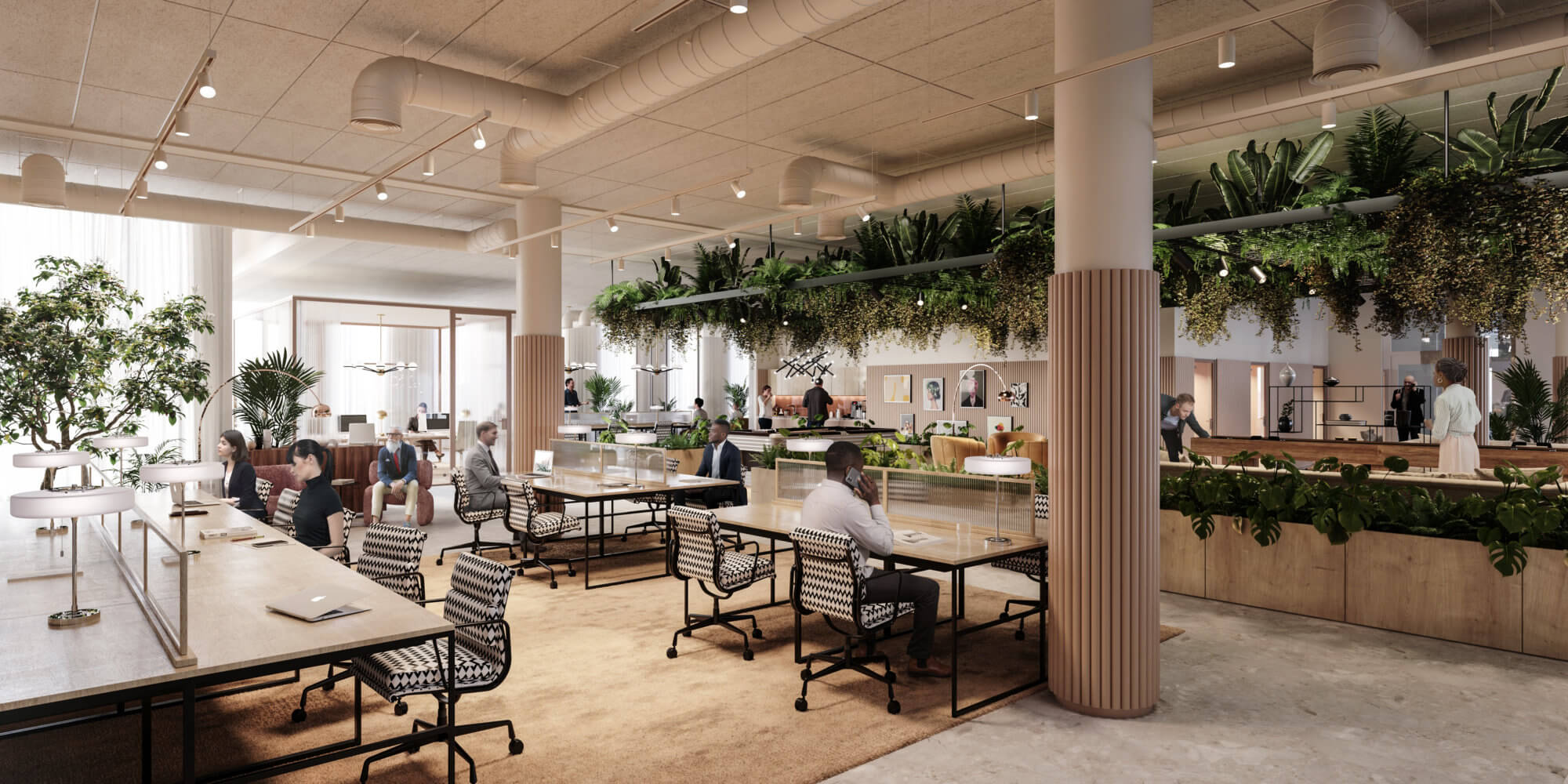
Communicate any property efficiently with digital presentation assets such as CGIs, 360s, walkthroughs, and animations that will engage your audience, increasing online excitement that matters. By adding 3D property elements to your offering you bring the essence of the real world into the digital world.
Show the characteristics and spaces that you and your clients care about, by allowing them to be experienced online from anywhere in the world.
Visually package your property’s USPs
Every one of your properties/projects have unique value, whether it be location, surroundings, layouts, size, materials, or flexibility, you can use 3D to visually explain your vision before development, refurbishment, or fit-out takes place. Ultimately, you will be able to quickly create interest and put on display the true value of your property.
Drive future value
We all know that the value of a property is not only immediate, in fact, its intrinsic value appreciates with time. But further value can be planned and even put on display through additional plans that may not be in phase 1. Does your property have the potential for future development? Make your plans visionary and at the same time concrete by showcasing the potential to drive future value.
Define unique characteristics
As the old adage goes, the devil is in the details. Every property/project is built around a few major values, which in the end, drive the interest in purchasing a property. However, increasing property value, and ultimately closing a quality buyer, lies in the details. By using 3D to push an average presentation into a game-changer, you can also put on display those unique individual characteristics that you have envisioned, which ultimately can skyrocket property value. Red granite lobby tabletops instead of wood? 3D allows you to capture every unique characteristic, which ultimately separates quality buyers from others.
Target great buyers/tenants
Like any great presentation or pitch, the tailoring of all information is key to its success. Imagine you’re a buyer/tenant, and you are viewing a property image that is in all white and beige, with floor plans laid out and neutral furniture peppered about. Sure, it’s in a great part of town and the commutes are easy for your employees. But aren’t you a little worried about the level of service and relationship you would receive from an owner that only values their property with some basic 2d layouts and image overlays? Now picture an owner that took the time to create an image that could actually show your company and teams in the office, with desks and furniture to subtly match your company feel and vibrance, virtually moving you into the space before you’ve even signed the contract.
Have meaningful conversations with clients
Have you ever joined a meeting where someone wasn’t prepared and decisions needed to be made? During this meeting, you end up using the time to draft what should have been ready for the meeting to discuss.
3D visualizations are quite literally the version of being the most prepared for a client or investor meeting possible. By delivering 3D visualizations of a concept you show your audience that not only have you thought the entire property concept through and sketched it out, but you have fully committed to what it will be. Confidence in an idea is a major cornerstone to buyer confidence and commitment.
Stand above your competition
Keeping up with the competition” is a relic of the past. “Staying relevant” is a graveyard for slow decision-making. You either continue defining the future and pushing your competition to keep up, or you enjoy what’s left when they are done cherry-picking the best buyers and tenants out there.
We all know that for larger deals, each potential tenant or buyer of a property has multiple options to move to or invest in. Choosing a 3D partner that will not only deliver images for you on time but truly drive the creative process, create value, and deliver things that you didn’t know possible is what will keep you ahead of the competition and in the good graces of potential clients.
Increase your potential buyer reach
It’s simple, in today’s ease of global movement and competitive property markets, people buy and rent property sight-unseen. With every development, refurb, or office let your potential reach is global. How do you reach a global audience with a very fixed-in-place product, property? You take the mountain to Mohamed.
Save the client effort, time, and travel by creating an overwhelming digital showcase of your property, which will increase your buyer circle (overseas), cut transaction costs, and impress your prospects.
10 Commercial Real Estate Predictions for 2022
10 Commercial Real Estate Predictions for 2022
An increase in CRE investment
It’s no surprise that 2021 saw a decrease in investment in certain areas of commercial real estate, but the good news is investment is on the way back up in 2022, both in traditional sectors such as retail and hospitality, and in alternative sectors such as life sciences and industrial real estate. An increase in vaccinations and a decrease in Covid-19 cases in many countries worldwide means a (slow) return to normal life, leaving many investors ready to once again turn their attention to shopping malls, restaurants, and hotels, while continuing their investments in profitable new areas such as warehouses for e-commerce or data centers.
The hybrid work model is here to stay
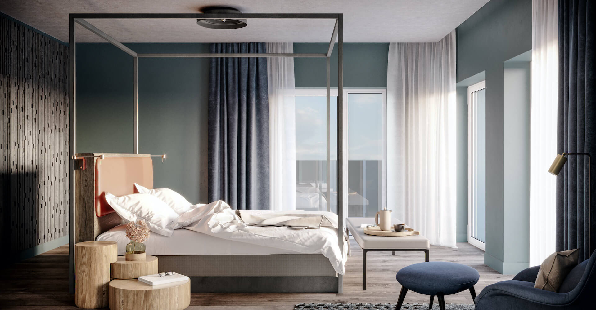
2021 saw many employees working from home and many organizations downsizing their office spaces to cut costs. Far from seeing a loss in productivity, many organizations realized this flexibility only made their employees more productive and happier at work. WFH is here to stay, but many employees will opt to go to the office at least a few days a week, creating the need to keep or even upgrade office spaces in many companies. Many organizations, such as those in the tech industry, have thrived during the pandemic and are experiencing massive growth in terms of hiring and revenue, leaving them with office spaces that are now much too small to accommodate the number of new employees. While some of this will be solved by the hybrid work model, many organizations will choose to move to bigger office spaces, creating new opportunities for property developers and leasing agencies.
Industrial real estate is on the rise
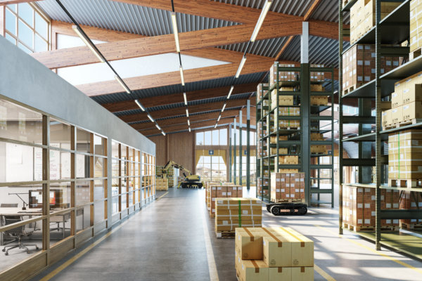
Changing consumer behavior has led to a boom in e-commerce and the data centers needed to power online shopping platforms as well as to ensure companies have the needed capabilities and infrastructure to work from home. This has led to massive opportunities for those leasing or selling industrial spaces, and this trend will only continue to rise in 2022. Expect to see opportunities in niche areas such as cold storage as a growing number of investors are interested in this maturing market.
It’s all about tech
Leasing activity will be driven by tech companies worldwide. According to Savills, we can expect to see office leasing activity comparable with pre-pandemic levels in 2022. However, this will differ depending on the country. Emerging markets such as Vietnam, China, and Indonesia will offer huge opportunities for leasing agencies and property developers due to their strong economic growth and less interest in switching to a hybrid work model. Office spaces will remain integral to tech companies worldwide though, even those with flexible working policies, as their massive growth means they’ll still need bigger spaces for those employees that do opt to go to the office.
Hope for the retail sector
Retail might just be the commercial real estate sector that saw the biggest challenges during the pandemic as lockdowns led to a massive shift in consumer behavior and extreme growth in e-commerce. While e-commerce is not going anywhere, the reopening of brick-and-mortar stores and the strong desire for a return to normalcy will offer ample opportunity in 2022.
The inhospitable hospitality sector
The hospitality sector reached record lows in 2020 and 2021 due to lockdowns and global travel restrictions. While vaccinations and a return to travel offer hope to this struggling sector and a full recovery is expected eventually, CBRE predicts that hotel occupancy won’t reach pre-pandemic levels until at least 2023.
Creative solutions to CRE investment
With both the hospitality and retail sectors crippled by the pandemic, investors started looking into alternative sectors to make up their losses and drive growth and profits even in uncertain times. This has led to an interest in industrial real estate fueled by the immense growth of e-commerce and data. Many retailers no longer need brick and mortar stores, but they do need bigger warehouses to store the stock they need for increasing online sales. Beyond that, the threat of the global pandemic has brought on interest and opportunity for specialized offices in life sciences and the medical buildings for research purposes. 2022 will continue to see investment in the aforementioned alternative sectors, but a return to normal life and the new growth mindset adopted by most thriving organizations, means that the possibilities for creative solutions in 2022 are endless.
Young professionals drive growth in Multifamily CRE
As many young people fled to their family homes during the pandemic to save on rent, multifamily properties (i.e. apartment complexes) suffered. However, 2022 will see young professionals looking to move out on their own once again as they return to the cities and the workplace and achieve their pre-pandemic financial stability.
It’s all about sustainability
Even before the pandemic, we were seeing a huge increase in the number of companies that promised sustainability in their business practices and investments. The pandemic only further amplified that need. Sustainability has taken a central role for corporations and economies with both business and world leaders promising to reduce emissions and move us towards a greener future. This trend will only intensify in 2022 as many investors and organizations will require tracking of ESG initiatives.
3D visualization’s even bigger role in CRE marketing
With so many meetings still taking place over Zoom rather than in person, 3D visualization’s place in property marketing is more important than ever. In an area as competitive as commercial real estate, there’s only one chance to make an impression. CGI, 360s, and animations are the future and allow property developers, leasing agencies, and marketers to sell not only a property but a lifestyle. By adding 3D property elements to your offering, you bring the essence of the real world into the digital world and can showcase it online anywhere in the world.

